The Most Beautiful 2D Sprite Games of All Time
Let's celebrate the simple beauty of sprite-based games.
This article first appeared on USgamer, a partner publication of VG247. Some content, such as this article, has been migrated to VG247 for posterity after USgamer's closure - but it has not been edited or further vetted by the VG247 team.
When you next have a little quiet time to yourself, sit down and think deeply about the artistic evolution of early video games. Think about how much work went into making Mario a real human being instead of a triangular spaceship or a rectangle. Think about how Sonic the Hedgehog's quills stir in the wind as he runs. Think about how sprite artists create these characters—and indeed, entire worlds—pixel-by-pixel, like a puffer fish building grand patterns in the sand shell-by-shell.
For a time, pixel art was a necessity in video games. While Atari dabbled with vector graphics by way of Tempest and the Star Wars arcade game, most games were assembled on grids. Oftentimes, the results were beautiful. We still admire sprite-based games, not just because they whisk us back to past console generations, but because they look good. We sigh over Alucard's fluttering cape in Castlevania: Symphony of the Night, but you won't find as many fans of the primitive, often muddy polygons that guided mainstream video games into the 3D space. (Not to say those fans aren't out there.)
Thus, we put together a list of the loveliest sprite games. This roll-call isn't limited to games from the '90s, the heyday of sprite art: there are plenty of modern sprite-based games that do a fantastic job combining nostalgic NES chunkiness with today's advanced engines. Great sprite art isn't as commonplace as it used to be, but if this list is any indication, neither is it in danger of fading away.
Dungeons & Dragons: Tower of Doom / Shadow Over Mystara (Arcade, 1994)
In the '90s, the arcade scene was all about games where you bury your fist in an opponent's face. Between the rise of Street Fighter and the superhuman endurance of side-scrolling beat-em-ups like Double Dragon and Final Fight, the arcade was the place to let off a little steam.
Capcom, the reigning champion of making games where you kick the snot out of people, acquired the Dungeons & Dragons license at some point and mated it with Final Fight. The union bore fruit and gave the world Tower of Doom and its direct sequel, Shadow Over Mystara.
Dungeons & Dragons is a franchise we usually associate with a group of adventurers progressing slowly through damp hallways and firing magic missiles at the darkness. Capcom's Dungeons & Dragons games defy the stereotype with bright, imaginative environments wide enough for four adventurers to swing their weapons. Tower of Doom and Shadow Over Mystara are beat-em-ups to be sure, but its characters aren't street toughs who equip themselves with brass knuckles and baseball bats. They're the same heroes you roll up on a Saturday night with your pals: Elves, Fighters, Wizards, Clerics, and Thieves. They can sling magic, fire arrows, and stab, stab, stab with their swords.
I don't play Dungeons & Dragons, but I'm relatively familiar with the universe. Even with my limited knowledge of the game's world, the sprites are a joy to look at. The very idea of crossing Dungeons & Dragons with an anime aesthetic had never even occurred to me. When I first saw Capcom's iteration of the traditional Wizard character and his spiky blue-and-white hair, my mind was blown.
The Breath of Fire series already proves Capcom has a way with designing and animating monsters. Tower of Doom and Shadow Over Mystara is another showcase for Capcom's skillful depictions of dragons, gnolls, kobolds, and trolls. The mighty Red Dragon is the D&D universe's most feared monster, and Shadow Over Mystara gives it the presentation it deserves.
It's no surprise Capcom's Dungeons & Dragons games are brimming with creative energy. One of the designers on-board was Vanillaware's renowned George Kamitani, who made a gorgeous spiritual successor with Dragon's Crown. Yeah, Kamitani loves drawing big, silly boobs, but he's also arguably the best monster designer in the video game industry. Kamitani can draw all the heaving bosoms he wants as long as he never stops drawing those beautiful multi-hued dragons that populate his games. —Nadia Oxford
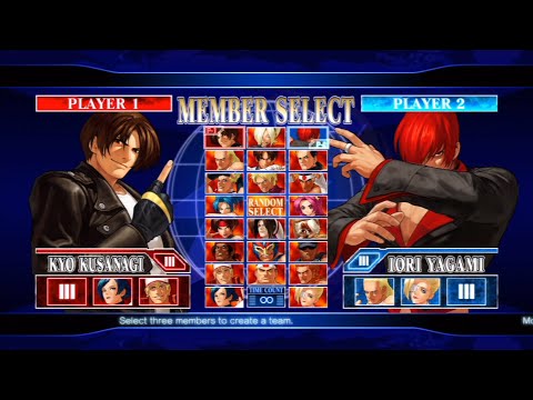
King of Fighters 12 (2009, Arcade, PS3, Xbox 360)
Picking a King of Fighters title, or really any SNK fighting game for this spot, was tough. Garou: Mark of the Wolves holds a special place in my heart, and there are certainly more popular iterations in the King of Fighters series.
King of Fighters 12 is a labor of love, though. It isn't the most popular KOF for gameplay, but the look of it was a Herculean task to create "the ultimate 2D fighting game." A Kotaku interview from the time details the process: Artists would convert the original drawings of characters into 3D models, then convert them back into 2D for a greater depth of motion. But to keep the shading and detailed colors of the fighters, artists then went in and touched them up by hand, pixel-by-pixel.
Is it arguable that the end result is not technically pixel art or sprites? Sure, I guess. But I respect the amount of work that went into crafting each and every character. It was a workflow that seems excessive, but resulted in absolutely gorgeous fighters. —Eric Van Allen
Chrono Trigger (1995, SNES)
Shock and surprise: The best RPG of all time has incredible sprite art. Chrono Trigger makes an easy case for being the best-looking game on the SNES, and if you're a fan of retro RPGs, that's a surprising realization. Though beloved for their depth, storytelling, and oft-lovely soundtracks, most retro RPGs were forced to compromise on their graphics. Final Fantasy 4 (localized on the SNES as Final Fantasy 2) wowed us with an hours-long quest and detailed enemy sprites, but the trade-off was a squished overworld populated by tiny NPC sprites devoid of detail.
Final Fantasy 5 followed the trend, as did Final Fantasy 6. Final Fantasy 6's visuals are miles beyond Final Fantasy 4's diminutive sprites, but the compromise is still clear. Yoshitaka Amano's monster designs are big and brilliantly detailed, while the main cast is assembled from simple sprite templates that offer limited movement and expression.
Chrono Trigger's graphics aren't compromised. Crono and his friends look natural in every environment they explore, from the emerald green forests of 600 A.D. Guardia to the joyous, fluttering banners of the Millennial Fair. And when the party looks unnatural against their surroundings, it's by design. Crono looks unsettlingly colorful amongst the bent, broken people in Lavos' grim future. Similarly, the alien structures woven by Queen Zeal's techno-magic appear forgein and dangerous against Crono's simple clothing and weapons.
I still love how Chrono Trigger catapults us directly from a calm, semi-medieval world into a future where mutants prowl broken highways and sleep on rusted cars. Then we're off to a prehistoric village and the End of Time itself. It's astonishing how much there is to see in Chrono Trigger, and it's astonishing how beautiful it all is... even when it's horrible. —Nadia Oxford
Metal Slug (1996, Arcade)
The look of a game can elevate it above just its mechanics. And as much as I love the running and shooting of Metal Slug, which is probably my favorite of the side-scrolling run-n-gun era, the aesthetic plays a major part in that as well.
The leads of Metal Slug are cartoonishly heroic commandos ripped from the annals of G.I. Joe. Bullets are stylized as blasts of flame, all set against a gorgeous backdrop. Stick grenades and old-timey weapons form an arsenal of weapons that feels almost like a Hogan's Heroes throwback.
The biggest style points come in the more wildly imaginative enemies. The Ghibli-esque tanks and airships, populated by animated soldiers with big expressions and fascinating weaponry. Metal Slug is a comical depiction of war, but that dark humor is what makes its sprites so memorable. —Eric Van Allen
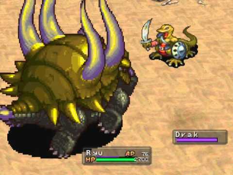
Breath of Fire 3 (1997, PlayStation)
I love dragons. Evidently, so did the Breath of Fire 3 development team. Everything about Breath of Fire 3's bright, chunky sprites deserves praise, and I'll never stop loving Ryu's myriad dragon transformations.
Ryu, a member of the diminished Light Dragon brood, usually bears his distinctive blue-haired human form. But when he unlocks the power of the dragon genes scattered throughout the game, he can combine them to turn into dragons of all shapes and sizes. A simple shift turns Ryu into the standard winged dragon that's common in European folklore, but nothing is too big or small, too traditional, or fanciful. With a little gene splicing, Ryu can turn into an adorable slug-dragon with a devastating breath attack, or he can gather up his friends and combine their bodies and powers into a majestic Tiamat.
The real fun begins when Ryu finds the "Hybrid" gene, which lets him merge characteristics with individual party members to make unique beasts. When Ryu combines with the tiger-man Rei, he turns into a sleek, deadly dragon with leonine features. When he combines with the winged Nina, he turns into an angel-dragon cross with lovely feather wings. When he combines with the engineer Momo, he acquires a suit of armor that shoots bombs.
Not all these forms are useful; they're certainly outclassed later in the game by Ryu's mighty Kaiser form. Still, the time and effort that went into designing and animating each one of Ryu's dragon transformations is evident every time he makes the shift. Capcom clearly just wanted to make these monsters, like a kid happily scribbling doodles of fantastic beasts in a notebook.
On the topic of fantastic beasts, Breath of Fire 3's monsters are unparalleled. Even the mighty Suikoden 2's enemy sprites can't quite stand up to Breath of Fire 3's menagerie. The designs are clean and simple, but every monster bounces, bites, and snarls. They're alive, and they're ready to fight.
For half the game, Ryu is chased by two mobsters named Balio and Sunder. The brothers are bipedal unicorns, which is an interesting design unto itself, and their animations make them unforgettable. They snort, they laugh, they aggressively swish their tails when they're prepared to attack. Every quivering pixel on Balio and Sunder screams "These unicorn mobsters will break your ass into little pieces and mail them to your mother." I still get chills whenever they appear in-game. —Nadia Oxford
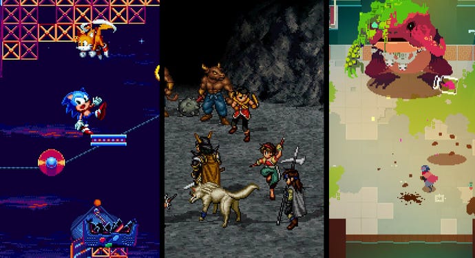
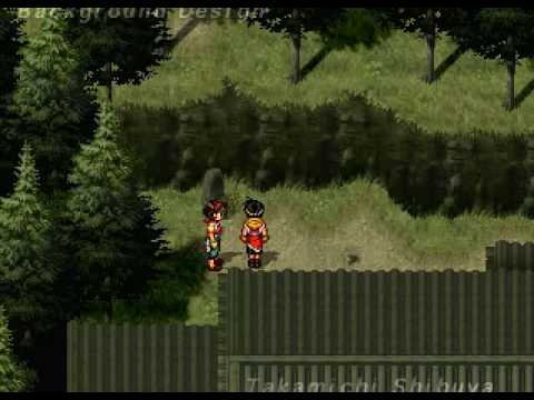
Suikoden 2 (1998, PlayStation)
I had no problem singling out Suikoden 2 as one of our top 25 RPGs of all time, and I have no qualms against singing its praises again here. This time I'm sliding behind the Suikoden 2 pedestal to celebrate its stunning sprite art.
Most game genres enjoyed a nice boost when developers shifted from the SNES and Sega Genesis to the PlayStation, but RPGs got the biggest glow-up. Severe space limitations for 16-bit cartridges forced developers like Squaresoft to limit their character sprites' movements and animations, but the PlayStation's CD format gave them boundless space to stretch their creative muscles.
Konami used all that extra room to fill Suikoden 2 with intricate sprites, which was obviously the right thing to do. Even Chrono Trigger, arguably the pinnacle of 16-bit sprite art, requires players to use their imaginations and fill in "missing frames" during dramatic pantomimes. By contrast, every character movement in Suikoden 2 is deliberate. There are hundreds, possibly thousands, of frames of animation that bring life to the 108 Stars of Destiny you recruit into your party. Many of them have expressions and movements you only see once, then never again—hours of work that cross your eyes for a few seconds, and then it's gone.
Suikoden series creator and director Yoshitaka Murayama took all that extra time and effort because he clearly believed Suikoden 2 was worth it. He was right. When I look at Suikoden 2's intro movie, "Reminiscence," I get a little misty-eyed because I know we'll probably never see sprite art this detailed, fluid, and well-choreographed ever again—though it's worth noting indie developers who grew up on works of art like Suikoden 2 are gradually channeling that inspiration into their own games. Godspeed, good people. Don't just animate those pixels: breathe life into them. —Nadia Oxford
Street Fighter 3: 3rd Strike (1999, Arcade)
This was actually one of the inspirations for this list, and for good reason. Despite any preference, I firmly stand by this: 3rd Strike is one of the best-looking fighting games, period.
The animations for each character are crisp and clean. The developers utilized every frame to add little touches to reflect a fighter's movement through action with every follow-through on a kick or dipped leg in a slide. There is incredible detail in longtime Street Fighter leads like Ryu and Chun-Li, and each plays to their individual style. Dudley simply radiates class.
Set it all against backdrops of cities, streets, and arenas, and 3rd Strike is the kind of game you can instantly recognize at a glance. While SNK's fighting game art has its own distinct flair to it, Capcom's own art found its groove in 3rd Strike. Like Marvel Vs. Capcom 2, it stood out in arcades and drew eyes. It wasn't big or flashy like that, but it was clean, crisp fighting, like all the best martial arts movies you've seen.
Everyone has their own favorite version of Street Fighter, from Street Fighter 2 up through 4 and, for some people, even 5. Each has its own style, but for me, it peaked in Street Fighter 3. —Eric Van Allen
Scott Pilgrim vs. The World: The Game (2010, PlayStation 3, Xbox 360)
I'll admit up-front that I carry enormous bias for Ubisoft's Scott Pilgrim beat-em-up. First, it takes place in my hometown of Toronto. Second, its energetic sprites come courtesy of Paul Robertson, easily one of the greatest sprite artists of all time. Combine the two, and you have a game that I never get tired of staring at.
I adore the silent in-jokes Robertson's sprite delivers; the non-stop references to anime, beat-em-up tropes, and Toronto culture. (Which is not an oxymoron, though there are Vancouverites who will happily tell you otherwise.) Robertson is Australian, but his sprites capture a perfect pixelated snapshot of Toronto's Annex neighborhood in the throes of winter: The perpetual flurries, the gloomy skies, the piles of slush pushed up against the curbs and stoops of old brick buildings. When Scott punches out bad guys River City Ransom-style, they explode into Canadian one-dollar coins (Loonies) and two-dollar coins (Toonies—and you can spot the bear on the tails side if you look carefully).
The references aren't restricted to Toronto paraphernalia. When Scott goes up against Todd (one of Ramona's "Evil Exes"), he utilizes his vegan powers to turn himself into a grotesque lump of tomatoes and tubers that echoes the nauseating body horror at the end of the movie Akira.
Scott Pilgrim's decision to follow the graphic novel's storyline instead of the movie's truncated plot enhances the game's playful art style. Scott and his pals are as exaggerated and weird as they are on the comic page, and the fights with the Evil Exes are richly represented.
That said, I'm disappointed the Scott Pilgrim game (and the movie) cut Scott and Todd's brain-bending scrap in Honest Ed's department store. Honest Ed's was indeed real (it's since been bulldozed), and as the comic suggests, its chaotic, tilted aisles were inexplicably akin to "the sound of a newborn baby shrieking at the utter terror of being alive." Sounds exactly like the kind of scene Paul Robertson lives to pixelate.
Alas, Ubisoft ran out of time before it could finish the Honest Ed's level. That, or a banshee draped cheap clothes and off-brand shoes visited the development team and shrieked a warning about the folly of giving the department store life as a digital landmark. —Nadia Oxford
Shovel Knight (2014, multiple systems)
When Mega Man 9 dropped in 2008, its NES throwback graphics sparked the retro revival that's endured since. Developers who seek to recapture the aesthetic of their childhood boast about how their game features "NES-style graphics," but it's rare to come across a retro-inspired game that truly captures the spirit of those iconic 8-bit sprites.
Yacht Club Games' critically acclaimed platformer, Shovel Knight, gets everything right about that NES nostalgia. When you first glance at Shovel Knight or one of its many expansions, you think, "Oh wow, that really looks like a Nintendo game from 1989." Then you gradually notice the work Yacht Club put under that veil. Shovel Knight still uses colors that weren't part of the NES' palette. Sprites are bigger and move more fluidly, plus there's no sign of the flicker and slowdown that infamously plagued NES games.
Last year, Yacht Club Games shared a deep analysis of how the graphics for Shovel Knight and expansions like Specter of Torment strike a perfect balance between 8-bit nostalgia and modern fluidity. It's art and science in equal measure. —Nadia Oxford
Hyper Light Drifter (2016, PC, PlayStation 4, Xbox One, Switch)
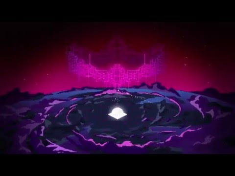
Hyper Light Drifter has a distinctive look, and that look has so much to do with its pixels. Fine details are offset by moody colors blending into each other. Shadows meld, characters stand out. And scales give you a measurable scale for a character, so when you see something towering in the distance laden in fine pixel detail, you understand the difference.
Every screenshot may seem hand-crafted, but in motion, Hyper Light Drifter feels alive. Pixels are incredibly good at reminding you that you're playing a video game—that each little brick of color is being run through a computer. Hyper Light Drifter feels like fighting a computer that's fighting you, emphasized by the continued deterioration of the protagonist.
It has impeccable action and a wonderful world, but the art and style makes Hyper Light Drifter click together. It's hard to imagine Hyper Light Drifter without the moody, tech-grime pixel art. —Eric Van Allen
Owlboy (2016, PC, PlayStation 4, Xbox One, Switch)
The result of 10 years of work, Owlboy's pixel art aesthetic helped it never look dated throughout all that time. Pixel art has a stuck-in-time quality to it that, rather than dating something, can help it resist the weathering process of continual improvements in rendering and quality.
Owlboy lands that timeless aspect so well. Its world is wonderful and imaginative, portraying a sky-high adventure with technology and nature, but never feeling dated or out-of-place. Characters each have their own style. The hero of the story, Owlboy himself, has incredible wing animations to really drive the feeling of flight home.
What always strikes me about Owlboy's look is the clouds. Backgrounds in pixel art games are usually an unsung highlight, but few so much as those in Owlboy. Rather than simple white puffs of wispy moisture, they form natural shapes and shades in the background. I was terrible at Atmospheric Sciences, but I feel a better meteorologist than myself could analyze and forecast the weather from those clouds. —Eric Van Allen
Sonic Mania (2017, PC, PlayStation 4, Xbox One, Switch)
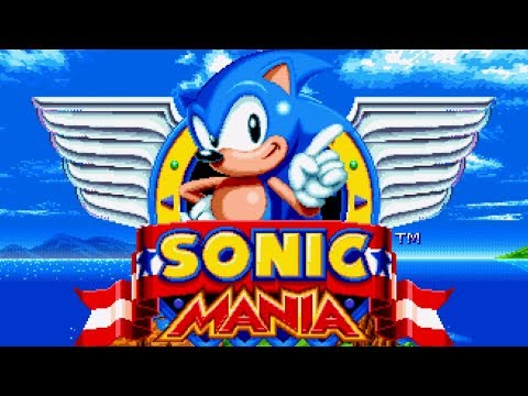
Imitating the art of Sonic the Hedgehog has been done several times over, from fan-games and mods to spiritual successors. But with Sonic Mania, the makers of those fan games were put in the lead for a full-on Sonic throwback. And they absolutely nailed it.
Each of the areas in Sonic Mania feels like it could be ripped straight from the originals, yet they have a crispness and added flair that makes it its own. Oftentimes, when a remake or revival nails a certain aesthetic, you'll hear someone say that it "looks the way you remember it looking." Oftentimes I groan at that, but with Sonic Mania, it looks better.
The new zones and reworked look of Sonic and friends feel like a fresh coat of paint on a classic. Every toe-tapping impatient hedgehog animation is both nostalgic and still surprising. New Sonic games have high standards, even more so when they're calling back to the roots where so many diehard Sonic fans' love grew out from. Sonic Mania doesn't just look like a good Sonic imitation; it looks like a good Sonic game. —Eric Van Allen
