The Making of Shovel Knight: Specter of Torment, Part 4: The Subtle Art of Backgrounds
In the penultimate entry, Yacht Club Games talks about the small but important details that can make the difference in a level.
This article first appeared on USgamer, a partner publication of VG247. Some content, such as this article, has been migrated to VG247 for posterity after USgamer's closure - but it has not been edited or further vetted by the VG247 team.
Editor's Note: This is a guest post from Yacht Club Games. We're running it here as it provides a unique glimpse into how games are made. You can find Part 3 here.
Finalizing a level requires that it be considered in every way. To make sure that we didn't forget anything, we'll take "passes" at the whole level, and then the whole game, with a specific element in mind. Pickups like Health, Gems, Darkness, and Red Skulls all got thorough passes to make sure they were balanced, but there are some less obvious considerations too!
Blocker Pass
Some of the work we do on our levels isn't just hard to discern, it's straight-up invisible! Take a look at the following room. It's clear that you're intended to head to the right and climb the ladder up, but:
If you find a way to try and climb up the open ceiling on the left, you can't get up there. Why not?
Here's why. See the rectangles in the screenshot of our level design tool above? We call those big red rectangles 'blockers' and they act as a collision ceiling that only turns on when you're in the adjacent room. The player normally only triggers an upward moving room transition by climbing a ladder, so getting out and above the room another way would create many problematic situations. We place these blockers throughout all the levels to prevent the player from accidentally breaking outside the bounds of the room.
If we zoom the camera out, you can see what's actually going on when Specter Knight attempts to climb up there. He hits a big invisible ceiling!

Delicately applying blockers to hundreds of rooms throughout the game takes tons of time, and hopefully, if done right, no one will ever notice!
Custom Properties
Shovel Knight enemies generally respawn when you scroll them back on-screen, but sometimes we need to override that behavior.
Watch Specter Knight after he defeats this Cogslotter. Since the enemy is positioned so close to the edge of the screen, if you re-enter the room you'll slam right into them, taking damage unfairly!

Back in our level tool, we have to set that Cogslotter's SPAWNTYPE to SINGLE_KILL, so that they won't respawn after you defeat them.
All sorts of game elements get small, fine-tuned adjustments like this! Even in the same room you can notice a few of them—the Cogslotter on the left is set to patrol left and right, while the one on the right is set to stand in place. The conveyor belt and extending bridge have their own custom speeds and timing as well. No facet of the game, no matter how small, should go unconsidered!
Of course, we don't want every enemy to have a million unique properties—they should behave predictably, so the player can actually learn what they're gonna do. So we try to keep changes like these to a minimum.
Speedrunner Pass
In this pass, we make the game more frictionless for players trying to clear the game as fast as possible. This means that we try to position everything so fast players won't have to wait.
Pay close attention to the moving platform and the swinging lantern in these rooms. As soon as you enter the room, they're always positioned in the ideal spot, so you can tackle the rooms at full-speed! Any game element with timing could potentially be set up this way.
Sometimes it can be hard to tell how we should calibrate this stuff. Should the platforms be synced for a blink-slashing, rail-mail Specter Knight, or for vanilla Specter Knight? What speed-increasing armors and curios do we think a speedrunner would have equipped at this point in the game? It's impossible to tell what routes and strategies clever players will eventually discover, so all we can do is speedrun the game ourselves a bunch, invite speedrunners to play test the game, and do our best to accommodate.
Background Art Pass
Now that our level layouts are mostly final, we can turn our attention to the background art. In addition to just lookin' pretty, background art can be used to reinforce gameplay ideas in many different ways.
Directly Conveying Gameplay Information
Most critically, the background art can directly convey gameplay information. With few exceptions, the moving platforms in Shovel Knight all have tracks drawn into the background, so you can see exactly where they'll go at a glance.
Or for another example, consider the background art around our bottomless pits. Typically the background fades to black right above one, letting you see the difference between certain death versus safely falling into another room. But there's less obvious ways we use the art, too.
Indirectly Conveying Gameplay Information

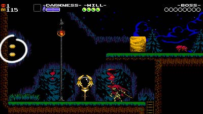
Background art does a lot to draw your eye to certain elements of the room! Sometimes we'll literally even "circle" platforms or objects we want you to see, like these gems on the left.
Background art can also create contrast between objects on screen. The red in these lanterns blends into the red in our twilit background, so the gameplay was instead staged against a dark black cave, drastically improving readability.
Background art can even subtly reinforce gameplay concepts! The two trees in the background here are being used to suggest the extents of the Beeto's patrol range. It's something that you'd probably never notice while playing the game normally, but it helps anchor the background to the gameplay a bit.

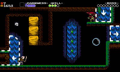
Here, the waterfalls are being used to suggest the presence of a secret room on the left. On the right side of the room, the main entrance and exit have waterfalls behind them, so having a waterfall on the left edge of the room suggests that the level continues that way as well. Again, the foreground here is what you're really paying attention to - the X mark in the wall should be a dead giveaway—but the background helps reinforce the gameplay that's already happening in the foreground.
The same waterfall tiles are being used here to separate this room into two sections - danger and safety. Throughout the room, you're diving down in front of the waterfall in moments of danger and rising up above it in moments of safety. It connects the feeling of the gameplay to the environment around it. Without that waterfall it'd still be a fine room, but you'd lose the feeling of pushing up against the current and climbing out triumphantly.
In this room, the shape of the cave itself is being used to break up the player's actions and suggest how to navigate the room. The things you need to Dash Slash are 'circled' by the cave's arches to highlight them, but also lined up with the waterfalls below to better convey the distance between them. The areas of the room where Specter Knight needs to descend after a Dash Slash are set in front of long, vertical cave pillars that line up with your path. Hopefully, this guides the player in subconscious ways. We love crafting patterns like this all throughout the game, but they should never look contrived!
If done right, none of this stuff should jump out at you while you're playing. It should just look like a cave! ...Or a forest! But like anything else in the game, the art can be improved if it serves the gameplay in some way. It's fun when there's a reason for the way everything looks!
Telling a Story
Finally, we try to use the stage's art to tell a story. Consider the first room in the game:
For our opening shot, we see the Tower of Fate standing tall in-between the trees on the right side of the screen. Then as the player moves to the right, the tower becomes more obscured by trees and caves. The tower gets out of the way of the composition so that the player can focus on the foreground as they learn Specter Knight's wall-climbing mechanics for the first time. Once the player transitions into the last screen, the tower comes back into view, lining up perfectly with the cliffs on either side, beckoning you from the horizon.
Without saying a word, and without disrupting the gameplay, the background is being used to suggest a journey and a destination to the player. Details like this are the key to making each level feel like a real place, and not merely 26 rooms of videogame in a row.
Screen Shake Pass
Plenty of enemies, items, and effects in Shovel Knight cause the screen to shake violently. Therefore, the art in each room of the game needs a tile of buffer space that continues off-screen. Here you can see one spot in the Stranded Ship that has not been extended - see how the rocky cavern wall toward the top of the screen stops abruptly offscreen? Each screen must be checked and fixed!
3D Pass
Since the Shovel Knights series is available on the Nintendo 3DS, all the levels need to support stereoscopic 3D! Honestly, we could write a whole new article on this topic, but for now you'll have to make do with a glimpse!
Each layer of art has a 3D depth value assigned to it. This determines how far back in 3D it appears when viewed on the 3DS screen. This is a bit hard to demonstrate on a 2D screen... but this gif should hopefully get the idea across—Specter Knight and Black Knight are anchored to the front of the display, but the background layers recede further into the screen like a diorama!
The first step of the 3D pass is getting all these depth values looking pleasing. Our playfield layer containing all our characters and enemies and collision is always set to a depth of 0, or no depth. This lets you always see all the action, even if your eyes are outside the 3D viewing angle. Our furthest background layer—in this case, the clouds—gets set to 25, and the rest of our layers land somewhere in-between.
We'll often use the 3D as an extra little flourish on existing backgrounds. At first glance the bubbles here seem attached to the same layer as the glass containers holding them, but in 3D they're actually set further back, giving the whole scene a bit more depth. These little details lie hidden throughout all of our stages, and can only be seen on the 3DS!
After assigning an appropriate depth to all of our layers, we have to revisit all of our background art one more time. When we develop the room in 2D, everything may look fine...
But when you play it on the 3DS, the added depth reveals missing art. You can see the pink sky poking through from behind the mountains and airship. These spots are normally obscured by the walls of the room in 2D, but there's nowhere to hide in 3D!
So back in our level tool, we add art underneath all the walls in the game. Unless you're playing on 3DS, you'll never even see these tiles.
Most often, you can only see these sorts of small errors with just your left eye or right eye on the 3DS itself, so doing a 3D pass can be a real headache... literally! But in the end, it's well worth the effort. Even today, there's no better feeling than seeing our stage designs magically spring to life in 3D!
Pass it On
Going over the levels repeatedly in passes helps tremendously with cohesion. After this level of scrutiny, a level should feel like it fits in with the rest, and the game is communicating its messages to the player in a totally consistent way. And as designers, through sheer force of repetition, we'll likely have the entirety of each stage committed to memory. But before we can dump our brain's RAM and be done, we need to apply the final polish—one last examination of the game that uses our Secret Techniques!
