20 Video Game Starting Screens That Left A Fantastic First Impression
From The Last of Us to Mega Man 2, these are our favorite title screens in video games.
This article first appeared on USgamer, a partner publication of VG247. Some content, such as this article, has been migrated to VG247 for posterity after USgamer's closure - but it has not been edited or further vetted by the VG247 team.
There are a lot of things that stick out to us in games. Maybe the UI is pleasant; maybe the music is phenomenal. Maybe there is architecture that is memorable, or maybe it's just a map that we love. When it comes to first impressions though, games have but one shot: the start screen.
The start screen can be dynamic. It can be completely still. It can have sweeping, emotional music, or it can be near dead silent. All that matters is the start screen can be impactful, and set the tone for what's to come in the game itself. In dreaming up listicles, title screens were one of the first things to jump into my mind. There are so many, I thought, maybe too many to honor in one measly list.
I digress, I tried anyhow. I sifted through the oldies but goodies, the new kids on the block; I figured out which individual entry in a popular series should get a nod, and why. I asked my coworkers here at USgamer if they had any suggestions, and discovered new appealing start screens through them. Thus the following are, in my eyes, the best start screens in video games.
20. Catherine
In forming this list, I considered the following: The design of the start screen, the mood it evokes, and how dynamic it is. Its music, while significant in setting the mood, isn't technically a criteria on this list. Catherine's start screen music, however, remains one of the best on this list.
It sets the tone somberly, even though the first image is Vincent, tied to a cube with barbed wire as Katherine sits atop it. Pressing start shifts to the next screen, wherein the story, multiplayer, and settings lie. Catherine sits atop the sign listing the options too. The music soon kicks into funky gear as sheep "baaaaah" in the background and Vincent, Katherine, and Catherine wait for us to just click something.
Catherine: Full Body, the current generation remaster with new content, twists the familiar start screen a touch too much for my liking, though it remains just as dynamic. Katherine, Catherine, and the new Qatherine all switch into the focus depending on the variant you get. The new music isn't as memorable either. No mind though: The original Catherine still exists, and reigns supreme.
19. Kingdom Hearts
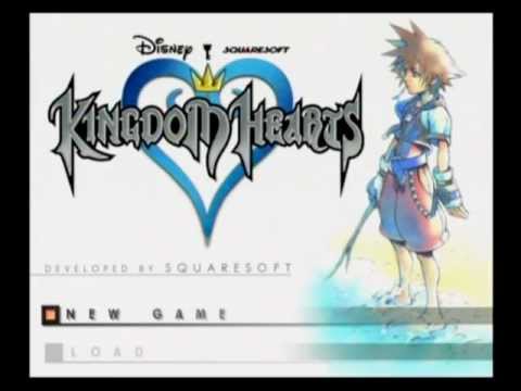
To me, no starting screen is more memorable than the still one for Kingdom Hearts. It's just Sora, twig in hand, probably on Destiny Islands somewhere, with no idea of the adventure that awaits him. The Kingdom Hearts logo is in the upper left corner. The font work is very PlayStation 2 RPG-era. The title music, "Dearly Beloved," remains iconic to this day.
The start screen is so perfect that every Kingdom Hearts game since has sought to capture its simplicity. Even 2019's Kingdom Hearts 3 shares its format: watercolor illustration on the right, menu on the left, logo in the corner. It may be a very still start screen, but when it comes to RPGs, it's easily one of the best.
18. Thumper
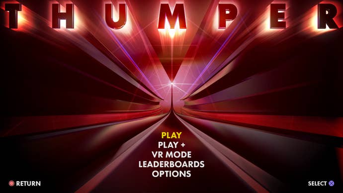
I don't remember the sound of Thumper, but I remember the feeling of it. How the hum of its rails shook my core; how visceral, and I mean that in the most non-buzzword-y way possible, hooking a turn felt. Visually, it's all a blur, but I remember that title screen.
The title screen is the calm before the storm. The music is soothing, compared to the violence that saturates it as you play. The road has no turns. It only veers onward; straight. When the title, Thumper in all-caps, comes into focus, it is never steady. It always shakes. Thumper is a game full of style, and has had the rhythm game fans arguing over its merits for years—can it really be a rhythm game if there's no traditional music to tap your toes to? Who knows. What's clearest to me is that its title screen, years later, stands tall as one of the best.
17. Vib-Ribbon
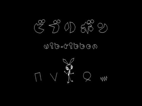
Is there a more chipper opening screen and animation than Vib-Ribbon? I doubt it. The white vector-lined PlayStation rhythm game opens with a mosaic wave of lines and shapes, before parting to reveal its mascot: Vibri the bunny. The melody bounces just as much as Vibri, as does the title, which appears in both Japanese and English. The start screen menu then forms, giving players an option to choose their language of choice, as Vibri and the title itself dances in a circle. Simple, but fun.
16. The Witcher 3: Wild Hunt
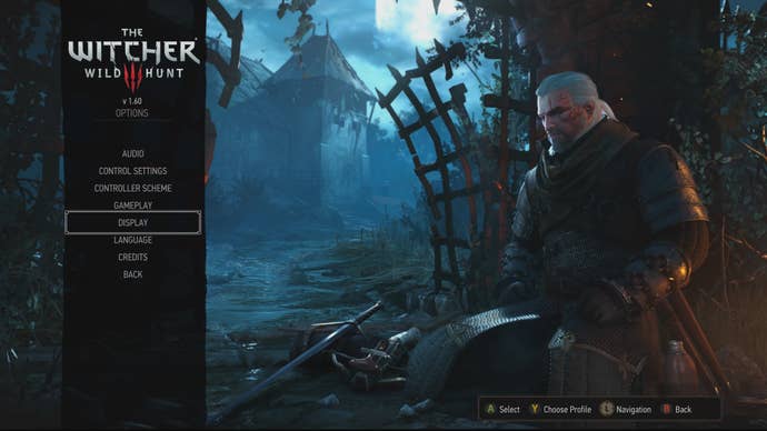
Sometimes, a man's gotta rest. And so he does on the start screen for The Witcher 3: Wild Hunt. Geralt sits, there, resting. Meditating. Recuperating from whatever brawl or hunt he's just returned from. It's the sort of start screen that would be great as a dynamic theme on PlayStation 4, too. It's a beautiful start screen in how it displays the vast countryside of The Witcher 3's continents. When I think of the best start screens of this generation of consoles, The Witcher 3's is one of the first to spring to mind.
15. Super Metroid
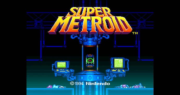
That title. There is no denying how memorable the title work for Super Metroid is. Debuting on the SNES, Super Metroid's bright colors and large sprites stood out in the action-adventure realm of video games. That translated to its start screen too. The eerie vibe for a Nintendo game, with a mysterious body on the floor. Computers, hooked up to a Metroid. In 1994, Super Metroid's start screen was cool, and it remains cool to this day.
14. Super Mario All-Stars
When compiling this list, I signaled my team in Slack. What am I missing, I asked. Our brave Editor-in-Chief stood on her chair (I assume) and loudly proclaimed (read: typed) Super Mario All-Stars. Why? "I always liked how it starts with the lights off and everyone chatting, and then when you hit start the lights go on, you see various Mario characters all just chilling." Case closed, enough said. When it comes to the Mario series' dozens of memorable starting screens, All-Stars finds a way to stand out in the crowd.
13. The Last of Us
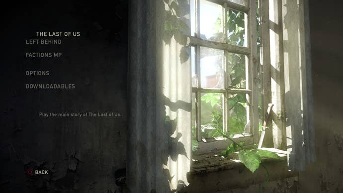
Another element that I love about starting screens is when they change when the game is finished. Portal does it. Fire Emblem: Three Houses does it. Xenoblade Chronicles does it. My favorite example of this comes in Naughty Dog's The Last of Us. As composer Gustavo Santaolalla's soft guitar plays, a nondescript window via a decrepit house is the simple title screen.
And—minor spoiler alert—once The Last of Us wraps, the windowsill has a new object stuck in it: Ellie's knife. It's a simple touch, but it's always been one that sticks out in my mind. I don't recall a lot of triple-A starting screens, to be perfectly honest, but I remember The Last of Us' twist on it quite clearly.
12. Hotline Miami
Hotline Miami is a game that oozes gore and style, but only half of that comes across in its menu screen, which ebbs and flows with the quiet, lo-fi melody of a song. It gives off a dreamy atmosphere immediately. Once you load into the game, the vibe of the main menu feels like it's the opposite of Hotline Miami itself—which is Miami-drenched, Art Basel-fied aesthetics through and through, with the frenetic electronic beats to match. In its trippy start screen, Hotline Miami's start screen takes pause.
11. Persona 5
There is already an Atlus game from the same creators on this list, but the folks there are so stylish when it comes to their work, that Persona 5 can frankly not be ignored. Bar none, Persona 5 has the most pizzazz in terms of its UI compared to anything else on this list, and that tracks to its start screen menu. Loitering in a subway station, the Phantom Thieves' bright red silhouettes and white masks stand strong against the landscape.
Toggling between options, from New Game to Load Game, shifts the camera around the train platform to pivot to a new angle, spotlighting a different character. Maybe it hooks on Ryuji leaning against a rail, or a dutch angle of the whole crew. All of Persona 5's menus standout just as much, but in the title screen, it sets the stage excellently for what to expect.
10. The Legend of Zelda
A lot of The Legend of Zelda games could qualify for this list, but the title screen that resonates as the most memorable is, well, the first one. Despite living on NES, the start screen had a lot going on. An animated waterfall; a flashing logo. Hitting start makes everything go dark, as if night has suddenly fallen, and an introductory story crawl kicks off the game—not quite Star Wars style, but nearly.
The Legend of Zelda series has always had memorable start screens. Breath of the Wild had beautiful illustrations for its own. Wind Waker showed Outset Island in all its glory. Ocarina of Time is maybe the one that deserves to be roped in closest to the original game, which has Link on the back of Epona, galloping across Hyrule. It all comes down to The Legend of Zelda's slight tease of a beautiful adventure, even with it subsisting on now-archaic hardware.
9. Flower
Thatgamecompany make beautiful games. In Flower, we direct a gust of wind carrying flower petals. In the start menu though, the game seems like it might be anything but. Instead, we're in a kitchen in a city, hearing the hustle and bustle of the streets outside. At the start of the game, the title screen is drab and sad, with a dead potted flower at the forefront. By its end, the kitchen is alive with potted flowers and color, no longer desaturated. Flower's title screen stands out because it shows that not only are we bringing the game's environments we float across to life, we're, in a way, revitalizing our own domesticated lives with beauty too.
8. Pokemon Gold and Silver
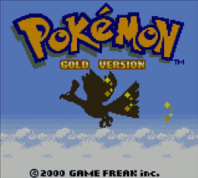
Who's that Pokemon? Pokemon Gold and Silver feature Ho-Oh and Lugia on the game covers themselves, respectively. On each's title screen, you can see silhouettes of the legendary Pokemon flying over the Johto region, with each reflecting their respective style—Silver's is at night, and darker, while Gold's is during the daytime, atop fluffy white clouds Its image of Ho-oh soaring above Johto reads as a nod to a famous scene from the first episode of the anime, in which Ash sees a mysterious legendary Pokemon soaring overhead. When it comes to Pokemon start screens, Pokemon Gold and Silver are the best of the best.
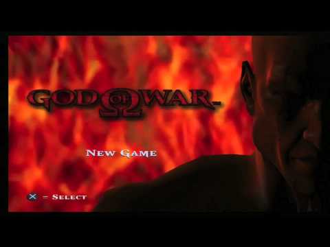
7. God of War (2005)
I remember the first God of War's title screen clearly. Just Kratos' face, huffin' and puffin' as he waits for us to kick off the journey. And then how the fire-y backdrop of the title screen fades away upon hitting start for the first time, with Kratos proclaiming in a very extra fashion, "The gods of Olympus have abandoned me." God of War still exudes bro-energy—so much so that 2018's God of War did a much-needed course correction for the series into sad dad prestige game territory—but that first game's title screen? Undeniably great.
6. Mega Man 2
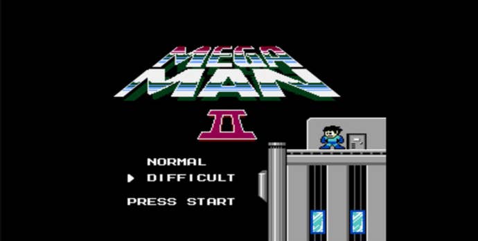
When I asked my colleagues for suggestions for this list, one game was suggested more times than one: Mega Man 2. Watching the opening on YouTube—my apologies—it's easy to see why it sticks out in so many of my coworkers' minds. Treated to a story crawl catching players up to the events of Mega Man 1, Mega Man 2's opening screen scrolls up a tall skyscraper, before pausing on a helmet-less Mega Man on the roof, hair blowing in the wind. In 1988, Mega Man 2's title screen was more cinematic than pretty much any other game on the market.
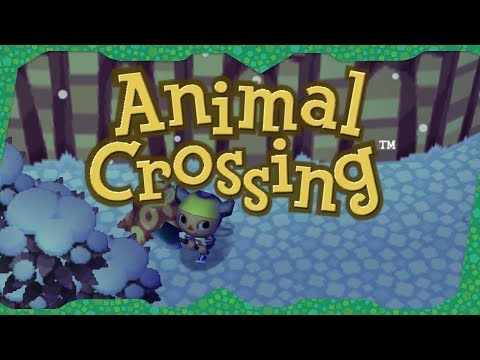
5. Animal Crossing
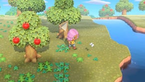
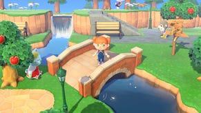
Animal Crossing's title screens offer us a true window into its world. Not a literal window, like in the aforementioned The Last of Us' title screen, but a window-window. Pioneered by the first Animal Crossing game, the title screen drifts across the town, following the villagers that live there. At first, it was our characters. Later, it pivoted to the animals that lived alongside us. Maybe Bianca's going for a stroll. Or in the case of Animal Crossing: New Horizons, maybe someone like Raymond is taking a nap underneath a tree.
The Animal Crossing title screen is nice because it delivers on the game's core conceit: It's always playing, even without us. Our neighbors are always going about their business, even if we aren't talking to them and giving them gifts.
4. Super Mario World 2: Yoshi's Island
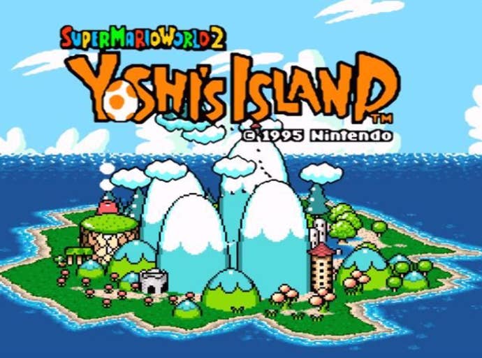
Of all the Mario games, Yoshi's Island may have the best art style. The coloring book-like aesthetic matches the cuteness of baby Mario and big Yoshi on their journey. On the start screen especially, the more buoyant, colorful art style is on full display. The camera swirls around the charming island. The title, with a cute Yoshi egg in its logo for an "o," waves in motion. In Mario history, there is no start screen that eclipses that of Yoshi's Island.
3. Sonic the Hedgehog 2
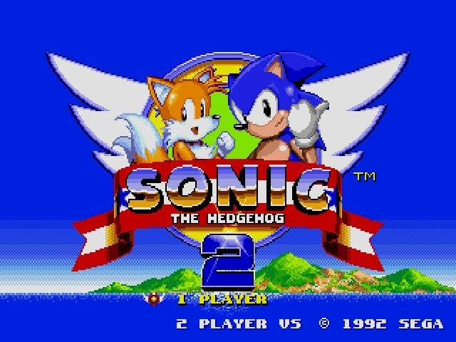
Pretty much any classic Sonic title screen deserves a nod on this list, but for me, Sonic the Hedgehog 2 is a finger wag above the rest. In Sonic 2's press start screen, Sonic isn't alone anymore: He's joined by Tails. When it comes to 1990s sprite art, I always admired Sega's work over most others. Heck, 2017's Sonic Mania is basically one big unabashed ode to early Sonic games' animations-right down to its own charming title screen.
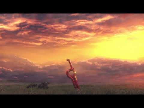
2. Xenoblade Chronicles
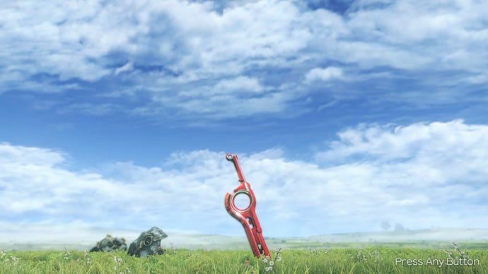
When it comes to iconic images in RPGs, the title screen of Xenoblade Chronicles is one of the many. It's of the Monado, the mystical, mysterious sword the story of Shulk swirls around, stuck in a field. Time passes around it. Sometimes it's night. Sometimes it's day. In the background, the shell of a god looms. It communicates quite a bit about the world of Xenoblade Chronicles, without having to do much. It shows the wide open landscape—and those landscapes are big It shows the sword in centered focus, begging the question of what is this sword? Why is it significant? Where did it come from?
After wrapping the game, the title screen changes to focus instead on the party of characters you've met along the way. It's a nice touch, effectively saying, "Hey, it wasn't about the destination. It was about who we met along the way," in a very cliched manner. Xenoblade Chronicles, for this reason, easily has one of the best start screens ever.
1. Final Fantasy 7
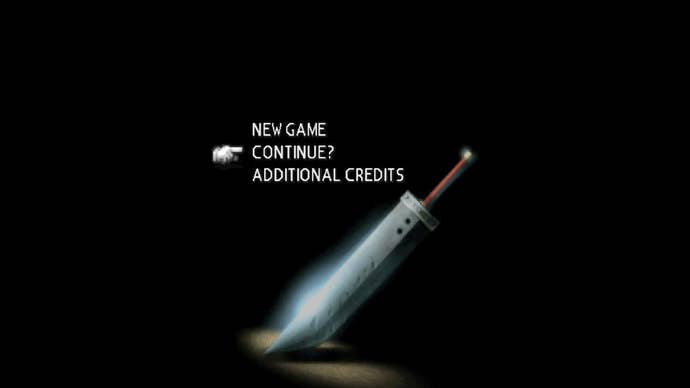
What can I say? I love a big sword, I guess. A while ago when I embarked on an ill-fated replay of Final Fantasy 7 ahead of Final Fantasy 7 Remake (I only got 10 hours in before never looking back), I tweeted about how perfect Final Fantasy 7's start screen still is. Final Fantasy 7 Remake even copies it, in ultra-HD of course. It's just a black landscape, and then the Buster Sword, with a dramatic shadow accentuating it. It is simple. It is elegant. And even if the polygons that built it have aged, its power hasn't.
It is, to me, the best start screen there is. I even forgive Square for the god awful fontwork in the opening credits that look like it was plucked from a hole in the wall tattoo's flash sheet. But I digress: Square nailed it where it counts. The start screen sets the tone for what's to come in Final Fantasy 7 over its many, many discs. And that's why Final Fantasy 7 is at the top of this list.




.jpg?width=291&height=164&fit=crop&quality=80&format=jpg&auto=webp)
.jpg?width=291&height=164&fit=crop&quality=80&format=jpg&auto=webp)
.jpg?width=291&height=164&fit=crop&quality=80&format=jpg&auto=webp)