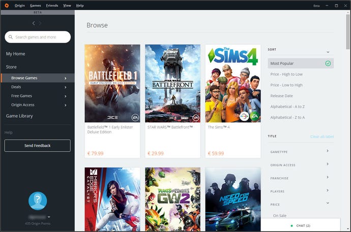
Your EA Origin client is about to look a whole lot better
The Origin client's dated UI is getting a big update.
EA is currently testing a complete UI redesign for its Origin client on PC. The new changes are available to those who opt-in Origin's beta programme.
NeoGAF member SmartWaffles has received the update, and decided to take a couple of screenshots of the thing, and it looks a lot better than it does now.
As you can see in the gallery below, the design is now based almost entirely on tiles, a bit similar to the Xbox One design but definitely less complex.
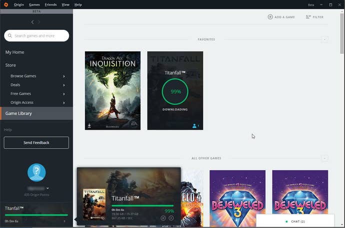

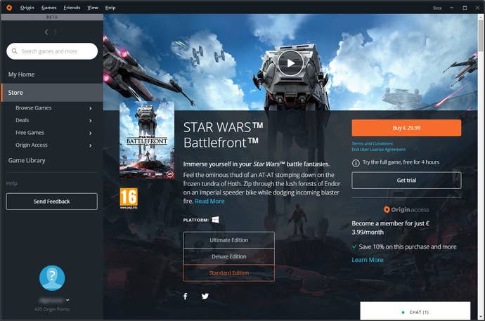
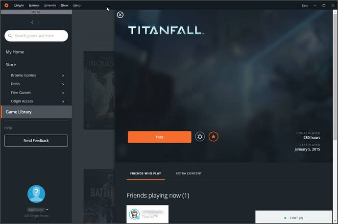
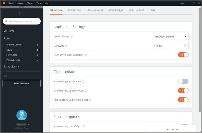
The chat/friends list button have been moved to the bottom, and it presumably still opens a separate window. The game library part has also been reorganised, and you can now see very clearly when a game is downloading or updating, and if you have any friends currently playing - right on the tile.
The store has been better integrated into the app, and now shows the list of available games much better, building on the same design changes in the library section.
If you want to get the update now, make sure you've opted-into Origin beta releases from the client's options menu, and restart it once you've made the change.
