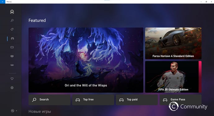
Xbox Store gets neat redesign in leaked screenshots
Microsoft is seemingly getting closer to revamping the Xbox Store.
An entirely new UI for the Xbox Store has leaked in a number of screenshots and videos. This is how the store is going to look on Xbox One, at least, at some point in the near future.
The design of the store is inspired by the Xbox app on PC, itself part of Microsoft's new Fluent Design mantra. Store navigating can now be found on the left side, with the main page entirely dedicated to information about game, including highlighting what is/isn't on Game Pass.
The project, codenamed Mercury, could be arrive as part of a wider update to the Xbox dashboard.
The original leak came from @wincommunity, but Thurrott's Brad Sams managed to get it working and gave us a look at it in a new video. This is an in-development build loaded up on PC, so keep in mind that some things could change.

