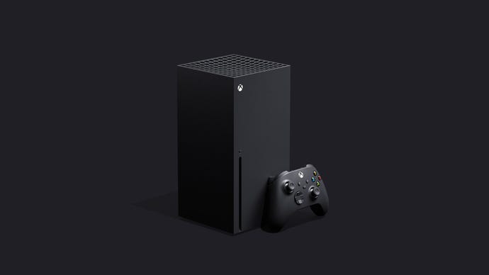
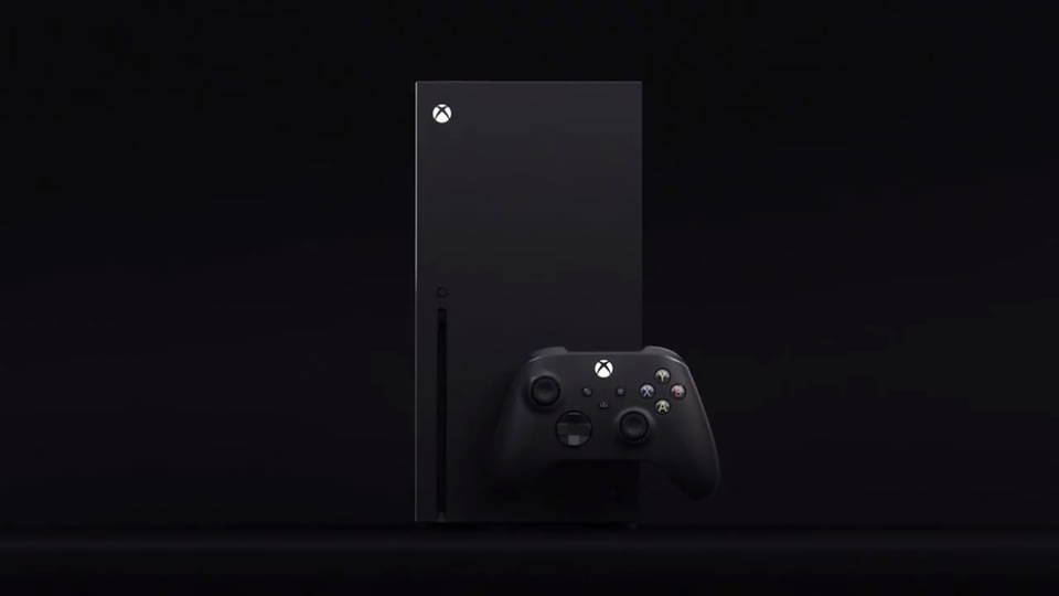
Xbox Series X is Microsoft's best-looking and most striking console design yet
So. Here we go. The race is on; a next generation console has been formally revealed. The Xbox Series X is Microsoft's latest attempt to become the dominant force in gaming hardware, and as well as learning the real name for the system formerly known as Project Scarlett, we also got to see what it looks like.
It's a basic black box - but I love it. My first thought from looking at it is that this boxy, unusually-shaped device that sort of resembles a scaled-down version of a PC tower probably won't fit into my current entertainment setup (even when placed on its side, which it can be, this thing appears to be even taller than an original Xbox One) - but I'm actually sort of into it regardless. It's got something the Xbox One designs didn't have - oodles of personality. Sometimes, less is more. Even if that less involves being a bit big, which this machine clearly is.
Let's be fair - the outward design of a console doesn't really matter in the end. The guts are what matter, the specs and components that ultimately power the games, which of course matter even more. But with that said... everybody wants something good looking and cool under their TV. Nobody wants an eyesore.
When I think back to that god awful original Xbox One design, with a huge unsightly exhaust grille and an unnecessary dust-magnet gloss finish, I shudder. A horrible machine. Things got better later on, with the Xbox One X and S, but in shape and style these machines still followed in line with what had come before. The original Xbox 360 is iconic, but that silly concave design was never quite right, and was only perfected with the Xbox 360 S. The brutal design of the heaving black box that was the original Xbox was okay, but was also not lucky enough to see a refining revision.
At first glance then, and with the caveat of only having seen it through carefully curated promotional images rather than in-person, the Xbox Series X is probably the first time Microsoft has nailed a console design on the first run. It just looks cool. It's a shape that might prove slightly awkward for those with thin-shelved entertainment units designed to only hold identical-looking slim set-top box style devices - but that is also what makes it stand out. It doesn't look like your DVR or your cable box as its predecessors did.
Its potentially awkward dimensions almost stand to send a message, as if to say 'This is an important, powerful device. If there isn't room, make room.' That seems to fit in with the messaging around the device in general, that it'll be the fastest and most powerful thing on the market - but of course we've yet to see what Sony's PlayStation has to say about that.
It won't be for everyone. People more strictly practical than I will probably be mad if the dimensions are as unconventional as they look. Microsoft is yet to release exact measurements. Some will find its minimalist take a bore. Others will undoubtedly take the p**s out of it for looking like a tiny PC tower, but honestly, why? Let's not delude ourselves - all these new machines are PCs under the hood anyway. There's a refreshing honesty to this resembling one.
So, whatever - but if this can stand out among your entertainment devices and have a design that says something about the vision behind the machine, more power to its designers. You can lay the machine flat, Microsoft has confirmed, though the striking nature of this minimalist design is surely at its best when the machine is standing upright, pumping air out through the single massive, practical fan on top. Its simple matte black design also seems like the sort of thing that could look striking and awesome in an array of colors. This is probably the first console design since the GameCube I've been keen to see in wildly different colors.
The design obviously owes something to 2001: A Space Odyssey's Monolith, an enormous black slab with untold power. That's the next hurdle for the Xbox team, of course. The machine looks great, but now the challenge is to get the specifications and the games to a place where it can stand toe-to-toe with PC and whatever PlayStation is cooking up. But in terms of its visual design for my money Microsoft has a winner on its hands - and that makes me even more excited to learn more and also to see what PlayStation fires back with.


