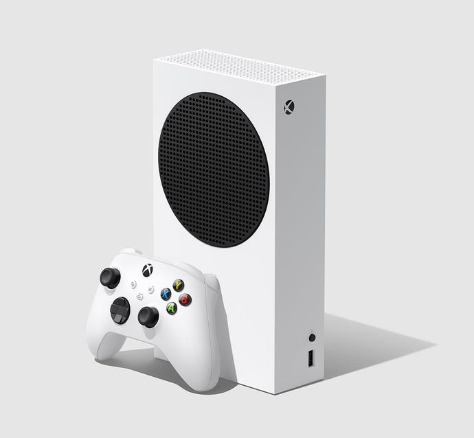
The Xbox Series S could have had a very different look
Microsoft's entry-level, next-gen console – the Xbox Series S – could have had a very different look, a new image has revealed.
The new generation of Xbox consoles has a pretty strong image: nice, clean rectangles that'll fit nicely on your TV unit, bookshelf, or wherever else you're planning to keep it.
Alongside the bulkier Xbox Series X, the smaller Series S looks quite compact, offset against the bigger unit with a smart monochrome finish.
But the Xbox Series S wasn't always going to look this way. In a Medium interview with some of the design staff behind the hardware, Microsoft staffers give some insight into how the final shape formed – and showed off some prototype designs (below).
That big circle we see incorporated into the final design seems to have always been a feature of the console – it's present on practically every unit we can see in the picture.
The final design, which has seen a fair amount of praise on social media, has been created to fit easily in your house – no matter where you're thinking of placing it.
"When we visited gamer homes, device placement (whether it was displayed or hidden) and furniture orientation informed all of our design choices," senior design director Nicolas Denhez explained.
And it appears Xbox learned from the original reveal of the Xbox One, too. “We wanted their gut reaction to whether the silhouette piqued their interest. What we didn’t want to hear is ‘that looks like a microwave,’” principal designer Chris Kujawski jokes.
It's pretty interesting to see the process that goes into hardware like this, and what Microsoft has to keep in mind before the big unveiling.
The Xbox Series X and the Series S are currently available to pre-order, and will launch on November 10. Demand for the consoles so far has been "record-breaking".


