Wii U playtest: Miyamoto's gun is shooting blanks
Now Nintendo has made Wii U's final pre-launch pitch to the west, Alex Donaldson took the hardware to E3's firing range last week. The conclusion? Iwata better start investing in some hollow points.
We're a matter of months until launch. Wii U is a powerful weapon, a gun who's firepower could change the industry's course as much as the Wii and DS did, but it has no ammunition. The software isn’t there. It’s shooting blanks.
After two hours with every game in Wii U’s playable first- and third-party line-up at E3, I can say this: the console is a gun to the head of the industry.
The tablet is genius, comfortable, light and naturalistic, the interaction between it and the TV screen feeling unforced. The options it opens for multiplayer are plentiful, original and fun - but there’s a problem.
The gun isn’t loaded.
While Wii U is incredible hardware that feels as strange and brave as that weird little stick on the N64 controller, at the moment it's being let down by lacklustre software, mini-game collections and current-generation ports. Where the N64’s stick had Mario 64 to sell it, the Wii U screen currently has nothing I’d call a killer app.
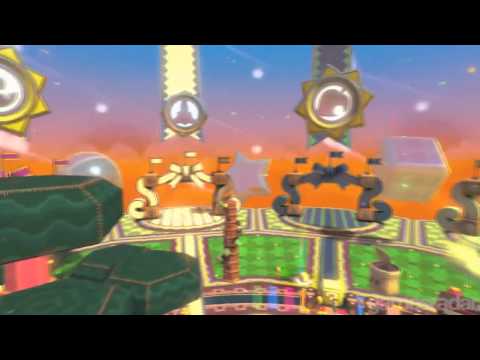
It only felt natural to begin my tour of Nintendo’s E3 showing with Nintendo Land, the press-conference-closing title which tries to simultaneously leverage Nintendo’s best-loved franchises and the atmosphere of Wii Sports or Wii Play.
It’s more like the latter than the former, though, and many of these demos are built up from the simple ‘experiences’ I played at E3 this time last year.
The hardcore faithful will be looking to Pikmin 3 for salvation through gameplay revolutions, but that too left me cold. Presented with two control schemes, one has you merely using the remote and nunchuk as in the Wii ports of the original GameCube titles. The gamepad, meanwhile, is relegated to a mere map.
If you choose to play with a gamepad-only scheme it plays more like the GC original. The controller's gyroscope is used for aiming the various types of Pikmin - feeling less accurate than the remote option. It's a disappointing use of the clever hardware.
The game itself feels a safe bet, mind. It's evolution over revolution, adding new rock Pikmin and promising twists on puzzles loved in the originals. If you wanted more Pikmin this is great news; it's just a shame the game isn't as brave as the machine it leads the charge on.
Takamaru’s Ninja Castle echoes the Ninja Star throwing mini-game from last year’s introductory trailer, for instance. It’s essentially a shooting gallery that sees you holding the Wii U Game Pad side-on and swiping your hand across the screen to send stars flying into the TV. It works well, but one wonders how much scope there is in this, especially given how much more tiring it is to rapid-fire by swiping a screen.
I’ll take a light gun with a trigger any day, and a comment made by a colleague as I played - "You’re going to need a screen protector for that thing" - made a little too much sense.
Luigi’s Haunted Mansion, meanwhile, has shades of Chase Mii from last year, one player having an advantage over the others via additional information shown on the Game Pad screen. It’s essentially Pac-Man with one invisible ghost and four vulnerable players. This was shown at the end of Nintendo's press conference.
It’s a fun multiplayer mode, but with only one variant of the map on show and Nintendo not talking the finer details, who can say how many times anyone will play it? Donkey Kong Crash Course, a tilt-based puzzle-platformer is similar, a fun and challenging experience with very narrow scope.
That story continues across all of the Nintendo Land mini-games on show. They do their job, working well as excellent five-minute demonstrations of exactly why the Wii U Game Pad is a compelling piece of kit that could revolutionize gaming, but none of them are what I’d call actual games. It’s a problem.
A title that appears spun-off from the WarioWare series offered one of the most fun demos at the show - and only required one controller for a five-player game. One player holds the Game Pad and commands a thief in a busy intersection full of NPCs. Everyone else looks at the TV - and tries to spot which character out of the many on screen is stealing apples.
For the thief it’s about remaining inconspicuous and blending in with the AI, grabbing apples at non-obvious moments. The rest must watch like hawks. When all the apples are stolen, the Game Pad is passed around to allow the other players to pick who they think the thief is. I got it right first time, making me a veritable Sherlock Holmes, but the demo itself was great fun and a perfect example of one-pad multiplayer.
Ifs and buts
Others left me disappointed, though. New Super Mario Bros U is a prettier version of a formula of which you’re already way too familiar. The awesome-looking LEGO City title looks like GTA for kids - a great idea - but most of the time only uses the tablet screen for basic map functionality.
For core players there’s Batman, mostly running well but with occasional optimization issues that will hopefully be fixed for launch. Ubisoft’s ZombiU looks to be one of the best titles at the show for Wii U, a shooter that plays well on the Game Pad and makes unique use of some of its features.
But every time I look at it I’m reminded of amazing Red Steel demos for Wii - and thus remain cautious.
Scribblenauts looks gorgeous in high definition, but I can't help wondering if anyone will pay full price for this seemingly definitive version of the game when they can get a very decent iOS version for a couple of quid.
In general the games look great - but by current generation standards. Nintendo’s colourful, bold art styles really pop in HD, but what happens in 12 months time when the true next generation arrives. Ifs and buts are the theme of the Wii U.
Most of the positive aspects of Wii U from the hardware itself. The Game Pad and machine look great in both black and white - though Nintendo wouldn’t confirm if both would be available at launch - and the Game Pad feels lighter, more comfortable and perhaps a little smaller than it did last year. It's clearly been improved.
I can’t emphasize enough how little you all need to panic about the Game Pad. I know at first sight it looks massive and unwieldy, but it isn’t. It’s light and comfortable to hold, and I could very happily use it to play through something more intense like a 40-hour RPG. Put those particular fears to rest.
The screenless ‘pro’ pad seems to indicate to me that Nintendo’s R&D department picked up a couple of Xbox 360 controllers - not a bad thing. It feels very similar, with button layout tweaks, and eased my worry that I would have to play the new Smash Bros with the Game Pad - as that’s a game I can’t see benefitting from it.
The smaller Nintendo-crafted demos from Nintendo Land make a compelling argument for how the Game Pad augments and improves existing game experiences, but Nintendo Land itself is not a solid product. Right now it feels an awful lot like a pack-in. I’m sold on the Game Pad based on the E3 offering, but the software simply isn’t there.
We're a matter of months until launch. Wii U is a powerful weapon, a gun who's firepower could change the industry's course as much as the Wii and DS did, but it has no ammunition. The software isn’t there. It’s shooting blanks.
I come out of E3 excited for Wii U but certain that Nintendo needs to step up and find system-selling software - and ideally before launch.


