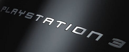
Why'd the PS3 Slim ditch the Spider-Man font? Kaz Hirai explains
To many, the PS3's Spider-Man font was like that gaudy tattoo you regret getting in college; sure, it was kinda cool at one point, but you were young and foolish, and Batman is way cooler than Spider-Man.
Fortunately, while you're covering your left shoulder in shame, Sony's starting anew. That is to say, the PS3 Slim is Spider-Man-logo-free. So, what happened to it? Kaz Hirai explained in an interview with Times Online.
"We wanted to make sure that we set a new direction for the PS3. The PS logo with the capital P and small S has always been our logo, has always been synonymous with video games and I wanted to reset the thinking. Also internally I wanted to send the message internally that we are resetting the thinking, going back to our roots," he said.
"What better way to do it than by resetting the logo? That puts the entire organisation on its toes. On a practical level, when you have PlayStation 3 spelt out, the aspect ratio was such that if you wanted it on a billboard it became tiny. It didn't work in terms of visibility."
So there you have it. Sorry Spidey, them's the breaks.

