Where Yoshi's New Island Misses the Mark
Yoshi's latest adventure scored highly with us, but it still disappointed on one level. Where do reviewers draw the line between fair criticism and personal expectations?
This article first appeared on USgamer, a partner publication of VG247. Some content, such as this article, has been migrated to VG247 for posterity after USgamer's closure - but it has not been edited or further vetted by the VG247 team.
"No, Yoshi's New Island may not be the game we fans of the original want, but it's definitely the game its creators set out to make. And a lot of fun, too. It's hard to be cynical about that."
So concluded the review Mike and I published yesterday about Yoshi's New Island. At 4 stars out of five, we definitely came in at the high end of the review scale for the game, though we certainly weren't outliers by any means. Yoshi's New Island clicked for some people and infuriated others – it may well be the most divisive game Nintendo has published in ages.
I've seen complaints that our review summary was meant as a preemptive "take that" to the negative reviews, but nothing could be further from the truth. Rather, I meant to capture my own ambivalence over the game. I get what Arzest and Nintendo were going for with Yoshi's New Island, and I think they more or less nailed it. On the other hand, in so slavishly imitating the original Yoshi's Island, they absolutely missed the mark on what I wanted the game to be. Still, during my time as a game reviewer, I've come to understand that reviewing games against some personal, subjective vision isn't particularly fair to the game or to readers, so I try not to do it. That doesn't mean I can't be disappointed on a personal level even when I recognize the inherent quality of a game, though.
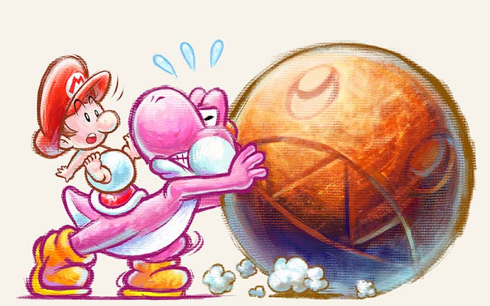
In Yoshi's New Island, we have case in point. Here is a game that takes content from a classic 16-bit action title, remixes it into entirely new level layouts, and paints it with a new coating of pastel fluffiness. Aside from some minor quibbles about fine details of control (mainly relevant when trying to fling an egg at the lowest angle of depression immediately upon bringing up the targeting reticule; a split-second's worth of input lag makes doing that unreasonably difficult), it plays exactly like Yoshi's Island. And that's a good thing: Yoshi's Island remains possibly my favorite Mario game ever. It offered wonderfully unique mechanics, giving Yoshi control and focusing on his (well, their) ability to produce and throw eggs. It creatively combined platformer and shooter, up to and incorporating an automatically recharging health system that would become the standard for first-person shooters a decade later. And of course it had its distinctive art style, a reactionary hand-drawn design meant to set the game apart from the cold prerendered look of Donkey Kong Country and its imitators.
The problem with Yoshi's New Island is... well, all those adjectives in the previous paragraph. "Unique." "Creative." "Distinctive." The original Yoshi's Island wasn't simply a great platformer, it was a game that set the genre on its side. It was a radically different approach to the format by the team that created the format with years of iterations on Donkey Kong and Super Mario Bros. Yoshi's Island lived to surprise players, beginning with the way it took the special add-on Super FX2 chip, a device intended to enhance 3D graphics, and used it to execute all kinds of fancy 2D graphical embellishments. It looked at the industry's move toward 3D visuals and prerendered assets and thumbed its nose at them. It observed more than a decade of steadfast Super Mario adventures and did everything differently. Yoshi's Island was deliberately contradictory. It was punk. It existed entirely to disrupt through innovation.
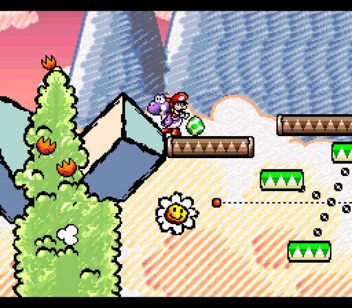
Yoshi's New Island, on the other hand, couldn't innovate its way out of a wet paper bag full of Flappy Bird clones. The anarchic glee of the original has been replaced with a gentle conservatism. It's a very well-made repackaging, but for those of us who hoped for something new in a sequel to a 20-year-old game that was all about bringing the new and the unexpected, the familiarity on display feels pretty disappointing. I can definitely understand where all the negative reviews for Yoshi's New Island come from, because there's a resentful little voice in my heart that demanded the same.
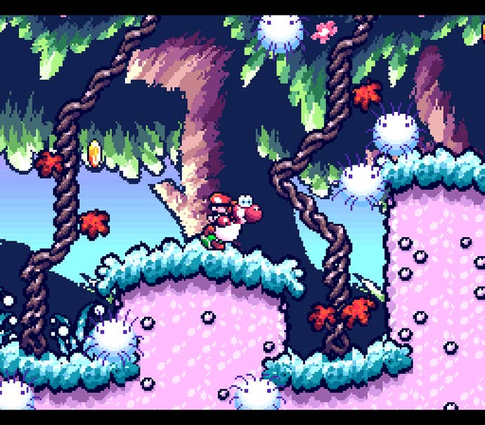
I complained in our Yoshi's New Island review that despite repackaging pretty much every element of the Super NES game, it completely skipped the infamous "Touch Fuzzy, Get Dizzy" stage...
...in which bumping into one of the floating puffballs drifting through the level causes Yoshi to succumb to a sort of hallucinogenic warping effect. But honestly, that's OK. The entire point of that stage was to goof around with the Super FX2 chip's capabilities, which is why that particular level was so compromised in the Game Boy Advance port (as it lacked the FX2 chip). In fact, much of what stood out about Yoshi's Island grabbed our attention because it took advantage of graphical capabilities no 2D platformer had enjoyed access to before. Nearly 20 years later, those once-revolutionary ideas are no big deal.
Yoshi's Island stood out because of the way its creators took such delight in pushing the limits of technology within the familiar framework of a 2D platformer. Shigeru Miyamoto's team used new graphical capabilities to fuel their creativity, designing challenges and situations that no other platformer had ever explored before. They broke new ground, and the manic invention on display in the game gave the impression that they had as much fun creating Yoshi's Island as we had playing it.
By comparison, you'll find none of that spirit in Yoshi's New Island. Here's the 3DS, a handheld platform utterly humbles the meager capabilities of the Super FX2 chip; it's a console that can almost literally be made to do anything with a 2D platformer. Infinite possibilities await an innovative mind... and all Arzest can think to do is color in the lines. Where's the imagination? Where's the delight in surprising players? Where are the radical new ideas and unexpected new twists on 2D platforming?
Yoshi's Island gave us a vitally important message back in 1995: Technology didn't have to obviate classic game formats. It could just as easily liberate them, suffuse them with new life. While publications like Next Generation were sniffing with disdain at anything limited to two dimensions, Nintendo was providing an example of how to use the potential of new hardware to sidestep the ugly, boxy polygons that defined 3D games of the era and instead put it to use generating beautiful, cutting-edge sprites. Yoshi's Island represented a renaissance for a format the rest of the world was ready to bury. But few have bothered to take up its baton and push 2D gaming to new heights, and Yoshi's New Island – which so carefully mimics a classic while utterly missing the point – really drives that fact home.
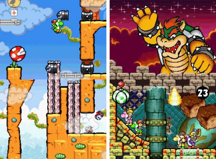
I refuse to believe 2D innovation is dead. Every once in a while, a game comes along to remind us of the format's potential, which the industry has largely chosen to ignore in favor of pursuing 3D graphics. Even the indie community mostly dabbles in recreations of beloved 8-bit adventures – not that I can blame them. If I didn't have to worry about providing shelter and health insurance for my family, I'd be off making my own dream game, which is basically Konami's The Goonies II with jetpacks. Thankfully, every once in a while, we get a Castlevania: Symphony of the Night or Mark of the Ninja to give us hope for a better future in 2D gaming. Yet Yoshi's New Island, like the New Super Mario Bros. games it shares part of its name with, suggests Nintendo no longer wants to take the lead in that regard; they're happy to take the concepts and mechanics they've honed over the years and simply iterate on them. Heck, given all that the Mario teams have done to define the platformer over the years, maybe they've earned the right to be a bit complacent. Does the inventor of the wheel have to be the one who constantly reinvents it, too?
The saving grace of Yoshi's New Island is that Arzest didn't just reproduce the original game's visual style and mechanics; they also recaptured its underlying design ethos. The excellent level design discipline – which features a bounty of secrets in sneaky yet logical and consistent places – demands players pay attention and play thoroughly. Meanwhile, there are just enough little tricks and one-way traps to let you screw yourself over in small but trivial ways; the game keeps you on your toes without feeling unfair. It's an extremely well-designed platformer, and that always merits praise. But it's possible to enjoy a game and be deeply disappointed by it at the same time, and that describes my experience with Yoshi's New Island. As much as I enjoyed playing it, I also find myself longing for a new game that's willing to pick up where the original left off and take the stagnant 2D platformer to the next level.

