Vita Slim Review: The Curse of the Handheld Revisions
Despite bringing some marked improvements to the table, Sony's revamped Vita model still falls to the pitfalls that ensnare most portable hardware updates.
This article first appeared on USgamer, a partner publication of VG247. Some content, such as this article, has been migrated to VG247 for posterity after USgamer's closure - but it has not been edited or further vetted by the VG247 team.
In almost every way that matters, Sony's recently released "slim" revision of the PlayStation Vita improves on the two-year-old original model. Make no mistake; the original Vita was nothing to sneeze at. It is far and away the most powerful handheld console ever, boasting a tremendous library of new and last gen games alike. But in almost every respect, the slim model is its better.
The Vita slim maintains the impressive graphical power of its predecessor, as well as its compelling PlayStation 4 connectivity features. It improves the older system's battery life considerably despite its smaller form factor; the new device is both thinner and lighter than the original, and while its face dimensions are almost exactly identical its rounded edges make it feel much more compact in the hands. The slim model greatly improves the design of the system's secondary buttons, making them large and prominent enough that you no longer need to fumble about trying to find the teeny chiclets for adjusting the brightness or pausing the game.

Even more importantly, it addresses the older system's two most glaring flaws. First, it includes 1 GB of on-board storage — admittedly not enough for most notable Vita games, but sufficient for a couple of PS1 or PSP titles to get you started until you can put together a second mortgage on your home to buy one of the system's large proprietary memory cards. (Of course Sony didn't take the truly consumer-friendly route and drop their overpriced proprietary memory format in favor of industry-standard SD cards the way Nintendo has for 3DS. This is Sony, after all.) And happily, the rear-touch control panel has been redesigned so you can actually hold the system comfortably without fear of activating the touch panel; no more Vita claw grip required.
Despite all these plusses, the Vita slim takes one massive step backward: It drops the original system's OLED screen in favor of a more standard backlit TFT screen. And it's an excellent TFT, miles beyond the ones Nintendo uses in its systems and not too shabby compared to high-end phones and tablets, such as Apple's iOS devices. Nevertheless, it doesn't begin to compare to the original OLED. Its images are less vivid, more washed out, lower in contrast — quite simply, not as beautiful. And for a device whose appeal comes primarily from its graphics, that seems an unfortunate loss.
For newcomers to the platform, of course, it doesn't matter. The change from OLED to TFT helped cut the price, which will attract new buyers in the first place. It does mean, however, that for those who boarded the Vita train back at Launch Day Station and were interested in switching to a slim in order to take advantage of all its other features, the migration would be as much a downgrade as an upgrade.
But isn't that the way it always turns out with handheld console revisions? The industry has a nasty habit of cramming a portable's debut model with all kinds of fancy features, then cutting a few of them a year or two later in order to bring down prices and expand the market. Handheld system revisions always seem to balance benefits and flaws in equal measure, and this becomes the early adopter's conundrum: Stick with the flaws of the original model, or trade out those shortcomings for new ones?
In fact, in the history of portable system revisions, very few hardware updates have been total home runs.
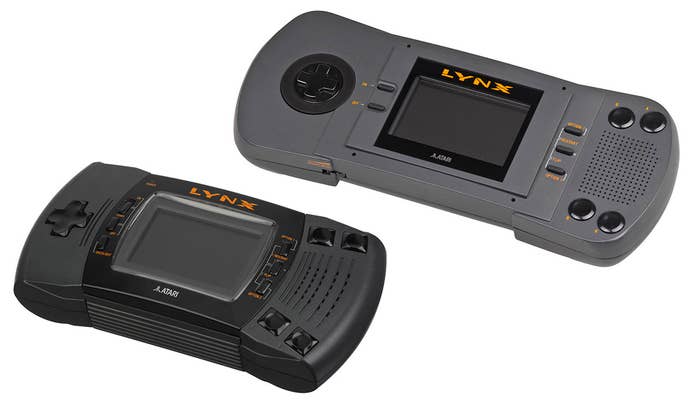
Atari Lynx > Atari Lynx II (1991)
The first-ever handheld hardware revision is one of the few flawless victories, though it shouldn't have been necessary in the first place. Atari streamlined the utterly enormous Lynx into a smaller form factor. This didn't affect any internal features like hardware power or battery life, but it did make the system portable, a trait severely lacking in the device's massive original release. In truth, the initial concept for the Lynx was more in line with the Lynx II's design, but based on focus testing Atari came to the conclusion that what people really want from a portable console is a system so large you need a backpack to lug it around. Remember, kids, focus testing kills.

Game Boy > Game Boy Pocket (1996)
Nintendo's first handheld revision was an even greater victory than the Lynx II, and is also the last time they got a revision completely right. The original Game Boy was a pretty great system in its own right, but the Pocket model improved on its strengths while also shoring up its weaknesses. It was even slimmer and more compact than the first Game Boy. It required far fewer batteries. And best of all, it updated the Game Boy's notoriously terrible LCD screen to be clearer, less blurry, and all around less ugly.

Game Boy Advance > Game Boy Advance SP (2003)
Sadly, Nintendo lost the plot a bit when it came time for their next incremental hardware revision. The Game Boy Advance SP addressed the original GBA's shocking lack of backlighting by incorporating a sidelight, which wasn't perfect but at least was good enough to put a cottage industry of light peripheral manufacturers out of work. Its form factor traded the sheer ergonomic comfort of the base GBA for a compact (if slightly more cramped) clamshell format — a wash, if not an improvement. But somewhere along the way, Nintendo's designers decided that portable gamers don't really need to listen to their games and cut the headphone port from the GBA hardware. If you wanted to hear what you were playing in any kind of noisy place (like, say, the public spaces portable games are designed for), the only solution was to buy a $15 adapter.

Game Boy Advance SP > Game Boy Micro (2005)
Meanwhile, the final mutation of the Game Boy Micro made many compromises in favor of pursuing cool factor — tragically forgetting that a device whose name includes the words "game" and "boy" could never be truly cool. The Micro was definitely neat, with a tiny high-density screen that really made GBA's graphics pop... but, on the downside, the thing was so tiny the crowded controls made action games almost unplayable for any hands larger than a child's. But the system's premium price meant it definitely wasn't meant for kids. And since the Micro never caught on — in large part because the DS caught on after all and obviated the Micro, which was really a way of hedging bets on GBA while praying people would adopt the weird dual-screen successor — the grand scheme to allow console customization with swappable face plates never really went anywhere, either.
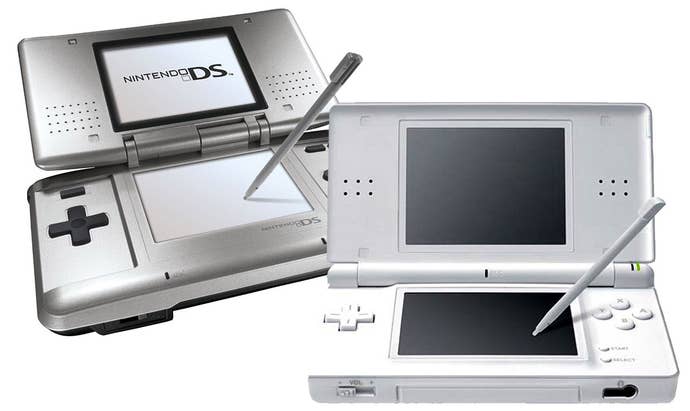
Nintendo DS > Nintendo DS Lite (2006)
In most respects, the move from the dopey-looking DS to the trim, Apple-esque DS Lite seemed like a victory all around. It offered better, brighter screens; an improved form factor; better color schemes; a more comfortable design; and basically seemed like an all-around win. Unfortunately, over the long term, the Lite proved to be rather less than reliable, with fragile hinges and shoulder buttons that stopped working entirely too quickly due to dust gumming up the mechanism. A brilliant little design, but woefully lacking in the durability-over-all mentality that keeps original Game Boys plugging away 25 years later.
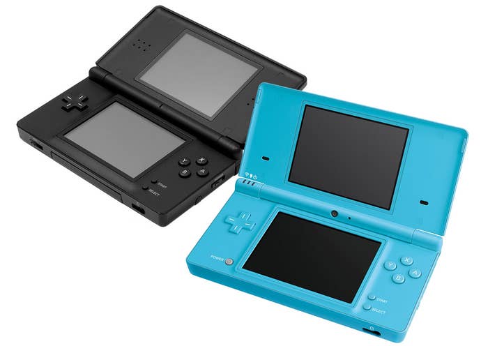
Nintendo DS Lite > Nintendo DSi (2009)
The Nintendo DSi almost but not quite counts as a new platform altogether, since it included a slight bump to the DS's onboard RAM (a tweak that hardly anyone took advantage of). The real boon of the DSi, besides its denser, more durable construction, was its ability to play downloaded games, marking a long-overdue move to digital distribution. Nintendo even added an SD card slot for expanded memory, as well as an onboard camera. But with the DSi's improvements came some crucial losses in compatibility; the system completely dropped support for Game Boy Advance software by culling the DS's slot 2 (which had the side effect of cutting out DS peripherals that used the second slot as well, undermining portions of the system's own library). Worse, the DSi turned its back on Nintendo's 20-year legacy of region-free handheld systems, locking out DSi software from countries other than the one the system itself came from.
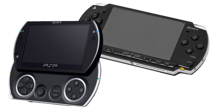
PlayStation Portable > PSPgo (2009)
The PSP went through several minor point revisions to improve the screen clarity, reduce weight, and prevent torsion from sending the UMD drive from popping open and sending game discs flying across the room. The PSPgo, however, radically reinvented the PSP as a compact device patterned after slider-style smart phones. While this made for a very cool and playable gadget, it also came with a massive drawback: The PSPgo removed the UMD drive altogether, meaning players' entire library of UMD games was instantly useless. The idea of going all-digital could have worked in theory, if not for two unfortunate factors: Not all PSP games are available through PSN, and Sony never bothered to offer any sort of upgrade or trade-in program for existing PSP owners to migrate their UMD libraries to digital. Unsurprisingly, hardly anyone bought a PSPgo, making it great piece of hardware utterly destroyed by its creators lack of respect for their customers.
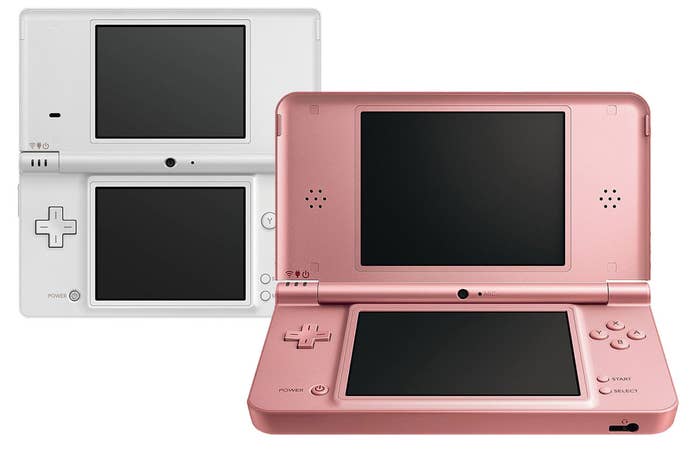
Nintendo DSi > Nintendo DSi XL (2010)
The DSi's second revision, the XL, carried forward all the strengths and weaknesses of the original model. Its main selling point, however, came from the absolutely massive screens it incorporated. The downside, though, was that its enormous dimensions nearly took it into Atari Lynx territory; unfolded, the XL was almost as large as a netbook, and even with the clamshell closed it was entirely too large for its own good — the first Nintendo portable in 15 years not to slip easily into a pocket.
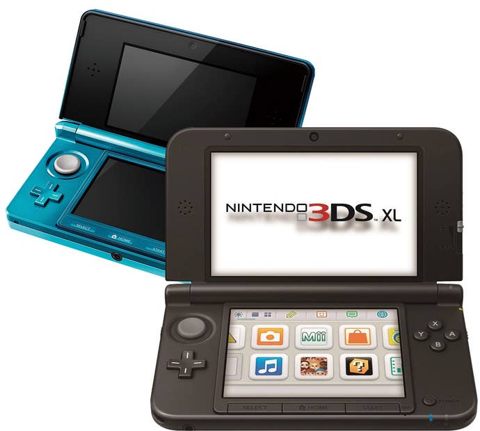
Nintendo 3DS > Nintendo 3DS XL (2012)
Nintendo didn't waste much time in relaunching the middlingly successful 3DS in a larger form factor — the XL arrived less than a year and a half after the original 3DS and proved a huge help in encouraging people to adopt the system. And while its larger screens were definitely welcome additions, this upgrade came with a few of its own downgrades. Like the DSi XL, it strains the definition of portability. It also has a notorious tendency for flimsy hinges, similar to the DS Lite. And the larger 3DS screen means the angle of viewing three-dimensional graphics on the XL is much fussier than on the original 3DS, forcing players to hold their systems just so in order to get the most out of the graphics.

Nintendo 3DS XL > Nintendo 2DS (2013)
And finally, there's the Nintendo 2DS. Maybe it's not fair to include the 2DS since, unlike every other handheld revision in history, it was literally designed to be a downgrade. The system's deficiencies are right there in the name: It's doesn't make use of 3D graphics! Unfortunately, the 2DS has a few other issues; because Nintendo abandoned the clamshell format, those poor screens are exposed to all manner of abuse. The system also manages to be even more cumbersome to carry around than a 3DS XL, a chunky wedge of hardware that couldn't possibly fit into a child's pockets. Which isn't to say it's a bad system... just a very compromised one. But, you know, intentionally so.
So what does all of this mean for the Vita slim? Well, basically, it means the new Vita is good enough. Thank the magic of lowered expectations, I suppose. As portable gamers, we've come to expect compromise. The downgrade in the slim's screen quality is a major letdown, but it's nothing we haven't seen before. The revision offers enough improvements to be compelling in every other respect... and, frankly, after you use the degraded screen for a while, you'll probably forget how nice the OLED was. The Vita slim gives with one hand and takes with the other, but at this point we've come to expect that.
Image source: Wikipedia
