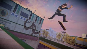
Tony Hawk's Pro Skater 5 visual change is not a makeover, says Robomodo
Tony Hawk's Pro Skater was always intended to look the way it looks now, apparently.
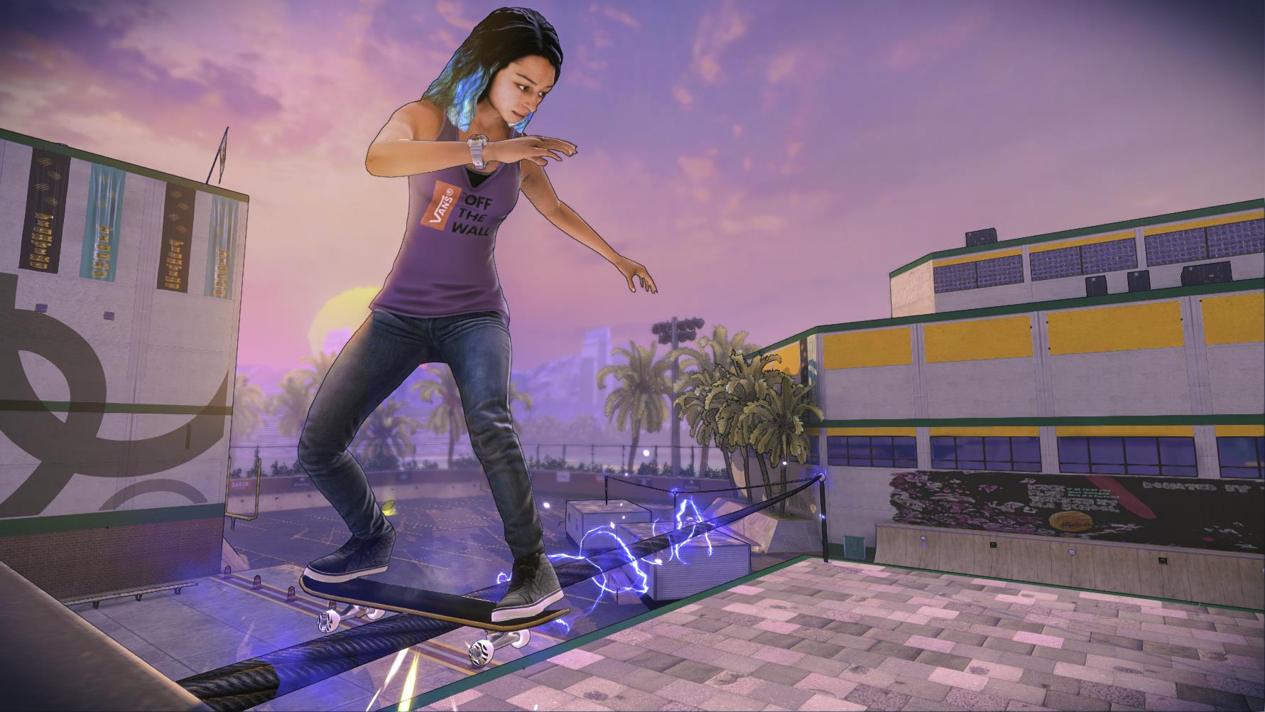
The latest Tony Hawk's Pro Skater screenshots demonstrated a dramatic visual change from earlier assets.
Speaking to Gamespot, Robomodo CEO Josh Tsui said the new look is just the evolution of the project's graphics tech, as opposed to a change of direction.
"This is the design we've been working on for a while," he said.
"The game has been evolving for a long time, and we've pushed the visual style forward in increments to balance it alongside other technical benchmarks and gameplay and multiplayer optimizations."
Tsui said Robomodo has "always been confident" in aiming for this style of visuals, but didn't start fleshing it out until ti had secured other development milestones - notably maintaining a framerate of 60 FPS at 1080p in 20-player multiplayer sessions.
"We've achieved that, so now fans are seeing a better-looking game," he said.
Tsui also said Robomodo wasn't inspired to push the visual upgrade due to fan feedback; some older screens were a bit underwhelming. Still, the new cartoon-like look has not gone down well with everyone.
Perhaps we'll see further improvements before the skating sim drops on September 29 for PS4 and Xbox One. The PlayStation 3 and Xbox 360 versions will release in November.


