The Last of Us Part 2 comparison video shows slight downgrade from E3 2018 demo
Some aspects of The Last of Us Part 2 look slightly worse in the final build compared to previous E3 demos.
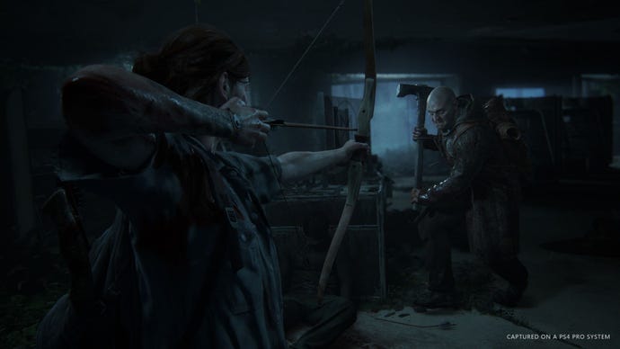
If you've been playing The Last of Us Part 2, you may have already come across some of the sections shown in E3 demos. As it is often the case with big games, the visuals in the final build don't always line up with those demos.
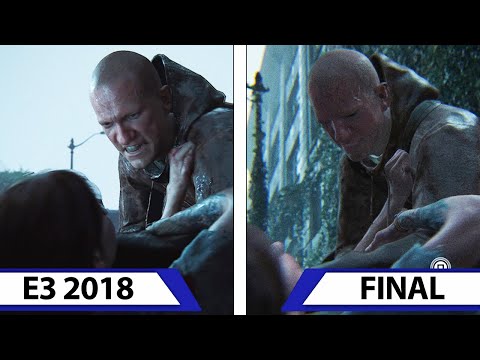
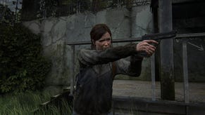
The video below from ElAnalistaDeBits compares the E3 2018 demo with the final product, in a section where Ellie comes across hooded enemies in the overgrown urban area.
Right off the bat, the original demo shows more volumetric fog compared to what ended up in the final game. It's a minor change, but far from the only one. Reflections in the water also appear to be less accurate. There's been some lighting changes that make the image look softer overall, with characters and certain parts of the environments no longer casting shadows.
The most noticeable downgrade, however, is the detail of the character models, as seen in the moment where Ellie gets pulled from under a car by a man. Facial animations in this area, too, appear less pronounced.
Some textures, such as those of certain vehicles, are less sharp and less reflective in the final build.
It goes without saying that these minor changes do not take away from how stunning The Last of Us Part 2 looks. All games go through the same process of optimisation during development, and that's where developers decide to disable certain settings to maintain a solid framerate.
Indeed, as seen in the video, certain parts actually look better in the final build, such as the more convincing wet effect on vehicles and other objects. Changes do not always mean a drop in quality, as they're sometimes made for narrative or gameplay reasons.
For more on The Last of Us Part 2, including our spoiler-filled discussion, and our guides for all safe combinations and Superhero Trading Cards - hit up those links.
