Switch OLED review: a far more impressive upgrade than I’d imagined
The Nintendo Switch’s new OLED model is a meagre upgrade on paper, but in practice it’s a significant improvement for handheld play.
Hardware reviews are usually pretty difficult work. You have to do analysis of in-depth, technical things in a painstaking and tiring process that often can barely be seen in the final published review - but it all needs to happen behind-the-scenes. The new Nintendo Switch OLED model doesn’t need such an intense testing, however - it’s pretty easy to explain and deliver a verdict on.
I’m sure some will do more in-depth reporting, including the folks over at our sibling publication Digital Foundry - but in the end, the new Switch OLED model can be summed up pretty simply: it’s the Switch you know and love, but the display is better. Way better.
It’s so much better, in fact, that I was a little surprised. I know how good OLED displays are - the original PS Vita was always a high bar for handheld gaming, and I’ve got a couple of lovely LG OLED TVs in the house - but just what a difference it made shocked me both in experiencing older content that I’m familiar with and games I’ve not experienced on the older model of Switch.
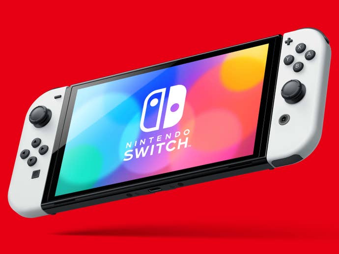
Let’s cut to the chase. What’s different? Well, as the name of the machine suggests, the primary draw is a new 7-inch OLED display. Despite the machine being more or less identical in size to the original (which, yes, means existing Joy-Cons will work and even some old cases), this new screen is just under an inch bigger than the original Switch’s 6.2 inch screen. That leads to one of the greatest benefits: less of an ugly black bezel around the screen. This might actually be my favourite feature of the device; the screen now stretches closer to the edges of the hardware, and it feels like the size increase is larger than it is as a result.
Size isn’t the main thing people are coming for, though - it’s the OLED format. For those who aren’t display nerds, that stands for ‘Organic Light Emitting Diode’, and it basically means it’s a more expensive type of display that results in a better overall image quality. You should get blacker blacks and brighter, more searing whites, and faster response times. OLED panels are actually more power-efficient, too, but perhaps because this is a bigger display, the battery life remains broadly the same as the regular Switch.
The biggest difference in the display is in how it’s lit - OLED panels emit their own light, so there’s no need for a backlight which might give off an uneven result or wash out the image. This is why even at a glance, an OLED display appears much more vibrant. It also means when a pixel is off, it’s completely off - no backlight brightening it from a black to a milky grey. That’s how you get those deep, intense blacks. Basically, there’s a reason that OLED TVs are considered the gold standard when shopping for a modern gaming TV.
OLED is always impressive, but I actually think in a handheld form factor it always stands out even more. This is why people celebrated the Vita’s OLED panel so much, and why it’s quickly become a standard for mobile phones. The difference on Switch is night and day; games are just more vivid and draw you into the experience more as a result. When combined with the subtle bump in screen size, it’s surprising just how much of a difference it makes. An upgrade that I thought was going to be marginal at best actually feels practically transformative.

In the interests of clarity, I tested games I’m very familiar with on the original Switch and Lite such as Smash Bros. Ultimate, Breath of the Wild, Sonic Mania, and the recently reviewed Wario Ware: Get It Together - but I also played one new game solely on the OLED, Metroid Dread. All enjoyed a significant improvement in image quality and the experience.
Bluntly, this isn't just a new OLED screen, it's also a high-quality OLED screen. Not all panels are the same, after all - but I'd say the OLED is one of the best ones I've seen on a handheld device. Certainly, it outstrips that much-loved panel from the Vita.
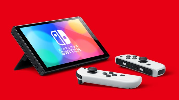
You also get 64gb of storage, better sound without headphones, and a way better kickstand for tabletop play. That last one could be transformative if we’re ever able to get on flights again, as the previous kickstand honestly sucked - this one is the opposite, sturdy, firm, and reliable feeling. It is also adjustable to a wide variety of angles, which means that if the moron in front of you on a flight reclines their seat, you can recalibrate the screen angle. Honestly, this upgrade has to be felt to be understood, tactile as it is, but it’s a great addition.
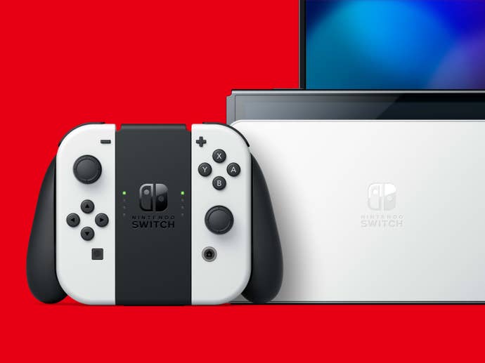
Finally it’s also worth mentioning the new dock. Based on some internet chatter I expect a lot of discussion over the coming weeks about this dock, as people are already claiming that it’s low-key ‘4K compatible’. Maybe it is, maybe it isn’t. Maybe it’s true that the Switch OLED started life as a 4K machine and then was downgraded due to chip shortages. Maybe a 4K Switch is still incoming. This new dock is functionally identical to the last one with one major change: it features a built-in LAN port. This previously required an add-on which took up a USB port, and a wired connection is way better for twitchy online games like Smash Bros - so this is a perfect and welcome addition. It’s worth noting that you can still slot older Switch models into this new dock, or place the Switch Pro into the old dock - if you go to a friend’s house, there’s universal compatibility there.

Finally, and not pointed out by Nintendo all that much, there's generic improvements to the hardware itself. My favourite change here is how the metal rails that hold the joy-cons in place feel sturdier and tighter than on the original machine, which means there's less of that terrifying 'this could snap' wobbliness that I've found characterizes gripping the joy-cons tightly. The bezel is improved not just through its shrinkage, but also in a glossy finish that just looks better. It's improved across the board.
So… that’s it. The in-game performance is the same; it is an identical machine under the hood apart from the screen. I won’t lie, I really wanted a suped up Switch; a Super Switch, if you will. I still do. I was always less interested in 4K resolution than a more powerful Switch that could throw more processing power at games that struggle to maintain a solid frame rate, which are relatively plentiful on the platform. The nagging disappointment from the announcement of the Switch OLED lingers thanks to that - and that’s still something I want.
If you play the Switch often in a handheld setting and enjoy having the ability to dock it, the Switch OLED is now absolutely the best way to play. The Lite remains more attractive if docking doesn’t interest you at all thanks to its particularly low price - but the original Switch is totally outclassed by this new model. The question is how much you’ll be willing to pay for it. At $350 / £310, it’s an expensive ask for an upgraded screen - especially when rumours of a 4K model continue to swirl despite Nintendo’s protestations. I think it’s an expensive ask for what it is - but your mileage will vary depending on how much cash that is to you, obviously.
But taken as it is, a screen upgrade with other minor adjustments, the Switch OLED is a more than competent upgrade. Like I said, I was pretty blown away by how much of a difference the OLED display seemed to make to Switch games. Despite being intimately familiar with the technology, it was more than I’d bargained for.
Disclaimer: A Switch OLED hardware unit was provided by Nintendo for the purposes of this pre-launch review.

