Forget 30FPS, Starfield's map is the game's biggest problem
There are many, many great things about Starfield, but the map navigation is baffling, backwards, and boring.
What is your favourite in-game map? There are plenty of good ones out there – I have a particular soft spot for Destiny and its ‘navigator’. The UI is simple, clean, readable. Navigating from place to place is obvious, and the way the design elements move in parallax as you hover your cursor over your next destination is oddly satisfying on a deep, primal level. For Destiny, getting the ‘navigator’ right was an essential part of the game’s success, and the glue that helped bind a lot of its rival elements together.
I wish Bethesda had taken some tidy, clean notes from how Destiny does interstellar travel. Because – unless you’re fast-travelling to your next mission – getting anywhere in Starfield is a massive pain in the arse. Earlier today, I was trying to find the system that the Mantis' hidden outpost is on (I needed more screen shots for our Mantis quest guide). I had the name, Denebola, and the specific planet, Denebola I-B.
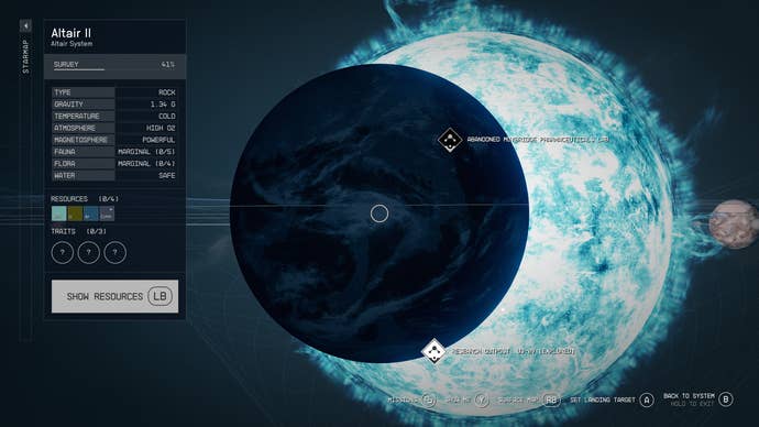
But because I’d already cleared the quest, there was no quick way of finding it. Opening up the star map from the main menu – or manually booting it from my ship’s navigation table – I was only met with the weirdly-tiered map that goes [local planet], [local system], [galaxy]. When you’re zoomed out to that last level, there’s simply a 2.5D map of the stars, with about one in 10 of them labelled with a name.

Hunting for Denebola within this was, frankly, the worst experience I’ve had in the game so far. Worse than not realising my first character save wasn’t deleted, just shunted to a different menu within the Load/Save screen (which, in itself, is a peculiar choice). Worse than the game just failing to load some dialogue, so I was stuck watching Sarah Morgan stare at me judgmentally for eight minutes before I gave up and restarted my game. Worse than the 30FPS that drops down a bit when all the lasers start blasting in Mantis hideout.
I get that rendering a whole-ass galaxy full of explorable locations is hard. I get that giving players the choice to zoom in from a planet’s surface all the way out to the shape of a whole nebula is a tricky design problem. But Mass Effect dealt with it well. Eve does it fine. Even No Man’s Sky has some frictionless answers to the problem that don’t involve manually hovering over about 40 damn spots to try and find the system you want to go to.

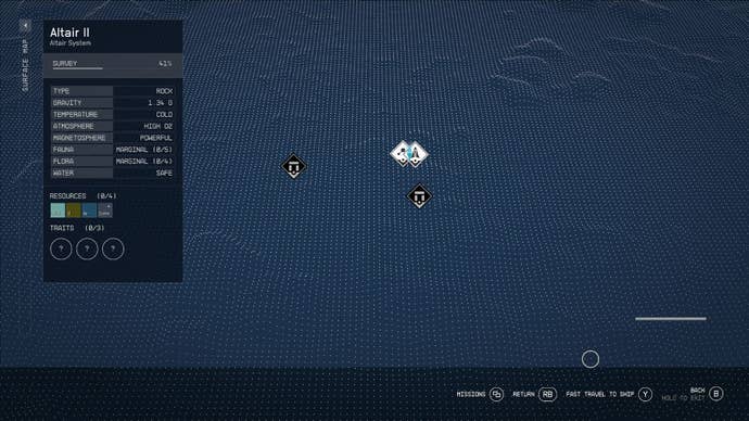
Planetside, it’s not much better – there’ s no minimap, so to speak. Just a featureless overall view of the biome or planet you’re on, pockmarked with icons that denote randomly-generated dungeons or points of interest. Even compared to Bethesda’s earlier work, it’s a step back. Opening up your scanner and following waypoints projected on the ground a la-Dead Space is not good enough (especially when you’re so often met with “cannot find a clear path” when you try to do this).
Bethesda has tried to make getting around easier for us by allowing us to fast-travel from pretty much anywhere. Aim your scanner at a quest location, and – as long as you’ve been nearby before – off you zoom. From your missions menu, or the star map, most icons can be teleported to. If you don’t mind sitting through some loading screens, even on the Series X. But not being able to orientate yourself when you’re trying to get your bearings, and then being so overwhelmed by the awkward UI when you do end up in a new system that it’s hard to parse where you’ve just actually travelled to… it all seems so far removed from the sense of place that Skyrim or Fallout 3 had.

Maybe, another 30 hours in, I’ll be more au fait with all this and it won’t seem so irritating. But right now, simply trying to find my way back to one of the game’s major settlements (if I’ve not got an icon anchoring me there) is driving me up the metaphysical wall. I long for a simple, player-friendly bit of UI: the fantasy of being an astronomer and navigator is all well and good, but I’m here for escapism more than anything else. I don’t want to have to have a degree just to be able to understand my bloody map.
There's a lot you need to know about Starfield, and whether it's Best Starfield Background, Best Starfield Traits, How to lockpick in Starfield, or Best Starfield Skills, we've got you covered.


.jpg?width=291&height=164&fit=crop&quality=80&format=jpg&auto=webp)


