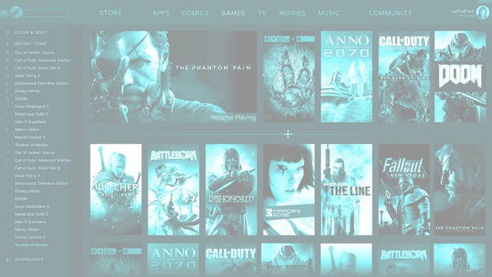
Slick new Steam client interface datamined from latest beta update, shows TV and comics tabs
Steam may be in for its most dramatic reworking in years.
Steam beta users have turned up something very interesting in the platform's latest test client.
As archived by Steam Database on Github, the current Steam beta client update includes a bunch of code related to the client UI and some images which may be mockups or concepts for a potential overhaul.
It's a really different look for the Steam client. There's a new navigation column on the left which can be filtered with various parameters, topped by a search bar. A row of tabs across the top guides users to their collections of apps, comics, games, TV, movies and music, as well as the main Steam Community hub.
The image, reproduced above, presumably shows the Games tab of this proposed new Steam client UI, and installed titles are arranged in tile form. A divider separates a small number of games from the rest - possibly user pins or the most recently played titles - with an extra-large title reserved for one game, which is labelled "resume playing". It's not clear if this is the last game opened or whether it is running and the user has tabbed out or suspended it.
Another image shows what looks like a game hub of sort - as if the user had clicked onto a game tile and thereby opened a stack of tiles related to that title, similar to the PS4. Information in the hub includes play time, trading cards, achievements, friends playing and people streaming. A menu of tabs takes the user to collection, settings and community menus, and a "memories" section shows off screenshots.
This second image definitely looks like a mockup, as further down the page it has empty sections labelled "game" and "widget". Moreover it has Metal Gear Solid 5: The Phantom Pain at the top, but then shows a Dota 2 news update.
If this mockup is representative of a direction Valve is actively pursuing, it would represent the most serious shakeup for the Steam client in years. Don't get too excited just yet; it may be months or even years away, as these images could well be part of a number of early concepts and may not even get past the draft stage.
What do you think of this as a new look for the Steam client?


