Simple Sprites, Potent Frights: How Sprite-based Horror Games Can Produce Genuinely Big Scares
Airdorf's Faith series demonstrates how simple sprites can magnify a horror game's creepy atmosphere rather than detract from it.
This article first appeared on USgamer, a partner publication of VG247. Some content, such as this article, has been migrated to VG247 for posterity after USgamer's closure - but it has not been edited or further vetted by the VG247 team.
I have a confession: old video games scare me. That's a funny thing to hear from someone whose life revolves around writing about retro games, I know. Let me tell you, though, there's nothing funny about the glitched-out pixels and digital screeches that haunted my dreams if I nudged my ColecoVision cartridges a little too hard as a kid.
Even when they're working well, there's something unsettling about games on early consoles like the Atari VCS and the ColecoVision. You can try to put a finger on the reason why those strange, blocky sprites and sparse environments are a little chilling, but you'll probably never settle on a concrete answer. Is it the characters' blank faces, rendered eyeless and mouthless by resource restrictions? Is it the oft-silent worlds they stumble around in? Is it the fact the player is usually left to fend for themselves since very early games typically lacked basic tutorials? I don't know, but I admit video games started feeling much warmer when Super Mario Bros. gave us a hero with recognizable features and joyful background music.
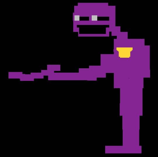
Decades later, I still occasionally jolt awake from a dream where I'm wandering, lost, through a jagged Atari landscape to the accompaniment of a monotone droning sound I can't identify. I'd write these dreams off as isolated shards of weirdness spinning in my brain, but I know I'm not alone. YouTube offers plenty of evidence that lots of gamers are a little scared of the sparse worlds and awkward representations of humans we saw on the first consoles and computers. Even kids who never touched anything older than a PlayStation 2 will jump at characters like Five Nights at Freddy's "Purple Guy"—a child murderer depicted as a four-color sprite with bulging white eyes and a huge, malicious grin.

That's why some of the spookiest games on the market boast graphics that belong on the Apple II, yet get as much buzz on YouTube as high budget horror titles. Pixel graphics and chiptunes are excellent vessels for fear, and the simpler you make them, the more potential they seem to have for delivering frights. All the better for letting your imagination fill in the blanks, my dear.
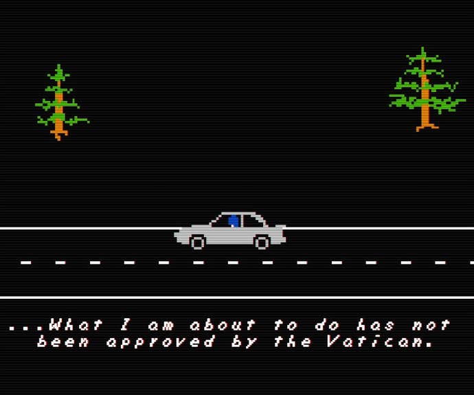
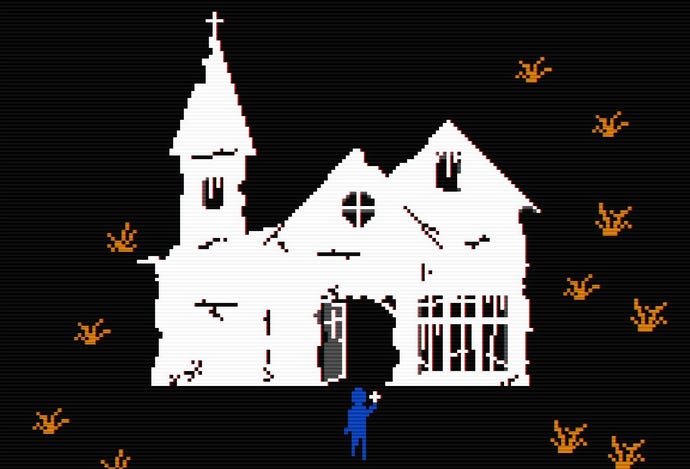
Ample examples exist in the Faith series of horror games by Airdorf. Using visuals that would be right at home on the Intellivision, Faith and its follow up Faith Chapter 2 follow a priest named John Ward as he tries to exorcise evil in a small town. Ward's character sprite is featureless save for its deep blue coloration, which is broken up only by Ward's clerical collar and the Cross he carries to ward off demons. Ward "owns" blue in Faith, same as the demon-possessed girl he tries to save, Amy "owns" purple—barring the blood-red gap that marks where she sliced off her own face. In Faith Chapter 2, another Priest named Father Garcia is defined by gray. Even elaborate fan art of Faith's characters subscribes to the shades they use in-game.
Airdorf says he'll "never forget" the chunky pixels and bright colors that made up the DOSand Apple II games he played as a kid, and he constructed Faith in an attempt to deliver effective horror through simple sprites.
"Could I make a game that was as scary as P.T. using graphics that shouldn't scare the player? I was going for the feeling of playing a seemingly harmless-looking 8-bit game that's maybe just a little creepy and uncanny, and then gradually having the player descend into a horror experience that creatively takes aspects of those old games and puts a horror spin on them," Airdorf tells me through email.

Simple sprites don't work alone to convey the creepy atmosphere in Faith. There are several retro elements that work in harmony (or should that be "disharmony?") with each other. Faith's droning, heavily digitized soundtrack complements Ward's lonely quest through haunted forests and cemeteries, as does its purposefully disjointed story that revolves around the "Satanic Panic" that gripped the United States in the '80s.
Faith also makes very effective use of sound to get players' hearts pumping. While most sprite-based horror games don't give their characters a voice, every character in Faith and Faith Chapter 2 speaks to themselves or each other in halting, primitive text-to-speech that resembles the robotic voice of a Speak and Spell. It makes the games' human characters sound cold and detached—nearly as much as the monsters, whose voices are made distinguishable by slight distortions. When Ward is cut down by demons, the game ends with the gravelly voice declaring, "MORTIS."
"In some ways, sound design in horror is just as important as the visuals. The sound design of Faith was a delicate balance between quaint 8-bit sounds from that era and more disturbing 'horror'-themed sounds," Airdorf says. "[The text-to-speech] came from a RP session I had with some friends during a Spanish class several years ago; we found a text-to-speech program on the class computer that we used as the GM, and when we would describe our actions the text-to-speech would call out 'el dragon se enoja. en fuego. muerte.' So, sticking with the 'ritual Roman' Latin theming of Faith, I made the now-iconic and meme-worthy 'MORTIS' death screen."
While other retro horror games utilize sprites and crunchy sound effects from the earliest days of gaming, Faith and Faith Chapter 2 utilizes one callback that truly gives the game its own identity: rotoscoped cutscenes. Rotoscoping, an animation technique in which animators trace over live-action footage to give on-screen characters lifelike movement, wasn't possible on the old game consoles Faith emulates. However, it enjoyed an explosion of popularity in '90s games like Prince of Persia, Another World (released as Out of This World in North America), and Dragon's Lair. Whenever Faith and Faith Chapter 2 transitions from sprites to a smooth, rotoscoped cutscene, it's jarring—but this is by design.
"I really like moments in shows that suddenly cut to a disturbing, highly-detailed drawing of a character or something," Airdorf says, citing a scene in SpongeBob SquarePants where SpongeBob slowly dries out and we're offered an extremely detailed frame depicting his physical distress. "Too many horror games take a shortcut by just cutting to like an actual disturbing photo or a photo-realistic jump scare image. I wanted to do something that kind of lived in between those realms. The whole theory behind switching between the 2D Atari-esque in-game style and the rotoscoped scenes was to destroy the player's expectations in a really unsettling way. Kind of like grabbing the player and shaking them without breaking the fourth wall."
Faith's story continues with Chapter 3, which is due out soon. We don't know how things will end up for poor John Ward and his tormented soul, but screenshots indicate stark sprites and sparse backgrounds are still our chariots through Ward's personal nightmare. In the meantime, don't turn your back on a horror game just because it bears simple shapes and colors. Otherwise the last thing you might hear is a garbled voice chanting "MORTIS."


