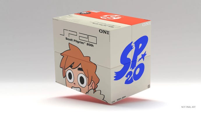
Scott Pilgrim's 20th anniversary set is a great ode to 2000s design
Though it will set you back a pretty penny.
In celebration of its 20th anniversary, the original Scott Pilgrim graphic novel series is getting an incredibly stylish looking re-release.
The 2000s really seem to be coming back in full force, and Scott Pilgrim seems to be leading the charge. Last week, Oni Press announced its 20th anniversary edition of the Scott Pilgrim series, and boy howdy is it a beautiful looking set. Or sets, as I should say, as there are two of them; one in the original black and white look, and another edition containing the colour versions of the graphic novels. While they're definitely on the pricey side ($200+? Ouch!), you can't help but appreciate just how good they look.
The cases were designed by comic artist Patrick Crotty, and you can so easily see the influence of PlayStation's 2000s era design in them - the Oni Press logo looks like a copy of Sony's classic typeface, and the text that reads "SP 20" literally looks like the PlayStation 2's logo. It's a good point in time of design to pull from, especially considering the PS2 is only 23 years old itself (yes, realising how old all of this stuff is is definitely making me feel my still quite young years feel aged).
This 20th anniversary set comes with some extra goodies outside of hardback versions of each volume too, such as a compilation of "Making of Scott Pilgrim" extras and comics, a "top secret selection of in-world items from the universe of Scott Pilgrim," and a collectible sticker sheet.
It feels like perfect timing too, as an anime adaptation of Scott Pilgrim is coming to Netflix next month, and it's looking like a real treat too. With the official Scott Pilgrim game having finally been revived a couple of years ago too, it's easily the best time to be a fan of the series.

.jpg?width=70&height=70&fit=crop&quality=60&format=png&auto=webp)


