Rockstar website updated with new art that could be teasing next game
The official Rockstar website has received a slight facelift.
Rockstar Games' official site was recently updated with a couple of new images fans think are teasing the studio's next project.
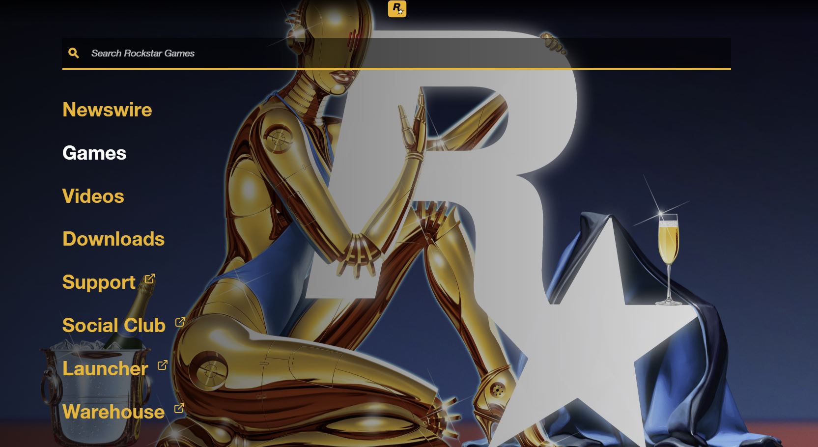
The first can be seen by bringing up the menu bar on the far left. The background shows an android with a retro, space age-inspired design holding a white Rockstar logo, with a glass of champagne resting on the star and a bucket of champagne off to the left.
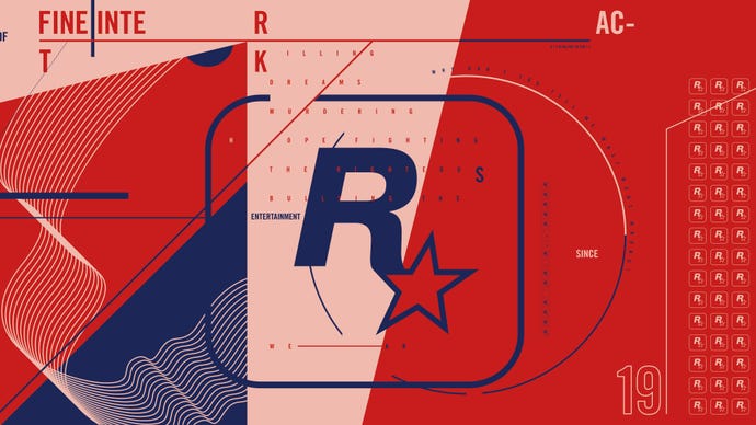
Then, Reddit user PrettyFlexo discovered another image showing a new look for the Rockstar logo. I couldn't find the image myself on the site, but PrettyFlexo helpfully saved it for posterity.
While the logo itself hasn't changed, the design of the background looks like it belongs on the poster of a 70s spy thriller. Itched all across it are the words, "Killing dreams. Murdering hope. Fighting the righteous. Bullying the weak", and "Why don't you tell me what went wrong?" curved on the side.
Fans are speculating that this could be the start of Rockstar's teasers for its next project. The second image, in particular, sounds very Bully. Rumours about a Bully sequel pop up every few months, so there's certainly plenty of fuel there.
When Rockstar first started teasing Red Dead Redemption 2, the developer posted new logo with a stark red background across its social media channels, which was later followed up by other, less-subtle teasers.
It's worth noting that no such change occurred this time around, so this may very well be a simple update to the developer's website that's not meant to be teasing anything.
Thanks, Gamesradar.

