PUBG Xbox One controls make no damn sense
The way PUBG controls on Xbox One is going to be the only thing you'll be hearing about in the next few days, because it's unlike any other game.
It is no doubt a big challenge to try and adapt PlayerUnknown’s Battlegrounds PC-centric controls to a controller, and I don't envy developers who spend weeks trying to figure out the best way of doing it.
A game as reliant on keyboard-and-mouse controls as PUBG was always going to feel bad on a controller. But there's bad and slightly annoying controls, and then there's insane. Unfortunately, right now, PUBG is firmly in the latter camp.
When Microsoft said that Gears of War 4 developer the Coalition was helping PUBG Corp craft the best controls, I expected better. It's all part of the company's so-called "boutique, first-party, white-glove treatment" of PUBG, so to end up with this control setup is a travesty.
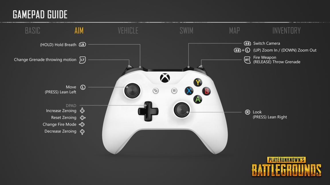
If you haven't played the game yet, here's the short version: PUBG treats the different things you do in the game, from shooting and driving vehicles to swimming and looting, as separate functions. So each of them gets its own control scheme. The in-game controls page has separate tabs for each function, listing individual button mappings under every page.
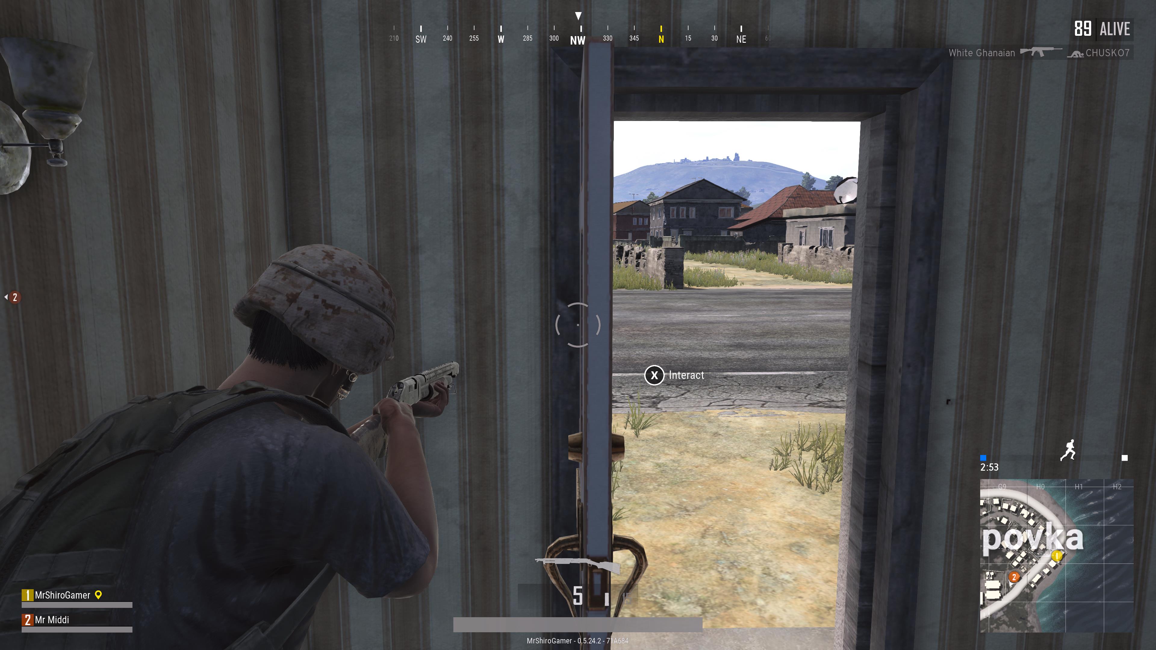
The problems start as soon as you hit the ground, and the first thing you'll notice is that - unlike practically every other shooter in the last ten years - holding the left trigger sends you into third-person aiming. To aim down the sights of a weapon, as you would want to do if you want to hit anything past 50 meters, you have to pull the left trigger quickly. Another trigger pull sends you back.
Even if you ignore how incongruous this setup is with what we've been using in shooters for years, you can't get around how clumsy it is. In the handful of rounds I played, PUBG went into third-person aiming for a split-second before going into proper ADS, because, as you might imagine, pulling the trigger also means you sometimes hold it for a fraction of a second before letting go.
The trick is to not go all the way, which is already more thinking than you'd want to do with something as simple as aiming. Even though I knew this quirk going in, my muscle memory always defaulted to holding the trigger before realising that it was the wrong move. I am not asking all shooters to conform to an arbitrary control setup popularised by CoD 4. On the other hand, that scheme is popular for a reason.
The bigger issue is that the replacement system is terrible, so why throw away something that works in favour of a shaky solution? This could be solved in one of two ways. First, PUBG Corp can simply reverse the two functions, so that holding the left trigger brings up iron sights - as expected - while pulling it is what triggers third-person aiming.
This ensures that no matter how softly you press the trigger, it will always go into ADS. To use the other, unpopular aiming mode, you'd have to do the uncommon motion, not the other way around. A better solution would be to adopt a similar approach to Ghost Recon: Wildlands. In Wildlands, holding the left trigger always remembers your last used setting.
To switch between iron sight ADS and third-person aiming, you have to click the right stick while you're holding the trigger. Since PUBG maps the lean functions to clicking the sticks, a simple aim toggle mapped to one direction on the D-pad could flip between them. Right on the D-pad should do the trick, since it currently resets zeroing distance, which is a bit redundant seeing as you can increase and decrease the same value using the D-pad up and down buttons.
Now that's out of the way, let's divert our attention to the other frustrating thing to do on a controller: looting and navigating the inventory. Right now, PUBG splits the inventory into columns, which you can flip between using bumpers. Within each column, you use the D-pad to highlight what you want, and the face buttons to interact.
This is unnecessarily complicated, so good luck trying to do basic inventory management while under fire. Games like Destiny, No Man's Sky, and Assassin's Creed: Origins all have tiled menus with multiple rows and columns. Their solution? A mouse cursor controlled by the right/left stick. The icon is big enough that you easily move it around with a stick, highlight what you want and go on with your life.
It won't work for dragging and holding like a PC mouse, but it's a halfway compromise between the freedom of a mouse and whatever it is PUBG currently has. Equipping and removing attachments shouldn't be this hard, especially when the game relies on that.
There's also a better and likely more expensive solution, which is having two separate UIs for each platform. Diablo 3 effortlessly does it, and Blizzard's challenge of adapting isometric RPG controls from PC to console was bigger than PUBG's.
In Diablo 3, menus are completely redesigned to complement analogue stick movement - a key strength controllers have over mouse and keyboard. This meant that menus had to mostly be radial, as can been seen in the character inventory screen. It's ingenious, and you'll waste no time getting to know the controls when you see it the first time.
The face button mappings also need to be redesigned. Tapping X should always reload the weapon, and holding is what should let you interact. Battlefield faced the same problem when it came to consoles, and DICE's solution was straightforward: opening doors requires holding the button whereas reloading only needs a tap. PUBG already follows the shooter standard with crouch and prone on the B button, so why not here, too?
The least egregious of these is vehicle controls. I don't think I've ever seen handbrake on the Y button. It should be on X, or A, the two sensible buttons racing games use 99% of the time. Switching seats can easily be mapped to Y instead. Nobody switches seats when they're driving the damn car.
Even if you don't agree with these potential alternatives, I don't think anyone would be upset if PUBG Corp allowed us to remap controls however we see fit. This is probably not easy to do, seeing as some big games still don't offer the ability to this day - but it's worth a shot.
Whatever solution we end up with, it has to be better than what we have today. There are other problems in the Xbox One version worth talking about, but boy, these controls are something else.

