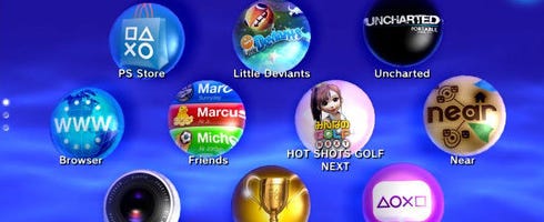
PSP2's new user interface shown in more detail
This is what PSP2's user interface looks like. It's replacing the XMB first introduced on the original PSP in 2005. Want to know more? Of course you do.
While the XMB was all about moving from row-to-row, NGP's touch-screen interface allows you to move icons about at will, in the same way you can move apps about with your fingers on your iPhone or Android phone.
Your only XMB action from here on out is going to be on PS3.
And that's that. NGP releases this year in Japan at least. Get more details than you'll ever need here.
Thanks, Kotaku.

