PlayerUnknown's Battlegrounds devs are considering 2 possible directions for UI and HUD, and they want your feedback
PlayerUnknown's Battlegrounds developers are looking to make a big change to the game's UI and HUD, and they're asking the community to provide feedback.
Information about the studio's current options was revealed earlier in a blog post on Steam. Creator Brendan 'Playerunknown' Greene explained the two possible design decisions that are currently on the table.
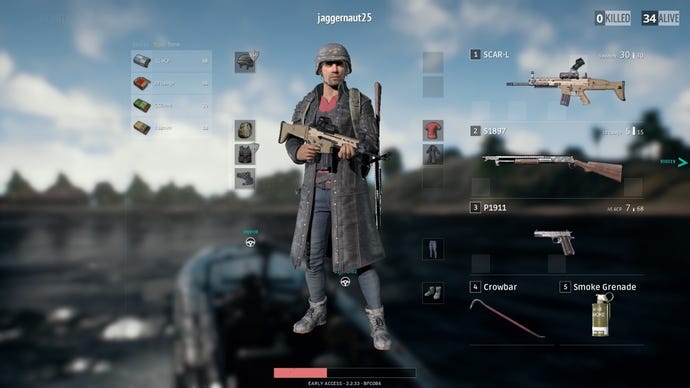
The first direction would allow players to see which - and how many - consumable items they currently have without needing to go into the inventory screen. This includes grenades.
"As a competitive shooter, the player must have all information readily available to facilitate fast decision-making and focus on tactics and combat," Greene explained the thinking behind the first option.
"Opening the inventory screen greatly reduces the player's situational awareness and hinders their ability to concentrate on the competition. The availability of this information allows low-level players to perform at a higher standard and provides greater accessibility to new players."
The second option is what the game currently has, meaning you need to open the inventory to check what type of consumables you have, and their quantities. There's an inherent risk to doing this, as it blocks your entire screen, which adds to the challenge.
But, it also means the game would be hiding basic information that shouldn't need to be behind a button press.
"As a realistic battle royale, too much information can detract from the immersive experience," he pointed out.
"The ability to make quick decisions based on the player's understanding of their current status, without relying on the UI, is one of many important skills in battle royale. A minimal UI in the game improves immersion, which in turn provides more enjoyable and intense moments."
Right now, the studio is asking players to explain why one should be used over the other in the comments, or through the official forums. They can also cast their votes in this handy poll for either option.
That said, the option with the highest number of votes won't automatically win. Instead, it's a way for developers to gauge the community's feelings on both design philosophises in the hopes that it'd better inform the final decision.


