PlayerUnknown's Battlegrounds creator teases a UI refresh
The front-end of PlayerUnknown's Battlegrounds needs a lot of work, so much so that players are starting to come up with their own mock-ups.
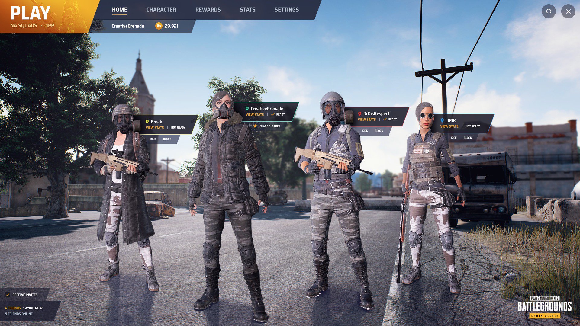
We've seen various examples of this since the game launched, with the most recent being posted by @CreativeGrenade.
As you can see, this design looks a lot cleaner than what's currently in the game, with all useful links arranged in tabs at the top.
When Brendan "PlayerUnknown" Greene himself saw the design, he chimed in to say that the game's developer is actually working on a UI refresh. The design, which sadly wasn't shown, has apparently been in the works for months.
"I think you will be pleasantly surprised when you see what we have been working on," said Greene.
It's understandable that something like this won't take priority over other development tasks such as performance optimisation and content creation, but it'll be great to at least see some version of the new UI in the game sooner rather than later.
With the new patch schedule in effect, however, it's hard to know when such features can be expected.
In other PUBG news out of gamescom, the game showed off HBAO+ and ShadowPlay Highlights support, both of which were added in a patch.
