Nidhogg 2 Review: A New Look For An Old Friend
It's time to duel!
This article first appeared on USgamer, a partner publication of VG247. Some content, such as this article, has been migrated to VG247 for posterity after USgamer's closure - but it has not been edited or further vetted by the VG247 team.
The first Nidhogg was an indie surprise. It was a game that sprung from Messhof thrown into the gaming convention circuit, where it found an audience that would sing its praises. Nidhogg was a minimalist 1v1 fighting game, prizing the core aspects of dueling above all else. And it worked. It was the kind of game you could load up and have a blast with friends, once they figured out the controls and mechanics.

So how does one follow that up? Messhof's idea was to keep the core of the game intact, add some more to the package, and take the artstyle in a different direction.
Let's start with the art style, which is divisive to say the least. When I spoke with Messhof co-founder Mark Essen earlier this year, he revealed his desire to make more than just "a better version of Nidhogg", instead hoping for a "different version of Nidhogg." The art style, the work of artist Toby Dixon, is a major step in that direction.
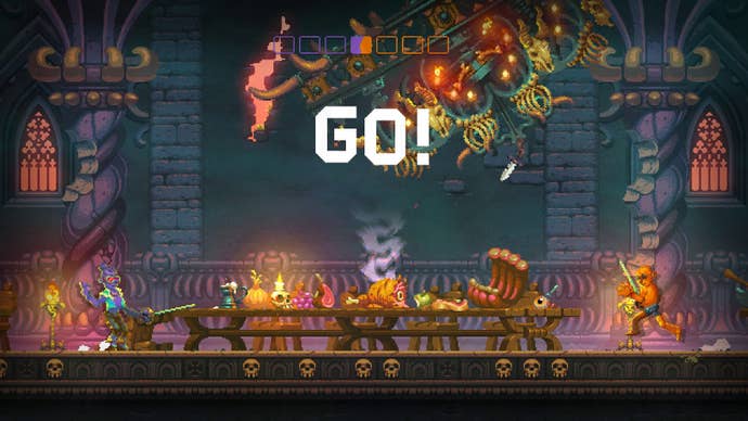
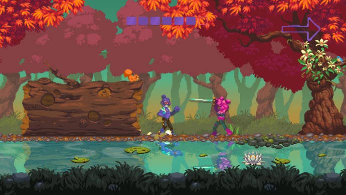
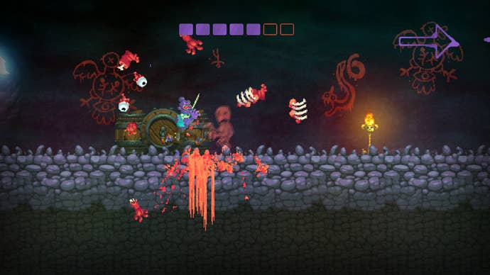
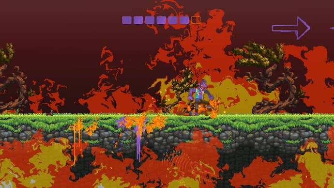
Compared to the minimalist pixel art of the first game, Nidhogg 2's art is all about growth. It's a game of flesh, of characters who are represented as bulbous bags of meat and blood waiting to be pierced, slashed, stomped, and eventually, eaten. The player characters, the eponymous nidhogg, and many of the stages feature an overgrowth of life to an almost cancerous degree. Blood flows from corpses like colored paint being thrown upon walls and floors.

Some are turned off by the art, but I think it ultimately feeds into the overall style of the original game. I mean, the original point was to duel another player for the right to throw your body into the waiting maw of a giant worm. We were already in weird territory, our wallpaper just matches the rest of the twisted house now. If nothing else, it feels like an interesting direction for the franchise and I hope a potential Nidhogg 3 sees as big a change.
With the new style comes more detailed characters. Nidhogg 2 has a rough character creator, letting you build your duelist out of various skin colors, torsos, legs, hairstyles, and accessories. Unfortunately, you can't save a look and you never really feel attached to any particular avatar. I generally just hit the "Mix" option and let the CPU choose my look for me.
The basic idea of Nidhogg hasn't changed from the first game. Each match is still two players dueling through a series of connected screens, with the aim of reaching the final screen opposite themselves. You kill your opponent not to gain points, but to give yourself the momentum and take them out of the match long enough to move towards your ultimate goal. Nidhogg was a game of deft precision. You had one weapon and four levels which were largely the same; it was a matter of learning the details of the fencing system and various dodges.

Nidhogg 2 expands upon the formula of the first game, but that expansion slightly morphs the focus. There are now four different weapons: fencing foil, broadsword, dagger, and bow and arrow. Every time you die, you'll respawn with one of the other weapons. They play slightly different, with the foil still being a poking weapon, while the broadsword is all big slashing arcs, and the dagger requires a close-range stab to kill your opponent, but is faster on the attack. Then there's the bow and arrow, which offers a ranged attack without having to throw your weapon, albeit much slower than simply throwing your sword.
This adds a bit more strategy to the game, in that you need to counter the next weapon your opponent has or ask yourself if you want to die to switch weapons. What I found interesting though is the additional weapons make Nidhogg 2 a bit less about precision than its predecessor. That layer is still there, but the broadsword and bow and arrow allow for more wild play. Add in the fact that players can drop weapons upon death and you have something that comes across a bit more chaotic and arcade in style. If I had to guess veteran Nidhogg players may dislike the change. Precision parries are still here, but I found that most people won't really play that way online. Nidhogg 2 is more accessible than the first one was, though I don't know if that's for better or for worse.
Adding to the chaos is the wide spread of levels. Nidhogg 2 launches with ten levels in total: Castle, Beach, Wilds, Airship, Winter, Swamp, Dungeon, Clouds, Volcano, and Club. Not only does each level have its own distinct look, from the neon-soaked color of Club, to the airborne slaughterhouse of Airship, but each level also has different layouts and obstacles. Parts of Volcano have you fighting above moving conveyor belts of lava, while the early platforms of Winter sink under the weight of two players, and the tall grasses of the Wilds can hide your future moves. The levels add variety the game was missing in its first iteration.

Prior to matches, you also have the ability to set a timer, turn off one or all of the available weapons, or set a number of other match conditions. These conditions include Baby, which forces both players to crawl; Low Gravity, which gives your jumps an extra boost; and Boomerang, which see weapons return to you when thrown. Again, these options are about adding variety to Nidhogg 2's basic duels and longevity to the game overall.
In the end, Nidhogg 2 hasn't stopped being about the fast and frantic fights, whether that's in person or online. Couch and local co-op is still a blast. Online netcode is better this time around, though I still had the occasional issue here and there. Without using Discord or Skype though, there's something missing from a great duel. (The screams of your enemy.) Arcade is more of an extended tutorial, taking you through fights in each of the game's levels; there's no difficulty selection and the AI is only okay.
But when it's you and your friends, opening up each other's guts and smashing heads into paste, you'll remember why you play Nidhogg in the first place. It's the first game with a little more love, which is sometimes all a sequel needs to be. I wish the game had perhaps a little more in the way of weapons and other gameplay modes, but I can't fault what's here too hard. Essen said he wanted a "different version of Nidhogg". I'd say he succeeded.
SoundIt's worth noting that the soundtrack is great, but it's a separate purchase from the main game. Buy the bundle if you want the full Nidhogg 2 experience.
ConclusionNidhogg 2 is a worthy update to the minimalist dueling action game. Messhof offers a follow-up with a wildly different art style, more weapons, more levels, and more options for playing with your friends. The game overall feels a bit less precise, but this is still Nidhogg at its core.

