The new Nvidia App is a brilliant new unified graphics settings powerhouse - and it’s out now
I can’t believe I’m excited about a PC settings app, but here we are. Nvidia’s new software is an excellent much-needed upgrade.
I’m hesitant to use the word ‘exciting’ when I’m talking about a piece of PC software that simply facilitates playing video games when I’ll be careful about how I use that word even describing actual full-blown video games. But we are where we are, and I have to embrace my inner saddo - so here it goes: I’m really, really excited about Nvidia’s new settings app on PC.
Simply titled the ‘Nvidia App’, this all-in-one setup aims to replace the old ‘GeForce Experience’ software - and the official 1.0 version of the app launches today. In fact, by the time you’re reading this, it’ll be available via the usual official channels - but I’ve been road testing the new software ahead of release.
The logic is pretty simple; the app has been designed to offer up a single, unified place for settings. Within the Nvidia App you can tweak settings for games and programs, install driver updates, fiddle with display settings, track or limit performance, and more. It aims to have a higher level of utility than Nvidia’s previous offerings, but arguably its biggest success is in how much tighter, clearer, and cleaner it is than anything that came before.
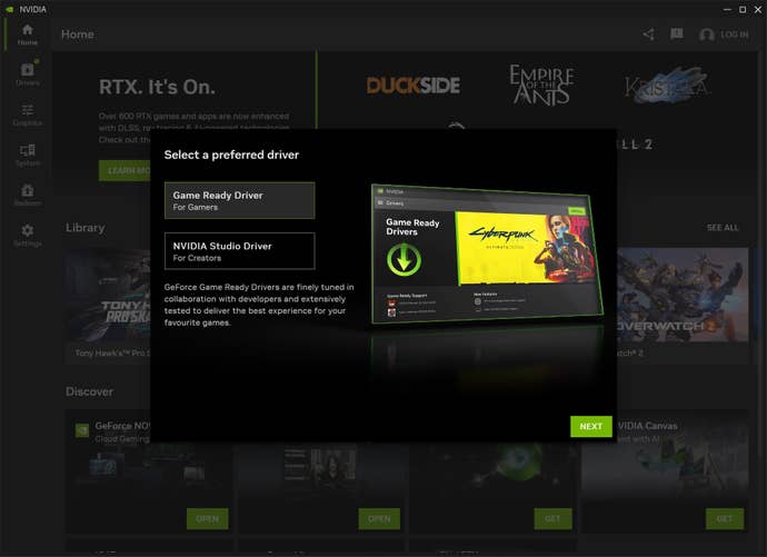
The first positive signal comes when you first boot the application, pitching a simple question: are you using this for gaming, or productivity? With this one choice, the app immediately reorients what it presents you with, making sure the settings that actually matter for you are front-and-centre. Once you’re in, it continues to be nice and clean.

I’m impressed by little things, like how the home screen has instant download links to the various other spears of the Nvidia portfolio. Before, I’m pretty sure that installing the hugely useful Nvidia Broadcast app required browsing to Nvidia’s website. If it was available in GeForce experience, it was buried away.
Here, the link to download this must-have application that uses your GPU’s power to clean up your outgoing audio or video for streaming or discord calls is right there in the homepage of the same app you’ll use to tweak GPU settings. The same is true of best-in-class cloud gaming service GeForce Now, performance measuring tool FrameView, and other tools - including various AI-augmented apps Nvidia is presently going big on. Once each app is installed, those home screen buttons instantly open each of them - another small but welcome change.
A lot of how the new Nvidia app pleases is in the little things. It’s snappy. It’s sharp. It looks good. It’s got a higher level of utility to it than GeForce Experience, which always felt like its utility was sacrificed in the name of being more explicitly ‘gamery’. Utility comes first here.

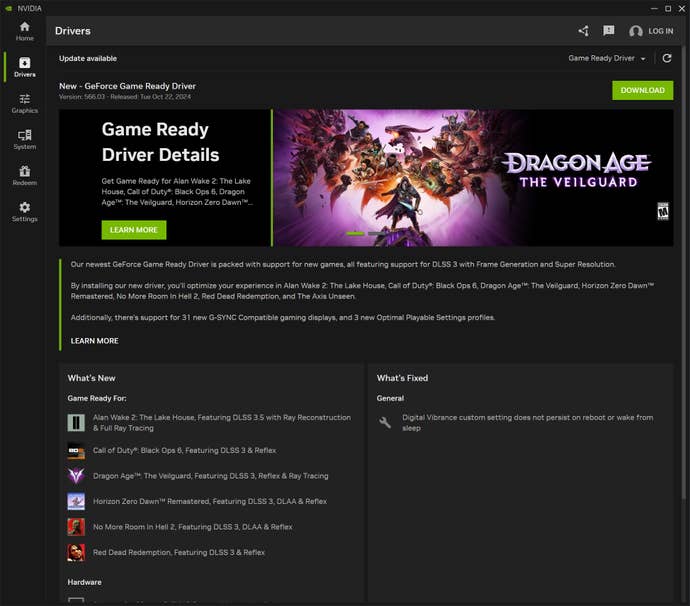
I particularly enjoy the clean and enlightening presentation of the driver installation screen when new drivers are available. In a ‘Whats New’ section, you’re told in brief exactly which games the new drivers are optimised for, even represented by little icons. Opposite, ‘What’s Fixed’ enlightens bug fixes. I basically never read GPU patch notes - but the presentation here is such that I’ll likely skim this every time.
Gone is that bloody awful overlay that you’d use to trigger game recordings and such by pressing alt-Z. In its place is a sleeker new overlay that only covers part of the screen, sliding in from the left. It carries over the design language of the main app - which is to say it’s better, clearer, and simpler to use.
I like that a handful of settings previously buried in the more nuts-and-bolts Nvidia Control Panel are now available here - though the control panel remains available, an untouchable barometer for all graphics settings. But really, most of the time, standard users should only need this new Nvidia app. Crucially, I’ve noticed no performance difference after switching from GeForce Experience - so this snazzy new setup isn’t having a performance hit.
I’ve got to be honest here: it all just looks and feels a hell of a lot better. There’s a lot to be said for an application like this that, to steal a phrase from Steve Jobs, “just works”. This thing isn’t the reason you boot your PC; it’s a means to an end. It’s a way of ensuring your games run the best they can. It is a utility. This redesign feels like one that puts that utility first - and I, honestly, am here for it.
I won’t miss the old GeForce experience. This app has already usurped it for me, even in its very first iteration. Hopefully over time things like Nvidia Broadcast can be integrated more directly into the app so they don’t operate as discrete applications. But even where things run separately, they finally feel more unified and cohesive. It’s a huge win. The app is out now - so head to the Nvidia site and get downloading.

