Konami's NES Box Art: So Good, So Bad
Konami deserves to be singled out in the grand, ongoing discussion about video game box art -- though not always for the best reasons.
This article first appeared on USgamer, a partner publication of VG247. Some content, such as this article, has been migrated to VG247 for posterity after USgamer's closure - but it has not been edited or further vetted by the VG247 team.
Last week, I singled out some of the best box art adorning NES games. Being a clever and astute bunch, many of you noted that games by Konami (and its subsidiary, Ultra Games) rightfully featured prominently in the line-up.
We're all in agreement that Konami deserves to be recognized for its work. The studio knows there's enormous marketing power in box art, and it took the time and care to dress up its games in technicolor dream coats. Moreover, Konami's games usually lived up to the amazing experience portrayed on the front of those iconic silver boxes.
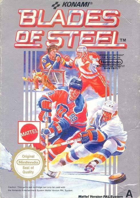
But while Konami's box art became famous in the '80s for being good, it gradually became infamous as the information highway hooked gamers together in the '90s and early aughts. Much of Konami's box art, especially the early stuff, straight-up lifted heroes, monsters, and scenes from paintings, book covers, and action movies.
Even when Konami didn't engage in the artistic variation of Finders-Keepers, its box art sometimes turned out a little weird-looking, or promised experiences that weren't in the game – though that usually wasn't the fault of the box artist.
Let's continue our NES box art appreciation by breaking down the good, bad, and "???" of Konami's packaging.
Castlevania (1986)
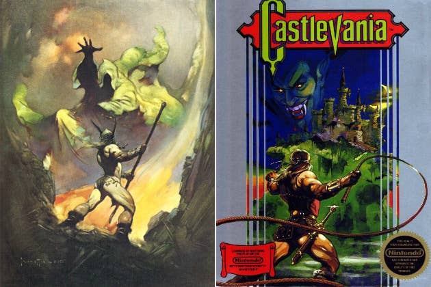
Shout-out to Arcade Sushi for pointing out how closely the box art for Simon Belmont's inaugural vampire-shredding adventure mirrors another work of fantasy. The Norseman, a classic '70s painting by Frank Frazetta, was obviously the inspiration for Castlevania's box art.
I think "inspiration" is the key word here, though. It's not uncommon for artists to use references in this way (though citation is customary), and the Castlevania box art still carries its own style and message. Not to far down the road, we'll see Konami basically break out a transparent cell, slap it on someone else's work, and whip out a Sharpie.

Castlevania II: Simon's Quest (1987)
Here we go. I remember discovering Konami's thievery with Castlevania II: Simon's Quest without the aid of the internet. A friend of mine had the Ravenloft Dungeons & Dragons module that served as the, um, basis for Dracula and his castle on the Simon's Quest box art. I was confused, to say the least. I initially thought it was a coincidence, even though it's clearly not.
I'll say this much for the artist, though: The box for Simon's Quest is seemingly a free-hand copy, not a trace. The gargoyles beside each box's respective vampire is the proof. The gargoyle next to Ravenloft's Count Strahd von Zarovich has details that Dracula's stone pal lacks, such as nostrils and scales.
My best guess is that the artist for the Simon's Quest box eyeballed the Ravenloft cover, guessed the statue next to von Zarovich is a griffin of some kind, and drew the creature accordingly.
Metal Gear (1987)
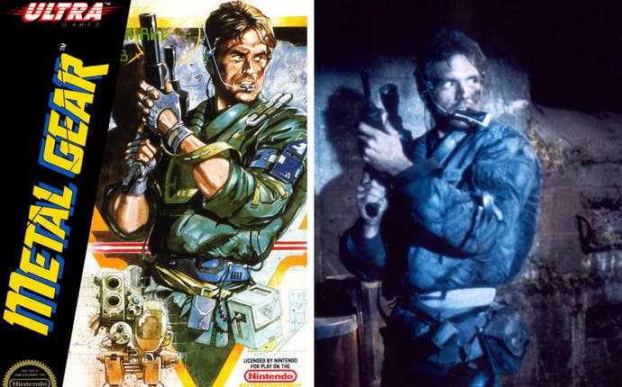
Hail the King of Trace Town, baby. Solid Snake started life as Kyle Reese from The Terminator. Man, Snake's been through it all. Killer robots, time travel, deception, rapid-aging viruses, and torturous plot threads capable of choking a moose. No wonder he's always so pissy.
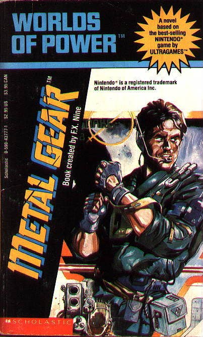
Snake Reese also features on the cover for the FX Nine novelization of Metal Gear. Guns, knives, and the occult were disallowed in the merry world of FX Nine, leaving an empty-handed Snake to make "an inexplicable jerk-off motion" for eternity.
Long-time games writer Scott Sharkey penned that metaphor ages ago, and I never forgot it. I wonder why.
Contra (1988)
Ah, Contra. How can a humble artist hope to convey such action gaming perfection in a single still image?
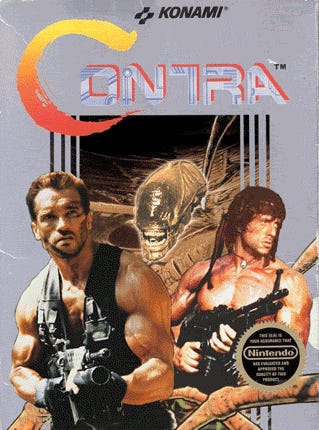
Eh. Why try. Just get Arnie from Predator, Rambo, and an Alien up on there. Great. Done-zo (Gif source).
Bayou Billy (1988)
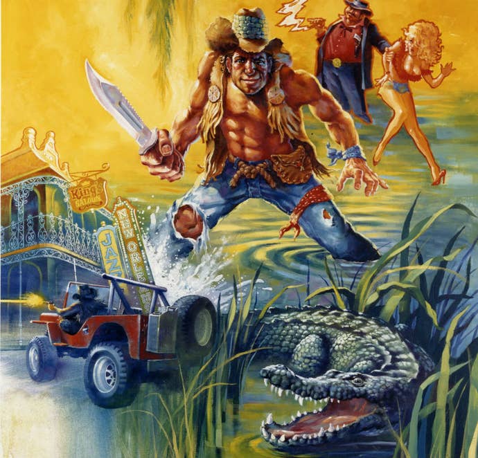
Konami / Ultra stopped its copycat shenanigans in the late '80s, which is coincidentally when it brought artist Tom Dubois on board. With Dubois behind the easel, Konami's box art entered a golden age. When I highlighted NES boxes last week, I mentioned how Castlevania III is one of my all-time favorites. That's Dubois' work.
Dubois still had occasional off-days, though; something evidently went terribly wrong with Billy's neck on the Bayou Billy box. He looks like the product of a jock and a cheerleader who neglected to see the "IRRADIATED LAND – DO NOT ENTER!" sign before getting down to secretive reproductive business behind the abandoned power plant.
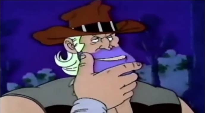
Nature and radiation were still more merciful to Bayou Billy than Captain N's animators, though.

Teenage Mutant Ninja Turtles III: The Manhattan Project (1991)
A few people told me my NES box art round-up should have included Michael Dooney's work for the criminally underappreciated Ninja Turtles III. Indeed, the box deserved to be on the list. It's great.
Why's it parked on this call-out post, then? Mainly because there's a Triceraton on the box, but no Triceratons in the game. That sucks; I love Triceratons.
I don't blame Dooney for the mix-up, though. According to Box=Art's interview with Dubois, Konami expected its box artists to do a lot with very little source material, mainly Japanese VHS recordings of gameplay. Chances are excellent Dooney had no idea what The Manhattan Project was all about, so he simply did his best to make cool art for a Ninja Turtles game. At that, he succeeded.

