Hello. You are currently reading an article on the new look VG247. Welcome!
Step into a world of wonder that is our brand new site.
It seems a little pointless to regale you with a wonderful tale of the new site's inception and design, mostly as you probably don't care, but as this is VG247's first proper redesign in about two console generations, I'm going to indulge myself.
Our story begins way back on Tuesday, December 15, 2020, between the hours of 10 am and 11:30 am GMT, when I attended a meeting called "VG247 redesign kickoff." This was where I came up with the idea that the new VG247 should be a website that looks good on monitors and phones, and should be about video games.
I elaborated, adding that the website should "look nice" and "have pictures on it" and that it "should probably have a new logo that looks cool." These thoughts combined were, unknown to those witnessing history in the making at the time, to become known as the greatest ideas in the history of our parent company ReedPop and, long story short, are the very reason this new website exists in front of your eyes.
What a story, eh? Hopefully you can agree that the tech and design team here did a great job running with my incredible design insights.
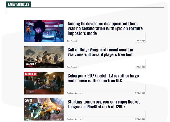
My hope is that you agree that we've created a bold yet welcoming new look for VG247, one that reflects the tone of the content you'll be reading. We want to foster a community that is engaged and wants to be part of the endless conversations around the latest video games. If you just want to see all the latest content, we've got a page for that, too.

I'm old, so my immediate touchpoint was video game magazines. Magazines, especially back in the 90s, felt like clubs. This was despite not having live comments. I felt like I was part of the Mean Machines club, I knew the in-jokes in N64 Magazine, and I enjoyed the rivalry between PC Gamer and PC Zone. I think we've tapped into that with the site's look, but I want you, readers, to feel like that here.
Our new comments system is tied to user accounts now (which once you’ve signed up means they’ll also work on our sibling sites like Rock Paper Shotgun, and eventually Eurogamer), and we've got a way to support us with cash in exchange for an ad-free browsing experience. No worries if you're not keen to make that step yet, but I want to convince you that we're worth it over the coming months. Subscribers will also get a monthly email newsletter thing from me, which is sure to be a thing of sheer wonder and delight.
You might have already seen the new video content we've been putting out, and this will continue and be front and centre, giving you more of us and our good/bad opinions. And we'll launch a proper podcast soon, too.
This is all just the start of what is a big longterm project to make VG247 your primary destination for video games discussion. That might be for you to get our searing hot takes on various topics, or it might be because you want to weigh in yourself.
Sign up for a free account now and let us know what you think of the site's new look. But please don't post to say you preferred the old look. This kind of comment will immediately flag you in my mind as someone with bad opinions and also isn't helpful in any way as we're not going back to that Wordpress hackjob. "Wow, Tom, you look so good in that photo that definitely wasn't taken three years ago," and "VG2Phwoar7, more like," are both preferred comments if you're struggling for ideas.

