Has Call of Duty: Infinite Warfare's cover art been changed to be less sci-fi?
Less space stuff and more focus on men with guns?
Has Call of Duty: Infinite Warfare's cover art been changed to be less sci-fi?
It's no secret that Infinity Ward's decision to take the next Call of Duty, Infinite Warfare, into the future hasn't been very popular with fans.
The game's debut trailer is among the most disliked videos in YouTube history, and it continues to gain more dislikes. Though not exactly the most accurate of metrics, it does echo a general resentment of sci-fi elements being included in a Call of Duty game.
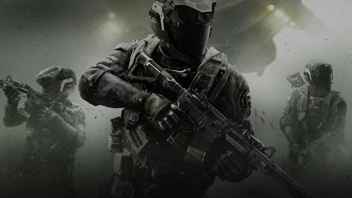
It seems Activision is taking steps to ensure this negative buzz doesn't eclipse the game's main message, as the publisher appears to have changed Infinite Warfare's key art.
The main art that was show when the game was announced featured a space craft in the background and the soldier can be seen holding a helmet that certainly gives off a sci-fi vibe.
Looking at the game's the official site, as well as some of the posters spotted at LA for E3 (via Charlie Intel), it's clear there is new art being used in advertising.
The new posters show soldiers in a more prominent way. The weapons they carry also appear to be modified versions of modern-day M4s. The airship remains, however, though it's obscured more. The new art defintely gives off a near-future vibe instead of full-on sci-fi.
See for yourself.


