I'd forgotten how stylish the original GTA: San Andreas was until the latest Definitive Edition update
Ah yes, this game had what the kids call 'aura' these days.
GTA: The Trilogy - The Definitive Edition's launch in 2021, three years ago, was infamously rough. From badly upscaled textures, to shoddy character models, to broken animations (and plenty more), the three games that defined modern open worlds were butchered. Now, Rockstar Games has wowed everyone by pulling off a complete 180.
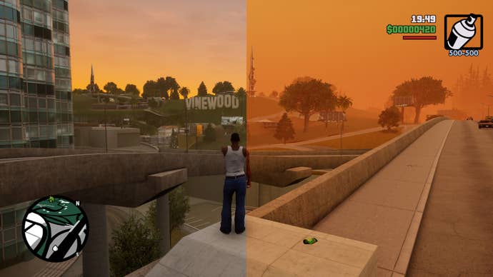
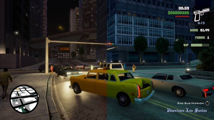
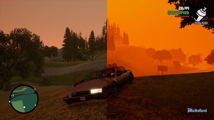
The November 12, 2024, update to the Definitive Edition collection across PC and consoles (with the old gen and Switch getting it a day later) doesn't just fix a lot of what was broken. It also brings back the classic lighting (now enabled by default) that tied the entire visual presentation together in the original console releases.
I promptly jumped into GTA: San Andreas, the one installment I'd been meaning to quickly revisit for a while, to check what was new, and found myself quickly absorbed by its world for a couple of magical hours during which, as it was back in my high school days, I barely made any story progress. Just driving around and enjoying the refreshed vistas was a blast from the past.
I've actually played a lot of San Andreas over the years, but mostly on PC through the original release from 2005. That version was always regarded as the most solid one (plus it nurtured a vibrant modding community), yet it always missed the vibrant color hues from the OG console versions, and thus felt far flatter visually, or at least more 'realistic' in a way that felt weird for anyone who'd played the 2004 release on PS2 (or later on Xbox).

For some weird reason, despite all the ports and re-releases the classic GTA trilogy has enjoyed over the years, Rockstar has always managed not to deliver an 'ultimate' way to enjoy these games. The original console releases has a framerate which was rough and could only be 'fixed' through advanced emulation. The aforementioned PC port wasn't exactly the same, something and that also applied to GTA 3 and Vice City. Later ports in modern consoles always screwed something up, with the 360 one being the sole exception. And you know how the Definitive Edition originally went.
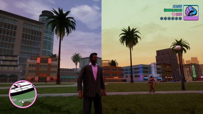
Now, with original developer Grove Street Games removed from the collection's credits and Video Games Deluxe taking over, the Definitive Edition feels several steps closer to definitive. The vibes are restored, and even if you could argue the modern lighting looks better at times (especially at night), restoring the fog and giving each city its own unique weather and set of skies, alongside much-needed color grading, has truly made a world of difference.

After so many years playing the PC version of San Andreas, I'd simply forgotten how great the true original release looked. Sometimes (far too often, I'm afraid), in the pursuit of a clearer image and realism with remasters and remakes, a good chunk of the original artistic vision is erased, and the Definitive Edition collection was a prime example of that. Even if it had felt okay-ish for a while now - as in not utterly broken - this giant rework and visual refresh is a reminder of everything that was lost.
Los Santos simply 'pops' in a way that a brutish approach to more modern graphics couldn't achieve, and it was just a matter of getting the colors right and that moody fog back in the game. Perhaps younger players who never played the original releases will be turned off with the highly saturated look that San Andreas sported back in the day, but it's hard to back to a sauceless visual presentation after realizing the older GTAs were never meant to look clean or realistic. After this patch, looking at the upscaled textures and UE4-rendered models that still remain rusty as hell through the very de-saturated modern filter is hilarious, and I can't believe we've been stuck with these bangers looking like that for so long.

Mind you, I'd already warmed up to at least Vice City Definitive in recent times, as that game and GTA 3 always felt far less post-processed, yet this patch also made me realize they were missing an extra 'otherworldly' spark. Now, the modern lighting also looks way too clean on them, with the lack of a misty horizon making their admittedly small maps feel even smaller. I don't want the full thing rendered on my screen at once, it was never meant to look like that!
Other small but welcome improvements include walking around while aiming heavier weapons than pistols and submachine guns in GTA 3 and Vice City, which essentially makes many of their missions easier, but it's all in the service of making the right upgrades where needed, which should be the main driving force behind every remaster. Preserve the past while preparing the games for the future...without diluting their identities.

I'd say this Definitive Edition is still a couple of smaller patches away from reaching perfection, and it's hard to predict whether Video Games Deluxe will stick to working on it for much longer, but it's suddenly become an easy recommendation for old and new players alike. As long as you overlook some leftover jank and a few plasticky, too UE-ish textures, this feels like the best, most painless way to experience these games two decades after their original launches.
The most hilarious thing about this whole story is that we have to thank the recent Netflix port (yes, really) of the Definitive Edition for these updates to the console and PC releases, as most of the new improvements have been brought over from that version. Gaming is so freakin' weird right now, man.

