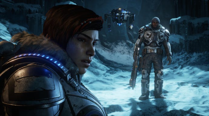
Gears of War 2 and Gears 5 comparison shows major differences between the small details and 2 comes out on top
While graphics keep getting more and more impressive, physics and reactive worlds either seem to be stalling or going back in time.
Physics effects are computationally expensive, which is one reason we’ve seen things degrade on that front. You can’t show off reactive worlds on box art or in screenshots, but you can show painstakingly-crafted character models rendered at 4K.
It seems to be the way the industry is heading, where surface beauty trumps everything else. Last year I interviewed a bunch of developers about this trend if you want a bit more insight into how physics interactions aren’t as important to developers these days.
Looking at Gears of War 2 on Xbox 360 compared to the recently released Gears 5 on Xbox One, the differences are stark. Gears of War 2 features destructible environments, allowing you to chip away at cover, or topple physically-simulated monuments. It has glass that shatters where you shoot it. Gears 5 just has bullet decals, the occasional destructible prop, and has glass that pops in one go if you even look at it funny.
Gears of War 2 also has a lot more weight to it, both in how the camera reacts and how enemies and player characters react to gunfire. There’s even much less detail in Gears 5 when it comes to blood, which vanishes seconds after it hits the floor in Gears 5.
Have a watch of this Crowbcat video to see the differences yourself:


