From PS1 to PS5: A Brief History of the PlayStation Logo
The PS5's new logo isn't groundbreaking, but there's value in sticking to what works.
This article first appeared on USgamer, a partner publication of VG247. Some content, such as this article, has been migrated to VG247 for posterity after USgamer's closure - but it has not been edited or further vetted by the VG247 team.
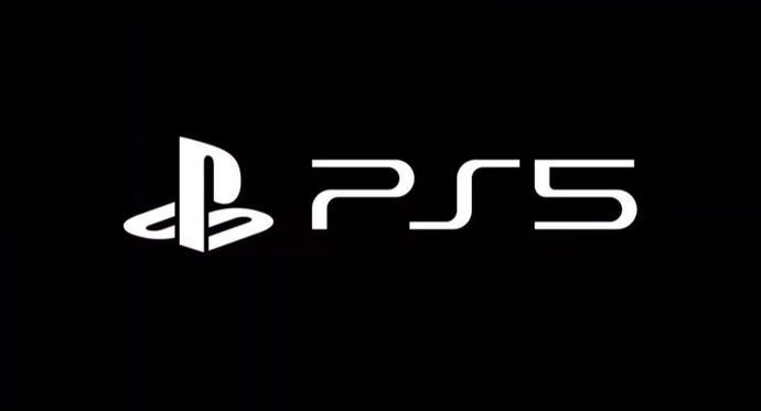
At Sony's CES 2020 press conference, the world got its first look at the PlayStation 5's logo. While showing off a logo—and one so similar to the PlayStation logos in use for the past decade—doesn't have the same "wow" factor as Microsoft's recent unveiling of the next Xbox, Sony's conservative design choice does give us one vital takeaway. No matter how different the PlayStation 5 ends being from its predecessors, Sony's vision for the console evidently hasn't forced a major reconsideration of its brand.
With one notable blip in the mid-to-late 2000's, Sony's PlayStation branding has followed a straightforward trajectory and settled into something that, for better or worse, endures. Where Nintendo tends to come up with new, evocative console names and Microsoft tweaks logos while ascribing obtuse meanings to added numbers and letters, Sony mostly prefers to keep things simple. Here's a brief rundown of how the visual branding of PlayStation products has evolved over time:
The Nintendo PlayStation Prototype
Before Sony set out to make its own video game console, it produced this prototype with Nintendo: a "PlayStation" system with a compact disc drive and a slot for Super Famicom games. Thanks to Dan and Terry Diebold, we got our first glimpse of the legendary prototype system in 2015, as well as what could be considered the oldest-known PlayStation logo. On the Sony-branded controller, you can clearly see a monochrome rendition of the Super Famicom logo next to "PlayStation," written with the characteristic intercaps but not in what would become Sony's standard font for the full wordmark. It can be a little hard to make out in photos and videos of the prototype, but the easiest way to tell the difference is that the horizontal line of the lowercase "t" extends out to the left.
The Original PlayStation Logo

Designer Manabu Sakamoto's original multicolor logo provides the most prominent pop of color on Sony's first PlayStation model, and its isometric "S" beat the Nintendo 64 to its 3D iconography by a few years. Though Sony later ditched the four-color variant on standard consoles with the PlayStation 3, it's been embraced by streetwear fiends and has even made its way to official Sony retro colorway Nike sneakers. For the 20th anniversary of the PlayStation, Sony also manufactured a limited run of 12,300 PlayStation 4 consoles that bear Sakamoto's red, yellow, green, and blue icon.
As an aside, the slim model PS one is the only PlayStation design refresh to ever get its own one-off logo with a different typeface and a spelled-out number.
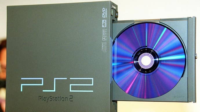
The PS2 Gets An Angular Logo

While subsequent riffs on this logo lost the gradient, gained some thicker lines, and rounded off those sharp 90 degree angles, the "PS2" shorthand is second only to the main logo in terms of enduring PlayStation design elements. Given that the PlayStation 2 is still the best selling console of all-time, this has to be one of the most iconic branding marks in gaming history. The same sharp three-character configuration was also adopted for the PSP and the PSX hybrid video recorder and console.
That all said, it'd be a no-brainer to stick with this for the next console, right? Well...
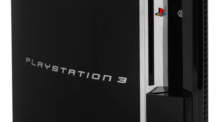
The PlayStation 3 Goes 'Spider-Man'

At launch, the PlayStation 3 had some big problems. The cheapest version cost $499; a lawsuit over vibration tech led to the disappointing Sixaxis controller, and all the talk of the cell architecture caused headaches for developers. There was also that odd typface. Then-president of Sony Computer Entertainment Ken Kutaragi reportedly pushed for the PlayStation 3 to use the same font as Sony's Sam Raimi-directed Spider-Man films even before the design of the PlayStation 3 console itself took shape. Whether or not you hear Tobey Maguire say "pizza time" whenever you look at this logo, seeing it really only invokes one of the lowest periods for the PlayStation.
Keeping It Short And Sweet

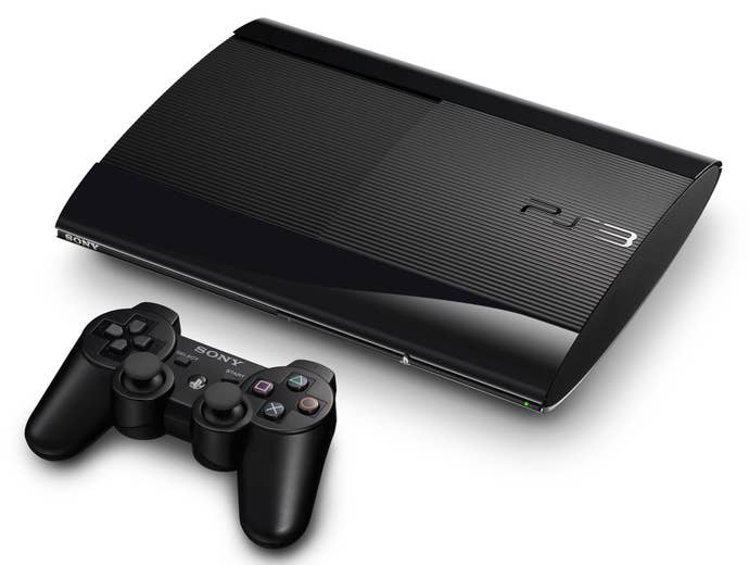
Finally, with the release of 2009's slimmer PS3, Sony adopted the revised take on the PS2 logo that it has used on its consoles (and adapted for the PS Vita) since. As many people have joked since the reveal of the PS5 logo, using the same logo for over 10 years doesn't scream "creativity"—but on the flipside, there isn't anything all that bad to say about it beyond "it's the same as it's been." Given that Sony has had a far more successful run with the PS4 than it did in the previous generation, there's a clear argument to keeping the naming and visual branding close to what's been established. Why rush to sell people something new and potentially alienating when they may prefer a continuation of what they already like?
Even though it seems increasingly likely that the next-generation of consoles is poised to bring an end to the very idea of rigid hardware generations, Sony's established naming and branding don't immediately seem at odds with the idea of more continuous refreshes. As with the monolithic impression left by the next Xbox, the really curious thing to see will be whether or not Sony shakes up the appearance of the PlayStation 5 or sticks with a design more suited to peoples' home entertainment centers. The real heart of the matter—and why people would be quick to joke about a logo reveal, even if it was drastically different—is that what the PlayStation 5 does matters most, not what's written on the box. If it's good for Sony that people are already intimately familiar with the PS5's branding, then the trick is making a console that feels worthy of it.


