Fortnite Android review: a few building hiccups can't hold back the best battle royale game
Fortnite has finally reached Android devices.
There’s a catch, however; you need to own a Samsung device. Yesterday afternoon, chatter began to develop on Twitter that the .APK file for Fortnite was available from the Samsung store and the Epic Games website. For now, this is the only way Android owners can play the Battle Royale as it's not on the Google Play store. The good news? It’s Fortnite and everything that comes with it, from emotes to gunplay. The bad news? Unless you’re playing on a stable wifi connection, the game suffers quite badly from lag, texture pop-in and rubber-banding.
Playing at home, from the comfort of my bed, the game is butter smooth. Occasionally other players will judder as they move, but for the most part the mobile version plays much like the Switch version. Later, sat in a café using only my data, the game would regularly pause every 20-30 seconds for a few beats. Upon the servers catching up I’d find myself facing a random wall or trying to leap over a bus. The game hasn’t been out for 24 hours yet, so this issue may very well be ironed out quickly by Epic who are sticklers for quality.
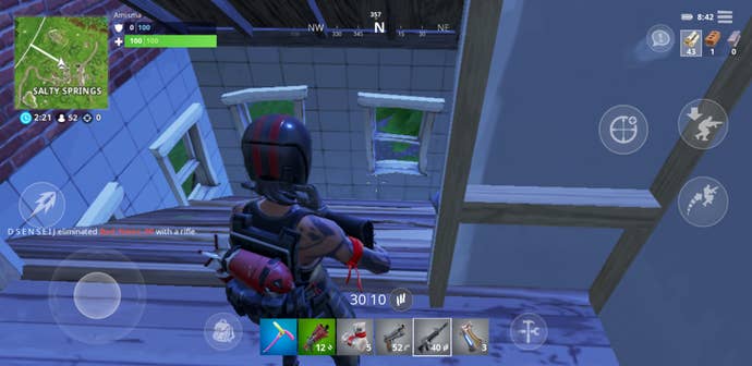
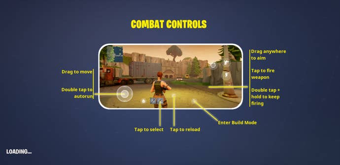
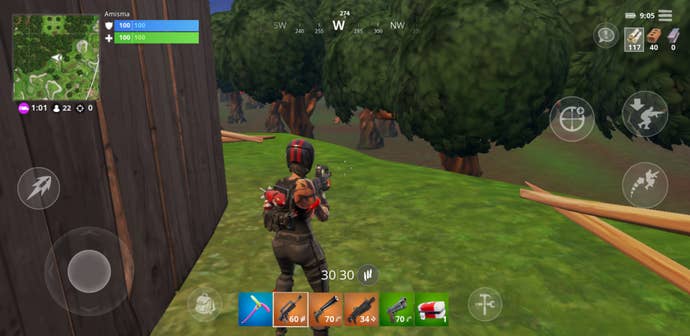
Away from connection issues, the game is exactly the same as on console, PC and iOS. Taking note from the mobile version of PUBG, a virtual stick is used for movement, while you drag the screen to look around. A dedicated shoot button sits just above the movement stick, which seems an odd placement, but tap on the screen to fire a weapon, hold it for continued streams of bullets and this feels a lot more comfortable. On the right, you’ll find an icon for jumping and one for crouching which feel intuitively placed. There’s also a crosshair icon which, when tapped, looks down the sights of the gun.
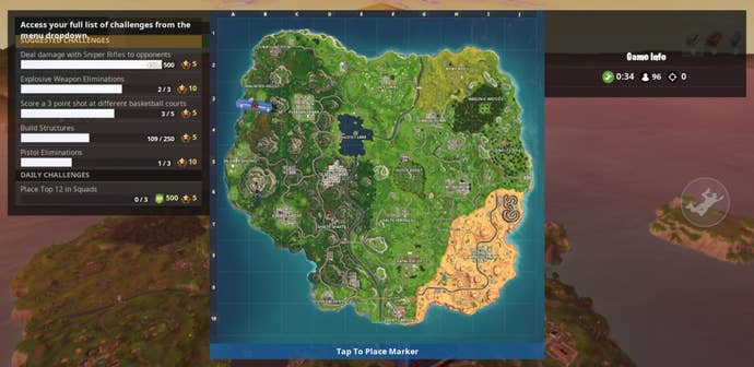
The map sits in the upper left corner – tap it to open and tap on the map to drop your marker. The health and armour bars sit next to the map at the top of the screen, because the lower edge is dedicated to loadout. There doesn’t seem to be any options to move around the placement of the icons, though inverting look, adjusting sensitivity and toggling auto-open for doors are all in the menu, as normal.
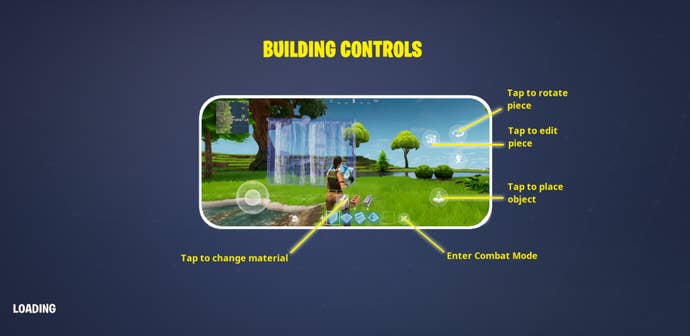
One of the crucial parts of Fortnite is the building, but unfortunately this is probably the most awkward aspect of the mobile version. The loadout bar at the bottom of the screen can be tapped to select weapons, and beside this is the icon which switches the loadout for the building menu. It’s worth noting, that nothing is removed – everything you expect from the menus on PC or console are here. But the actual act of building doesn’t flow as well as other platforms. There seems to be a very slight delay between pressing the build icon and the ramp, platform or wall appearing. It takes a lot of getting used to and you can see this in the players around as people grind to a halt to juggle their building options. Don’t expect outlandish build-offs just yet.
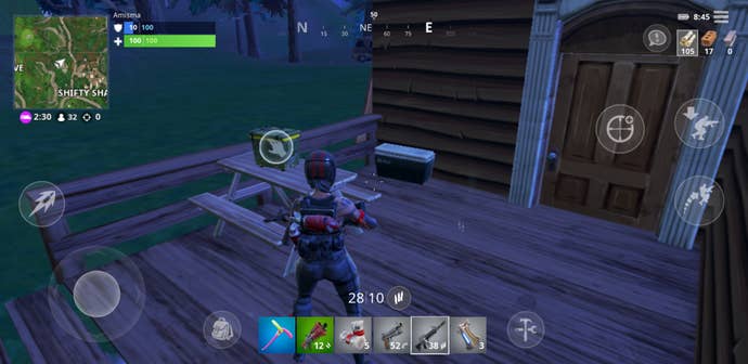
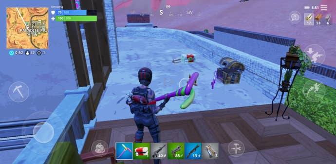
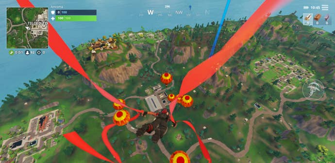
Of course, with fingers all over the screen, the experience is a little stilted compared to elsewhere. And, at times, the screen feels a little cluttered. An example of this, open a chest (just tap it) and an ammo crate and suddenly the screen is covered in icons indicating that a tap on any of the loot will pick them up. This causes a slow-down in play as you tap through the loadout to juggle items, but I found times where I’d have to realign my view otherwise I’d open my backpack or build menu rather than pick up the ammo or bandages at my feet.
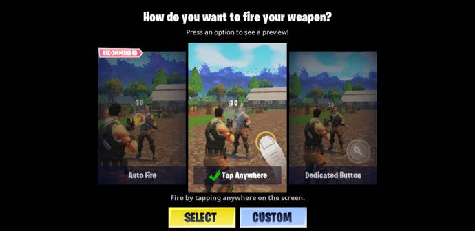
But it is remarkable that the game plays so well and Epic have implemented a lot of small additions for ease of play. As with other platforms, you can auto open doors and chests, running over loot drops to pick up everything automatically. Interestingly the developer has added an auto-shoot option, which targets opposing players and shoots for you. This will help those who feel overwhelmed by the many icons on screen and of course offer accessibility for many. The three shooting modes are; auto fire, tap anywhere or a dedicated button.
There’s no doubting that the game looks great. Options can change the graphics quality from low to high and you can lock the framerate at 30fps or 20fps to improve performance. My Samsung S8 played the game nicely on high settings at 30fps. This is never going to be the optimal way to play Fortnite – if you have access to the game elsewhere that will stay your primary way to play.
But for odd games here and there, the mobile version is wonderful. Would you choose it over a Switch for portable play? Unlikely, but having the option is great and if you already have an Android phone in your pocket then it’s a no brainer to connect your Epic account and have a few games.
Of course, all of your progress from elsewhere is here. If you’ve bought a Battle Pass, then you can keep working towards unlocks while waiting for a bus. In fact as the game opens, it offers so many ways to connect your account from dedicated Epic sign-in to linking your Nintendo Account. Yes, it has a few flaws right now, which is to be expected, but you can bet that Epic is already hard at work to fix server delays, tighten up the lag and expand options for ease of play.
As the game stands right now, the maps are full of people, there’s no wait for matches to start, voice chat and cross-platform play are included. Mobile Fortnite could easily take over a lot of your screen time – for me a few matches used up around 10 percent of my battery from a full charge, but this will fluctuate with settings and whether you enable battery saving mode. You can expect a full fat version of Fortnite, but also expect a few hiccups along the way over the first few weeks.


