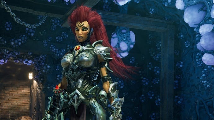
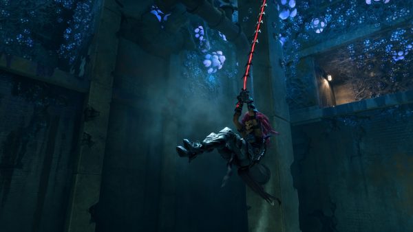
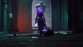
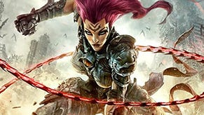
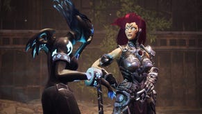
First Darksiders 3 screenshots show the art style hasn't changed, but the graphics certainly have
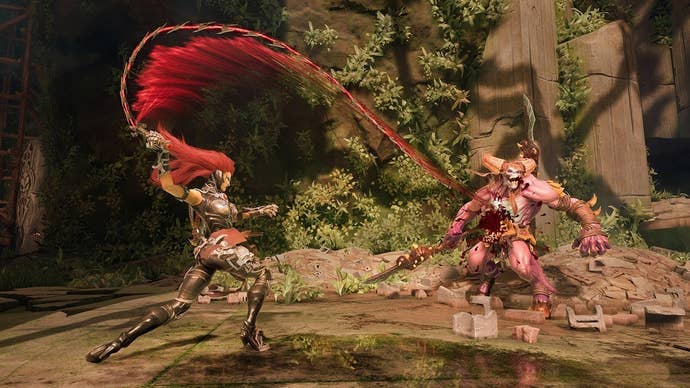
Darksiders 3 keeps the same general aesthetics used in the older games, but it looks much better.
Darksiders 3 was only recently announced, with a wonderful trailer, and we now have our first look at gameplay screenshots.
Thanks to an IGN preview, we have a better idea what the game is going to look like. As you can see, it's very much adhering to the same style set by the original games, and the preview confirms this is deliberate.


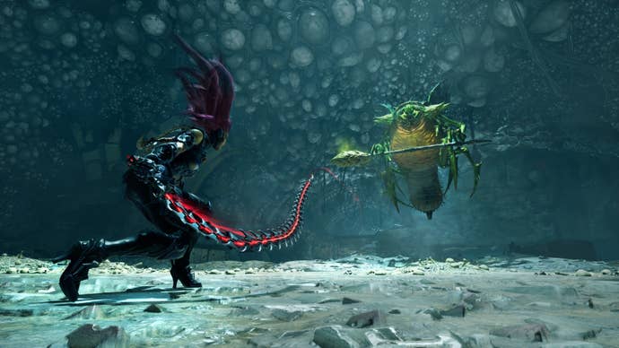
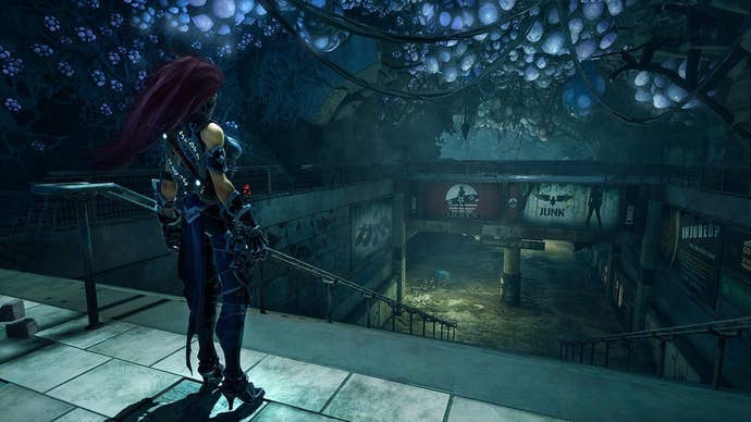
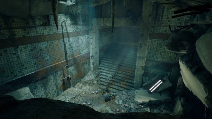
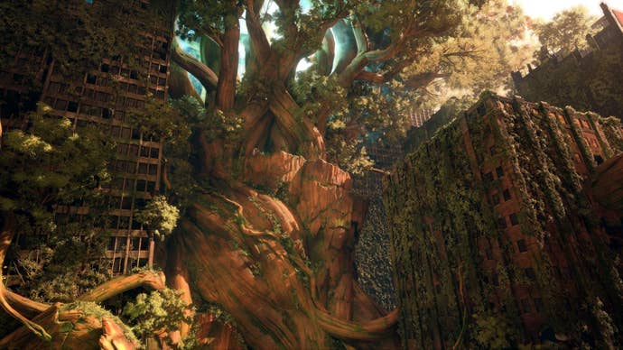
According to IGN, the world is fully connected, but it's also doing so in a logical way. You'll be able to see areas you explored in the distance when you're in a level that's supposed to be higher up, similar to the way it works in Dark Souls.
Enemies, too, will feel like they belong to their respective levels, and the traps and collectables will be hidden in a way that makes sense for the environment.
Darksiders 3 is out next year on PC, PS4, and Xbox One.
