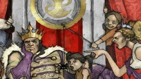
Fable III gameplay video: "Fable I and II were DOS; Fable III is Windows"
IGN's posted a lengthy video of off-screen Fable III gameplay, featuring design boss Peter Molyneux explaining the user-interface and how the whole thing's been upgraded from the endless "lists" of Fable II.
Get it after the break.
"On Fable I and II our GUI was lists of things," he said. "List after list after list of clothes and weapons and level-up things and abililty-spending stuff. What we realised is that, while core gamers are OK with lists, there are a lot of people that really can't be bothered to sort through 325 items to select the clothing they want to wear... They weren't using it at all.
"So we said, 'Right. Fable III. No lists.' Imagine Fable I and II were like DOS, where you had these scrolling things come up; Fable III is like Windows. Everything we had in a 2D list is now in the world."
You can easily see what he means in the footage below, as the players character runs around the world swapping clothes, and so on.
You can also see that there's hardly any furniture at all in terms of HUD.
Watch it. Pete's worth watching. Molyneux dropped a fair amount of new stuff on the game in his GDC session yesterday, including confirmation that John Cleese is to voice the butler, it'll have Twitter support and more.
It's out for 360 later this year.


