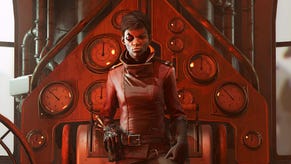
Dishonored 2's art director says there's "nothing" he would change about the extraordinarily beautiful stealth sandbox
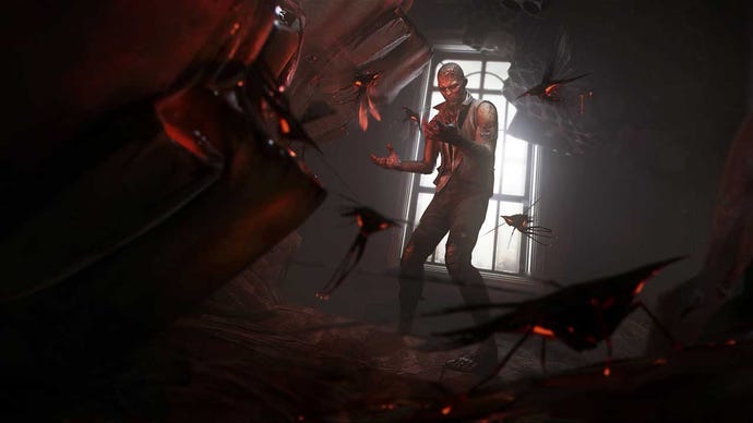
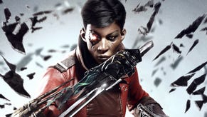
Dishonored 2 is an extraordinarily beautiful follow-up to one of the loveliest games of the last generation.
Dishonored 2 has three main characters, apparently. Emily, Corvo, and Karnaca, the primary setting.
This is a common marketing line in video games, but I almost forgive Arkane Studios art director Sebastien Mitton for using it in a chat with us earlier this month, not only because the landscapes are hugely important to a stealth game like Dishonored 2 but also because the sequel's environments makes such a leap on the original; of course Arkane wants you to notice.
"This is the first time I’ve reached the point in a project where there is nothing I want to change."
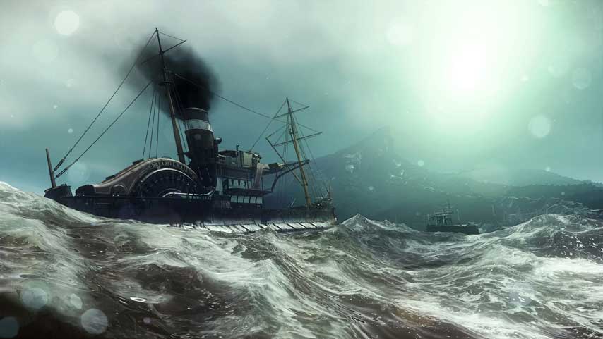
In the first Dishonored, everything outside the immediate mission area was fake - "a matte painting". In Dishonored 2, what you see beyond the areas you can reach is "real" geometry, built out with polygons. If you could get beyond the borders, you could explore it, and from the heights you can sometimes see where you've been and where you're going.
This change allowed Arkane to pull off some really neat effects in order to communicate the feeling of the city, Mitton told us.
"It's a real city and it allows us to cheat sometimes with the background, with the vista. It's like in the background of a movie where you change the focal point of the camera to make something in the background seem closer, you change the FOV. We’ve played with that and with the emotion," he said.
"Sometimes you see the mountain in the distance, that’s cool. Sometimes you’ve scaled that mountain and sometimes it's like wow – now it’s hanging over the character and just about to rain. It drives emotion. It’s a new tool."
In the first Dishonored, the focus was on using cover. In Dishonored 2, environments are more layered and complex, giving the art team scope for "some really cool stuff" like this.
Mitton said jumping to a new generation of hardware and new development engine (Void, based on id Tech) gave Arkane's art team the ability to show the city and characters the way he wanted, inspiring empathy and distrust where appropriate.
"We now have our own shaders where you can have light going through skin – sub-surface scattering. So if you have characters that go between you and the light source, you can see the red aspect of the hands and the ears," he said.
"It feels more realistic. It’s not photorealistic; it’s just that the hair shaders are cool. Same if you have light, it explodes in the air. We have a clothes system. It’s not that new for video games, but it’s still cool to have movement in the characters."
This glut of new graphical detail is found "in every corner" of Dishonored 2, Mitton said - just take a look at the ocean sometime, and compare it to the original Dishonored's static pools.
Although Dishonored and Dishonored 2 share a visual identity - exaggerated character features, an oil painting aesthetic, a distinct design flair in fashion and furnishings - Karnaca is an all new city and a warm southern capital, and the visuals reflect that.
You can see this difference in the game itself, as your character travels from grey Dunwall to colourful Karnaca, and for Mitton, that change was a challenge.
"It's hard to manage colours. It’s easy to work in black and white," he said.
"If you possess a fish and you enter a building, or you enter with badass powers by the rooftop, or you just take the front door, it’s different emotions because you don’t enter the building the same way."
"People react differently to different colours. The way I wanted colours is that per mission or per room, I know that some colours can convey certain emotions. So we play with that inside rooms or in a house. Sometimes it’s all wooden. Something red, maroon. Then you have to compensate with the lighting which has to be more blue or more warm."
This colour manipulation changes how the player receives each new area, and it's something you see in movies and comics. With video games, and especially a non-linear game like Dishonored 2, things are trickier.
"If you possess a fish and you enter a building, or you enter with badass powers by the rooftop, or you just take the front door, it’s different emotions because you don’t enter the building the same way," Mitton said.
"So we tried to manage these colours globally and then we go into specifics based on play tests. Time after time we iterate and then make them really specific."
The art teams has to go back to the drawing board if missions are re-ordered during development, but clearly Arkane got it sorted out in the end because Mitton is perfectly happy with the result - a very rare occurrence in game development.
"I am super satisfied by what we did for Dishonored 2. Some people say about the original game that it's a living painting. It’s a success in terms of how do you manage art in a video game. And now that we’ve raised the bar in every corner – graphics, content, message – I don’t feel that I can't be satisfied," he said.
"I'm really satisfied with the result. This is the first time I’ve reached the point in a project where there is nothing I want to change."
Mitton and his team achieved this remarkable feat through his perfectionism; he refuses to let anything slip. Every art department was subject to his will in this regard, ensuring everything from characters to VFX and beyond hit a level in line with Mitton's personal goals - this time.
"The next project we will raise the bar again," he added.
