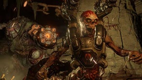
Concept trailer for Doom 4 shows us what could have been
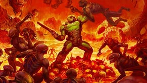
The game eventually went on to become the Doom (2016) we all know and love.
While Doom 4 never technically released, a new concept trailer that shows us what it might have looked like in motion.
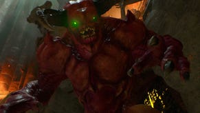
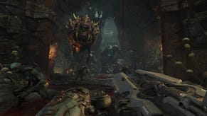
Doom 4 eventually went on to become Doom (2016), but in its early days it had quite a different look about it (though don't get me wrong, still plenty of ripping and tearing). But recently, a video from the Artstation page of Danny Keys, a video editor and media artist at id Software, showed off the game, though the page has since been taken down (thanks, PC Gamer). That's ok though, because video game archivist The Gman's Archive has since shared the video that supposedly shows a 2012 build of Doom 4.
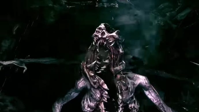
If you weren't aware, Doom 4 was in development for quite a long time. Doom 3 had been released in 2004, and id Software wasn't sure how to approach a sequel, which Noclip discusses in its documentary on the series. Doom 4 undoubtedly looks pretty bloody, fleshy, and gorey, just like any of the other games, but from the 2012 iteration, it looks like it would have had quite a darker tone to it.
Aesthetically it looks more like Dead Space than any of its other games, and is a far cry from the honestly quite colourful, and critically-acclaimed, 2016 version. Obviously being from 2012, it would have been designed with the PS3/ Xbox 360 in mind, the games of which by and large had a severe lack of colour, often looking quite muddy compared to the brighter tones of previous console generations. Gameplay-wise, though, you can see some similarities in what it went on to be.
It's incredibly cool to get a look at this version of Doom 4 that never got to flourish, if only for the sake of history, so hopefully we'll get to see more of it one day.
.jpg?width=70&height=70&fit=crop&quality=60&format=png&auto=webp)


