Bravely Default 2 hands-on preview: solid turn-based chops, but flawed in places
As a card-carrying classic Final Fantasy fanboy, I should love Bravely Default 2. But what makes sense on paper doesn’t always reflect reality - and I’m really struggling to get into this game.
In many ways, Bravely Default 2 feels like a game often pulling in two polar opposite directions. As a player, I end up torn between them, struggling to split the difference between the elements of the game that I think work and the ones that I think stumble. It’s a challenging game to write about, particularly at the preview phase, where I’m prevented from getting into too much detail so I don’t spoil too much.
It’s worth noting that, as this is a preview, these impressions are based on my early hours with the game in its first two chapters.
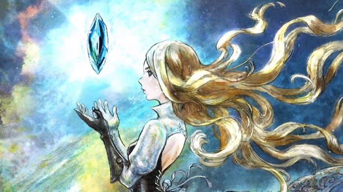
So let’s keep things general. Bravely Default 2’s dichotomy is perhaps best represented in its artwork. The backgrounds and environments are ridiculously good-looking - a painterly look that is full of energy, attitude, and life. It’s an art style that tells you much about the world in which the game is set - a world which fondly remembers and harkens back to the golden age of turn-based Japanese RPGs in the nineties. It was a simpler time, and that simplicity is retained - there’s just a higher level of detail thanks to a boosted pixel count.
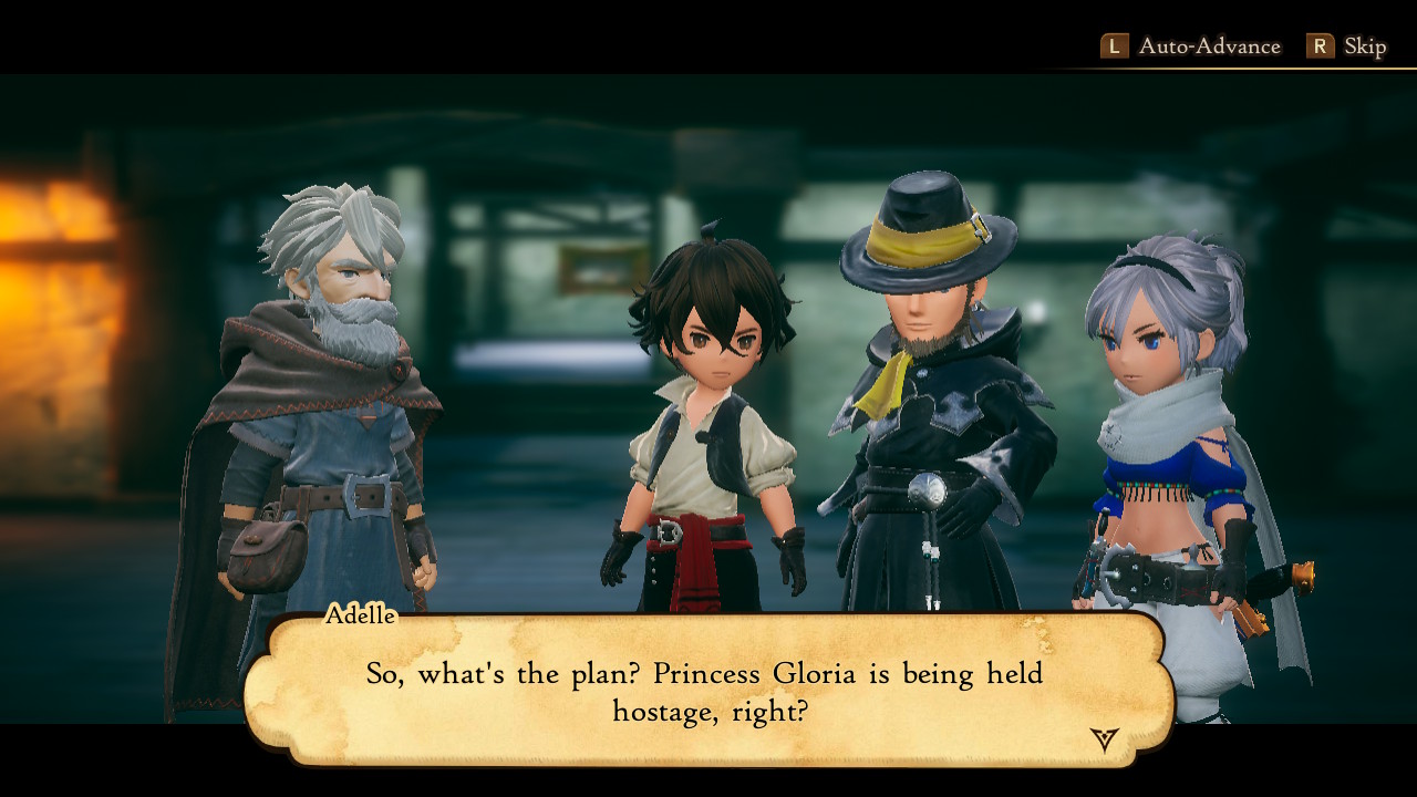
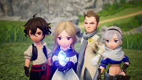
Can you sense the “but” coming? Let’s rip the band aid off. But then there’s the character models. These are important, obviously. No matter how beautiful your backgrounds are, this is where the player’s eye is most immediately drawn… and man, I don’t like ‘em.
Maybe it’s animation. Maybe it’s the simple fact that the low-poly count, stubby, ‘chibi’ character models that graced the 3DS ‘Bravely’ games don’t translate too well when you simply give them more polygons and bump them up to HD. It was an art style arguably born out of necessity to simplify for weaker hardware. Presented with more power, it’s just jarring. The characters are fine enough from a distance, like on many overworld screens. As soon as things get close up for story sequences, however, the effect breaks.
Ultimately, I’m not sure I can articulate an absolute cause of what happened here, of what went wrong. What I do know, however, is that it often looks pretty rough. It’s difficult to be drawn into the story with these dead-eyed dolls staring out at you - and it goes a long way to undermine the gorgeous world they inhabit.
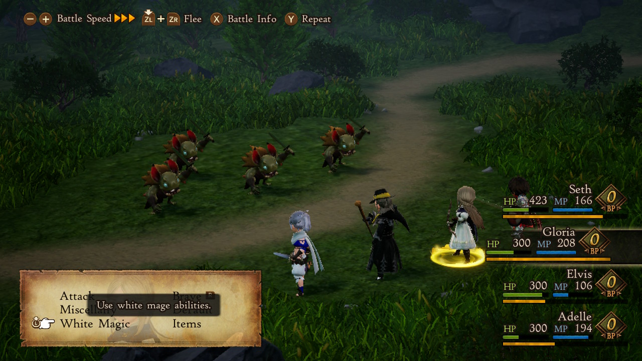
We can take this sort of polarity of design over to the battle system, too. This is the heart of the game, and it’s also where the series gets its name. Brave is a mechanic where you can spend future battle turns all at once up front - and Default is how you basically have to pay those back by skipping later turns.
It’s structured slightly differently this time around - rather than setting up an entire team’s worth of actions and then letting them play out, you stack commands character-to-character. This actually makes combat feel a little more moment-to-moment thrilling at the cost of sometimes feeling like a tactical genius. To accommodate this, the Default command, which lets you save up turns for later, is shifted off a shoulder button to a menu option. Going Bravely, however, is still on R - so when you feel confident, you hammer R and stack up a bunch of commands, going all-in.
This is a genius twist on the base mechanics of a true turn-based system that serves the series as well here as in previous entries. Combined with things like a job system that features both main and sub-jobs alongside a wide variety of abilities, you’ve got a recipe for a deep and heavily customizable battle system that players can spend hours in.
At its best, you’ll be saving up turns by defending, then tactically letting rip with an all-out assault from all characters that’s designed to exploit whatever enemy weaknesses you can, be that the timing of boss phases, the expiry of buffs, or whatever else. There are many plates spinning at once for one to keep track of. The game is hard, too, which means that you'll need to engage with all of these systems to do well.
The depth on offer here is honestly impressive, even by standards of a genre that’s often obsessed with giving players a lot of character progression options. And yet… battles struggle to satisfy. A large part of this again comes down to the look and feel of battles, regardless of the mechanical prowess beneath. Everything feels a little flat.
The difference between Bravely Default 2, a full 3D game, and Octopath Traveler, the last Square Enix developed and Nintendo published JRPG, is telling. Octopath is without a doubt the more simplistic of the two games, but the battles in it are far more visually and emotionally exciting. Bravely Default 2 can match up to the beauty of Octopath’s background art and even its music - both are excellent here in BD2 - but something about battles just doesn’t click as you’d hope it would, at least in these early hours.
With all that said, there is a seed of something special here, especially for fans of the gameplay mechanics of classic Japanese RPGs. As you unlock the earliest versions of the job system and begin to deal with weapon types, equipment weight and all the rest, I can feel pleasure synapses in my brain firing as I sense the deep possibilities within this system. Even with boring-looking battles, it’s hard not to be pumped when the excellent soundtrack begins firing on all cylinders. I just wish much of how the game looks and moves didn’t feel so uncanny and soulless. Perhaps, as I get deeper into the game, that’ll matter less to me. Here’s hoping.
