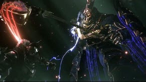
Babylon's Fall updates visuals so they're no longer a blurry mess
PlatinumGames has tweaked the visual style of Babylon's Fall following a wave of negative feedback.
Babylon's Fall has existed in this weird state where many PlatinumGames fans are aware it's the studio's next big game, but there seems to be hardly any excitement for it. In July, the developer concluded the first of three beta tests for the game.
This was players' first ever opportunity to go hands-on with the multiplayer action game, but even before the test went live, many had a lot of misgivings about the game's visual style, which we got to see when Babylon's Fall was re-revealed at E3 in June.
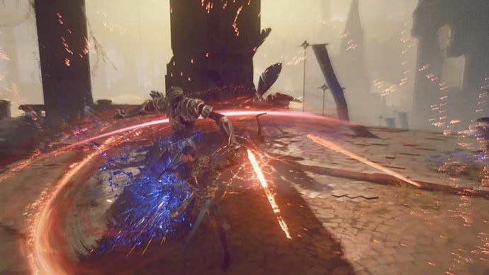
It seems Platinum took this feedback on board, because the studio has announced a change to the game's look, which should hopefully make it easier on the eyes. More specifically, the game has done away with the pixelated, filtered aesthetic for a sharper, more in-focus look.
"With a big thanks to our Sentinels support, the Babylon's Fall team have been working on updating the graphics to improve legibility while retaining the unique oil painting style!" said PlatinumGames in a Tweet.
One of the most common criticisms about original look has been just how blurry the image is. Even setting aside personal preferences, the original style made it harder for people to keep up with the game's action. I've also seen some with poor eyesight complain that it was a strain to watch/play, and could cause headaches.
This new look will likely be in the next beta test, which is set to take place on PC and PS4, though Platinum hasn't set a date for it just yet.
