March was a poor month for accessibility in games
Finally, at the end of March, we’ve seen some of the major releases we’ve all been not-so-patiently waiting for this year. I was hoping this would be one of those times where I could gloat about how game studios are finally listening and learning the lessons the a11y community has been teaching. Instead, the handful of releases in March have left me wondering how there are still developers who seem to be unaware accessibility is even a thing.
But before we get into the disappointments of March, I want to return to something I mentioned in last month’s column - Kentucky Route Zero and its mysterious options menu. After I noted that I was unable to find an options menu, many, many people told me exactly where it was. You just hit the start/options button. While my inability may seem like an indication that I should just stop playing games because I am obviously too dense to figure out this simple thing, it actually speaks to an accessibility issue found in many games: non-intuitive UI.
A game’s UI needs to be intuitive - blatantly obvious - in order to be accessible. If you present players with a radial menu on your start screen, it should be safe to assume that every selection needed to set up and play the game is within that radial menu, or visible somewhere on the screen that the options menu is located by pressing the start button. Don’t make players guess and don’t leave things as essential as your game’s options unsaid and assume players will just figure it out.
Speaking of hidden options menus, let’s get into our first game for March, Hunt: Showdown. Hunt: Showdown is a cool game. A novel take on the battle royale genre, the game starts out as an online multiplayer cooperative experience until you’ve eliminated your bounty. Then it’s every player for themselves and if you die, you really die. You lose your hunter and weapons. That’s where what’s great about this game ends.
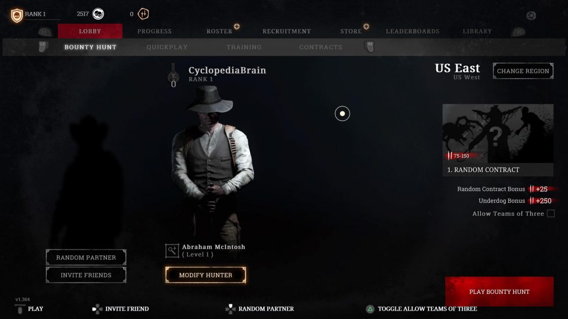
The cursor navigation of every menu screen for the console versions of the game will prove to be a barrier for entry for many. While there are four controller layout options, the fact that nothing is remappable is yet another barrier. And that hidden options menu I mentioned? See that very small and faint little wagon wheel icon in the top right corner of the above image? That’s it. I played this game for a good little while before realizing that this wasn’t just some weirdly placed art, but a thing that serves a purpose. The in-game experience isn’t any better, unfortunately.
You may have read Jeremy Peel’s piece about how hearing is the most important sense in modern FPS games. In it, he discusses this very game and it’s true, hearing, in Hunt: Showdown, is essential. Deaf and hard of hearing players will find this already punishingly difficult game nearly impossible to play.
My very first match in the game went like this:
I was dropped into the nearly pitch-black world just feet away from a deadly enemy. Hearing players would have had the benefit of hearing the buzzing of the thing that was about to kill me, but because this sound is not visualized in any way, I had no idea what I was walking into until...
It’s right on top of me, attacking me, and I still can’t see it.
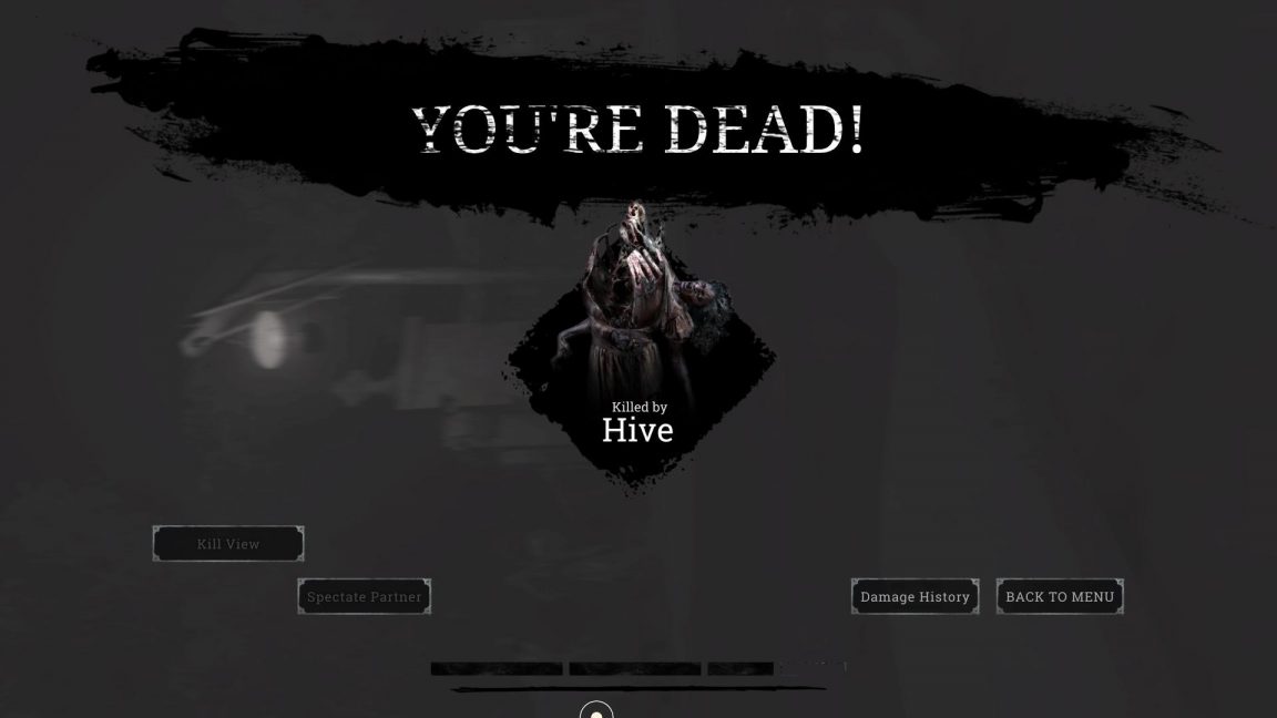
And that was that. I died; lost my hunter, my weapons, and built up nearly zero experience points because I died about twenty seconds after the start of the match. All because of an accessibility issue.
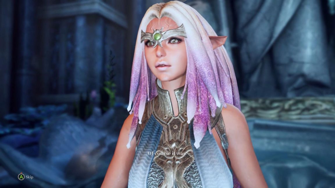
Next up is Bless Unleashed. A free-to-play MMORPG, Bless Unleashed has everything I love in this type of game. Outfits, crafting, gathering, chests in which you will find cool stuff. Oh, and it has quests and stuff too but I’m here for the outfits. I am loving my time spent in this game.
But it is killing my poor fingers. While there are five controller layout choices, the button mashing required for all combat will make this game painful for many at best and unplayable at worst. No matter what control layout you choose, during boss fights, there will be a required series of L and R bumper and trigger mashing that many will find impossible to do, or at least do successfully.
Oh, and the subtitles are, well, they’re atrocious.
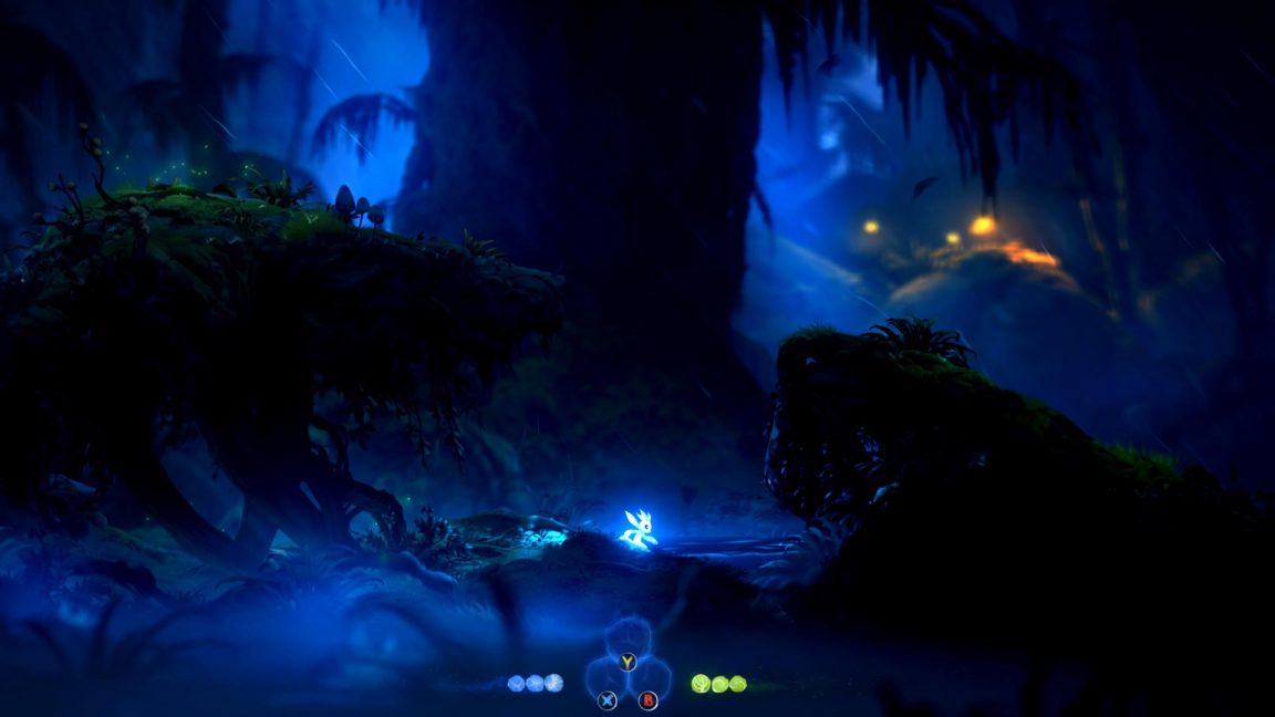
Perhaps my biggest disappointment for March is Ori and the Will of the Wisps. This game is adorable and gorgeous and I so badly want to be able to play it and enjoy it. Given that it was published by Microsoft Studios, I assumed accessibility would be a given. Instead, Ori feels like a game that punishes disabled players from the start. Once players choose their difficulty setting, they’re locked in. Choose normal and find it too hard? Gotta start over again.
And once again, the button mashing. I fell into this hole shown above and eventually quit the game after failing a dozen times or so to properly time my button taps to scale the wall, because it wasn’t just one or two taps and you’re out of the hole, it was more like seven.
As with Hunt: Showdown, Ori is very largely reliant on its sound design. While it’s not a matter of staying alive in this game, it’s equally frustrating because much of the emotion and immersion of this spoken dialogue-free game is in its sound design. The game is perfectly playable for deaf and hard of hearing players, as what little dialogue there is is captioned quite nicely, it’s just that this game was very clearly designed for the “ideal” player base to be hearing, as so many are.
Players are led to believe that controls are remappable (at least that’s what the “revert to default” option in the controls menu means to me) but they are not. This will render Ori and the Will of the Wisps unplayable to many disabled people.
My biggest disappointment with Ori is that we’ve all seen platformers be made accessible. One need only read a bit about Celeste and its inclusion with accessibility options. The frustration, for me, lies in that I know it can be done and still isn’t.
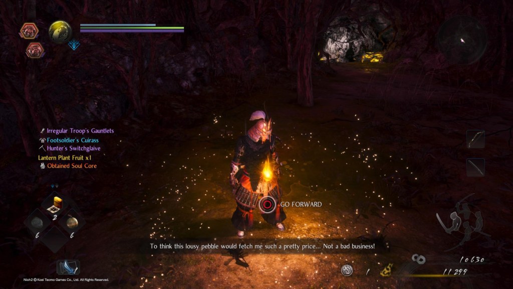
Nioh 2 is a Souls-like game. That’s about all I can tell you about it because I can’t really play it. Despite offering fairly extensive options, Nioh 2 still fails in the way every Souls-like game does: they’re too hard, require too-precise movements and too-precise timing without allowing for ample customization for players like me whose fingers just can’t hack it. Given that I’ve had the argument about “easy mode” impeding an artist’s vision more times than I care to recall, I’ll just quote Cory Barlog. “Accessibility has never and will never be a compromise to my artistic vision.”
Unlike other games in the genre, Nioh 2 does allow full controller remapping, as well as five controller layout choices. Unfortunately slowing combat, an option so many players need in this genre, is not among the many options available in this game.
Nioh 2 also allows players to customize text size for the UI, alerts, and dialogue. There are three size options though the difference in size is so negligible, it’s a struggle to notice in-game. Difficulty of the combat aside, the most glaring accessibility issue in Nioh 2 is one that is quite common in open world games. There is no sound visualization for incoming damage that is out of the player’s field of view. As Michael Anthony noted in his review on Can I Play That?, deaf or hard of hearing players are unaware of things like arrows being fired at them from off screen until they’ve been hit by the arrow.
In anticipation of the release of Doom Eternal, I played Doom 2016 because the last time I’d played Doom was around 1994. It turns out that not a whole lot has changed. You shoot the demons, Hell is very bloody, and the game is very hard if you have hand joint pain. I dislocated my thumb six times while playing for my accessibility review (don’t worry, they just pop right back in).
To its credit, id Software tried with accessibility for Doom Eternal. They just missed the mark in so many areas.
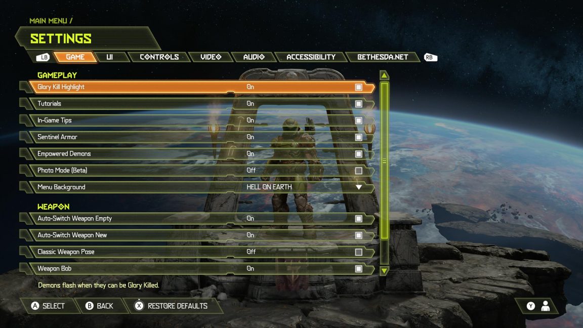
The above is but one of the six very expansive menus. They’re all equally long and all equally tiny. There are color options for the UI, including the menu presentation, that make it easier to read but not by much.
The in-game UI is microscopic and while this is a common problem, it’s not one you expect to see in a game which has a dedicated accessibility menu.
A major problem with the game is that some accessibility is walled off through progression. Stick aim is only available on certain guns and players have to fail a number of times before they unlock the armor that makes Doom Slayer less prone to, well, doom. While I appreciate these additions, they need to be available to all players right from the start of the game in order for that game to actually be accessible and inclusive.
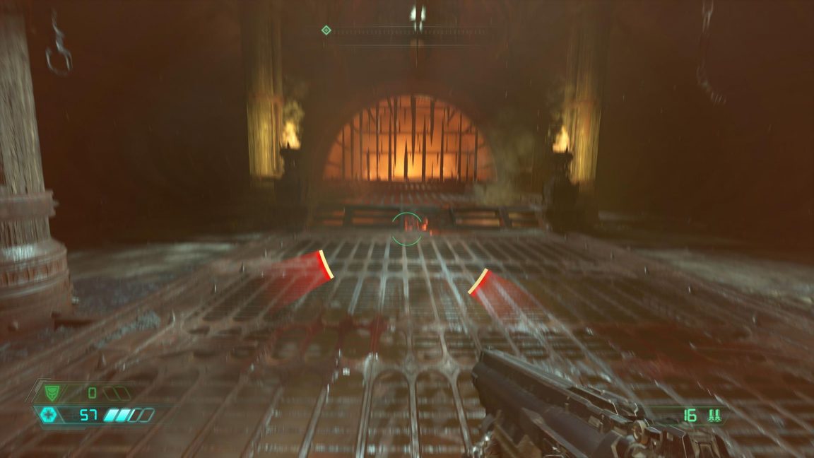
As with Doom 2016, Doom Eternal fails deaf and hard of hearing players by not providing visual cues for enemies until the player is taking damage. Something as simple as little red blips on the compass bar would remedy this and make for a much more equal experience.
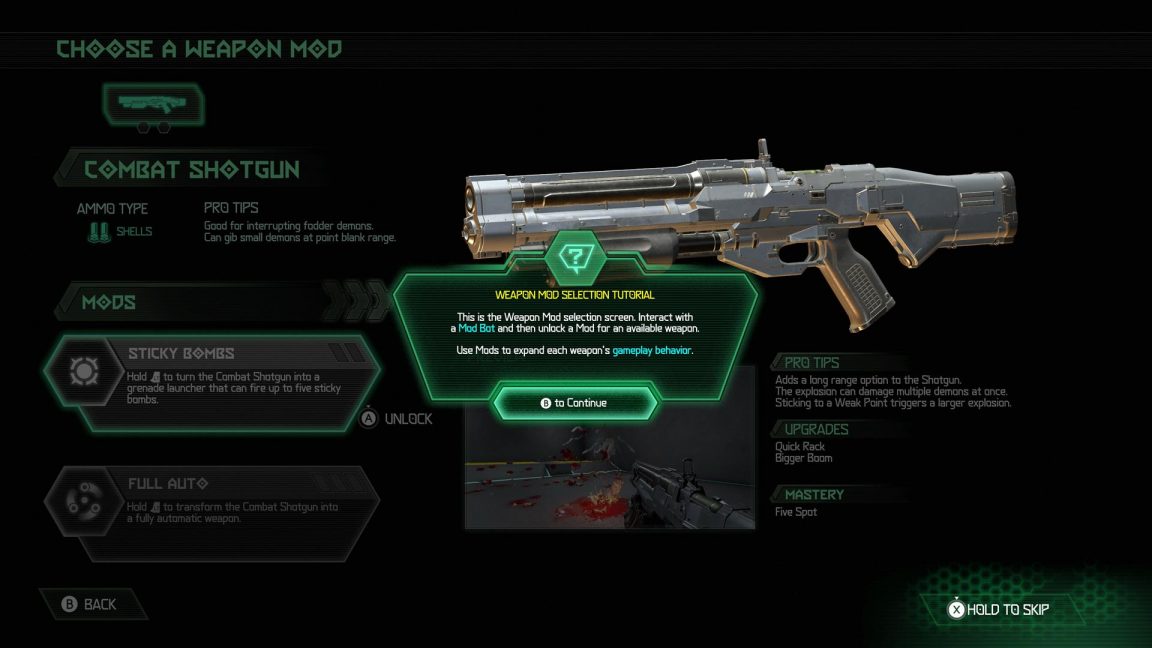
The biggest issue I had, and the one that left me with a dislocated thumb, was the controller layout options. While they are remappable, there are just so many buttons that do stuff that players can’t avoid mapping to the often inaccessible buttons like stick presses and bumpers. This will also prove a challenge for players with cognitive difficulties, as every single button being used makes it remarkably hard to remember what button does what.
My highlight for March has been Animal Crossing: New Horizons, as is the case for so many people. The game is just pure adorable joy. The accessibility, however, or lack thereof rather, steals a bit of that joy.
To start, there are no options to speak of, aside from social options and online options. Most Switch games have fantastic subtitles and Animal Crossing New Horizon certainly does as well, but there is a lack of visualization for essential in-game things, such as some bugs, balloons, and the fishing bobber sound, that will leave deaf and hard of hearing players at a disadvantage.
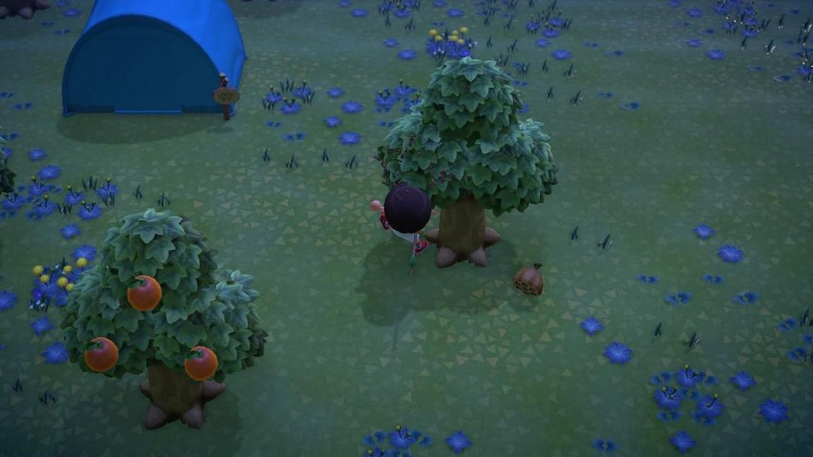
There are noisy insects such as the wasps attacking the poor guy above (though they’re difficult to see in my not-great photo) but the ones that are stealthy by design - those you need to catch for your collection - are not given any sort of visualization at all.
The fishing is tricky. There is a different animation accompanying the sound indicating it’s time to tap the reel in button, but the zoom is so minimal and the animation so small, unless you’re playing with the Pro controller and take the time to memorize the different vibration patterns, catching a fish will also be more difficult for deaf and hard of hearing players. The minimal zoom and tiny collectible objects will also prove frustrating for blind and low-vision players.
The controls for Animal Crossing New Horizon are rather simple, though the required use of R to chat, and LZ to access your Nook Phone will leave those unable to use these buttons unable to play the game. I’m grateful for the simple controls and the fact that no stick clicking is required because my thumbs need a rest after Doom.
Finishing up this month of accessibility disappointments is Bleeding Edge, the new team brawler from Ninja Theory. Here we have another game that, like Doom Eternal, has an accessibility menu but still manages to not be that accessible. I chatted briefly with accessibility specialist extraordinaire, Ian Hamilton, about the game’s accessibility during its beta back in February and he was absolutely correct in stating that yes, Ninja Theory had checked all the boxes required for game accessibility, especially those that fall under the CVAA, but they still just missed the mark.
As with many games in this genre, the charm lies largely in the amusing and interesting personalities of the characters. Each character has dialogue lines that they say randomly throughout the match. That’s happening in the above image but it’s not captioned, so deaf and hard of hearing players will never get the funny little quips. Also not captioned are the announcements. Things like “objective activated” or when players are told the match will be starting soon.
Controls are fully remappable which is always a great thing to see and there are toggle options for every action that usually requires a button hold, eliminating a common barrier for many players.
For player communication, which players are told right from the loading screen is essential to success in the game, there’s text-to-speech and speech-to-text. The issue here, and this is far from a problem unique to Bleeding Edge, is that every member of your group needs to enable it for it to function. Unless you’re playing with a group of friends all the time, that’s very unlikely to happen.
For deaf and hard of hearing players, the visualization of opponents on both the minimap and their colored silhouette that shows through walls is incredibly helpful and for players better at this sort of game than me (which is most of them) this will go a long way in helping them not die repeatedly.
Blind and low-vision accessibility is the area I know the least about, but Bleeding Edge, though it has menu narration, doesn’t seem to have much in the way of helpful features for blind and low-vision players. Which is a shame, because this sort of game seems like it would be a great fit for pushing that particular area of accessibility even further.
Courtney Craven is co-founder of Can I Play That?

