The Last of Us Part 2 has raised the bar for accessibility in games
The theme this month in our game accessibility feature is useless UIs, tiny subtitles, and questionable subtitle practices. And then there's a Naughty Dog game, which we'll get to after looking back at the other big releases in June.
Starting us off on the wrong foot this month is Disintegration. The gist of this game is floaty FPS/strategic combat with robots that humans have elected to have their brains deposited in to make them invulnerable to, well, everything. I wouldn’t mind being integrated into a robot right now myself, if I’m being honest. The combat is unique and it feels pretty good but my fun is hindered by far too many "what on earth were they thinking?!" moments throughout the start of the game.
The most glaring issues right from the start are the tiny, tiny UI text and the very limited control options. There are only two control schemes available and you have to be on top of your screen to be able to read the button assignments and options text. Luckily, “Option Two” remedies unintuitive Gravcycle controls and instead of binding moving up and down with L1 and L2, rebinds them to R1 and L1.
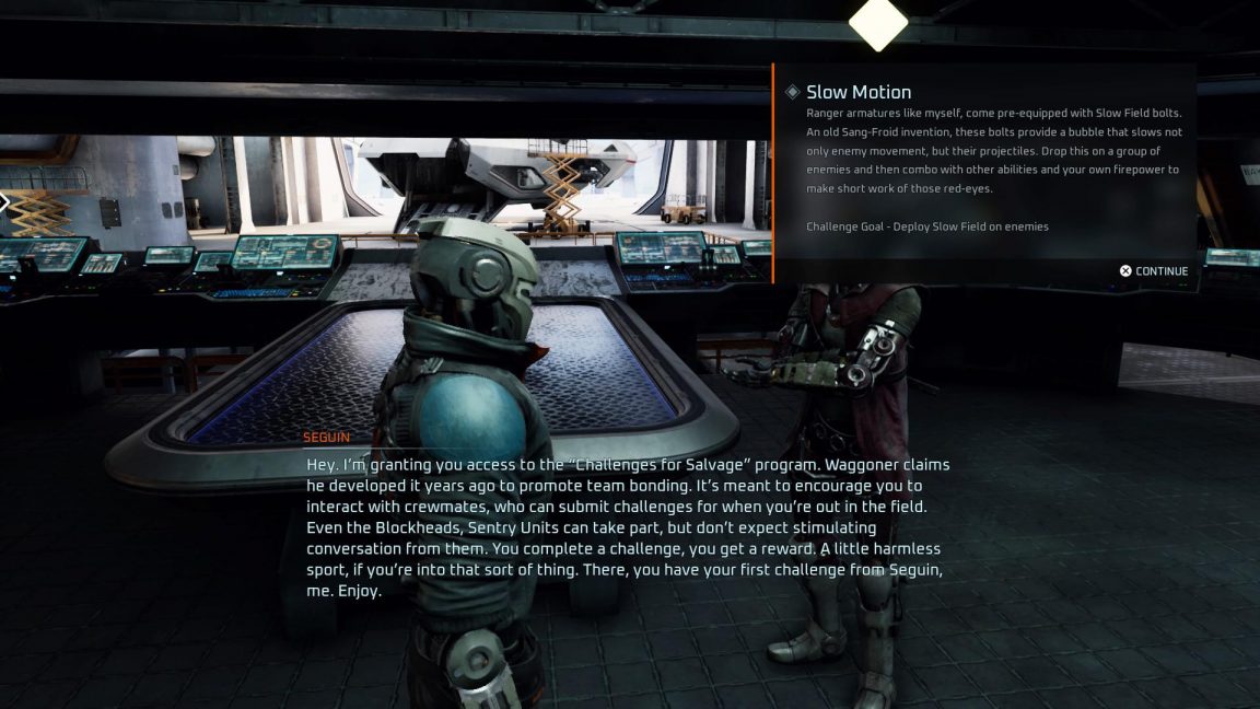
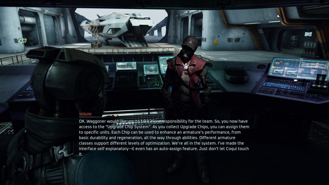
The second problem is the subtitle text. Where to even begin? First of all, like the UI text, it’s tiny. Nobody can read that. Second, there’s no background so when you’re out in the game world which is often much brighter than the garage, you can’t see them. Third, I’m not trying to read a book, I’m trying to play a game and read dialogue. I hate to inform you but just plopping ALL of your subtitle text onto the screen at once isn’t the way to avoid having to time your subtitles.
In case that first paragraph wasn’t enough, here’s another. And here you can see where contrast between the text and the background becomes an issue as well. The one saving grace for this mess is that the novel-length text doesn’t disappear until you press a button. So at least you’ve got ample time to read your novel, I guess.
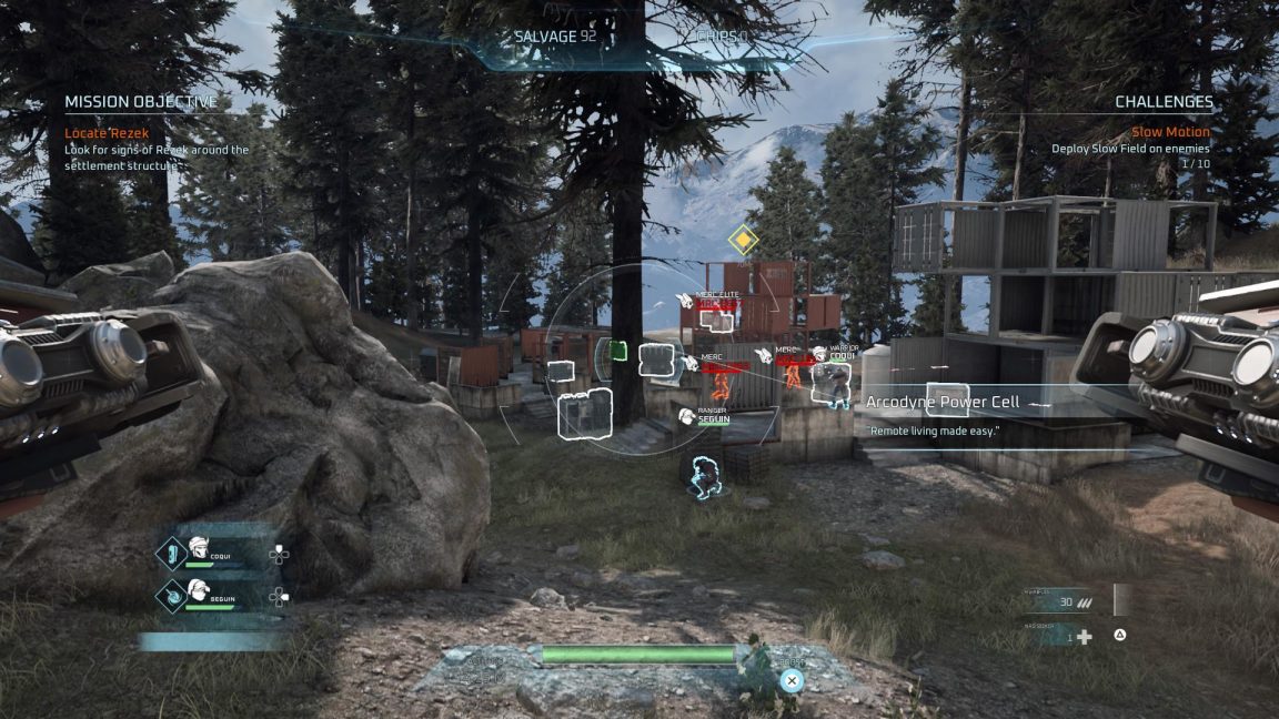
Now let’s get back to that UI. They’re supposed to serve a purpose, right? User Interface seems to indicate that the user is supposed to be able to interface with it. I’m about six feet away from my TV here, a comfortable distance at which I can enjoy most games while also taking in the splendor of my dog. In most games, I’m able to make out at least enough of the UI at this distance for it to still be useful. But in Disintegration, with its varying shades of blue and only blue for all the UI things, paired with tiny icons, the only thing that actually helps me is the reticle. I can see where I’m shooting and where I’m guiding my crew to. This game is in dire need of some contrasting colors and a boost in size for so many things.
That’s not to say developer V1 Interactive got it all wrong. Your Gravcycle is equipped with a very helpful scan mode that tags all nearby enemies, exploding things, and collectibles. There’s also a handy icon with directional arrows that displays on screen any time new enemies come into the area via hover car (Gravehicle?)
All dialogue is subtitled, albeit microscopically, including your crew members shouting the location of approaching enemies. This, paired with the scanning ability, make for a decent experience for deaf and hard of hearing gamers. Blind and low-vision players and players with limited mobility who rely on being able to remap buttons will very likely find Disintegration difficult, if not impossible to play, due to its lack of controller remapping, limited control scheme options, and the fact that everything is just so tiny.
If nautical nonsense be something you wish, SpongeBob SquarePants: Battle for Bikini Bottom Rehydrated came out this month. On the surface, the remastered SpongeBob and Co. is a delight to play. It’s bright and colorful, lighthearted, and for anyone such as myself who spent their late teenage years singing along to the theme song, there’s a good bit of nostalgia hearing the square yellow guy’s signature laugh. But the gameplay leaves a lot to be desired.
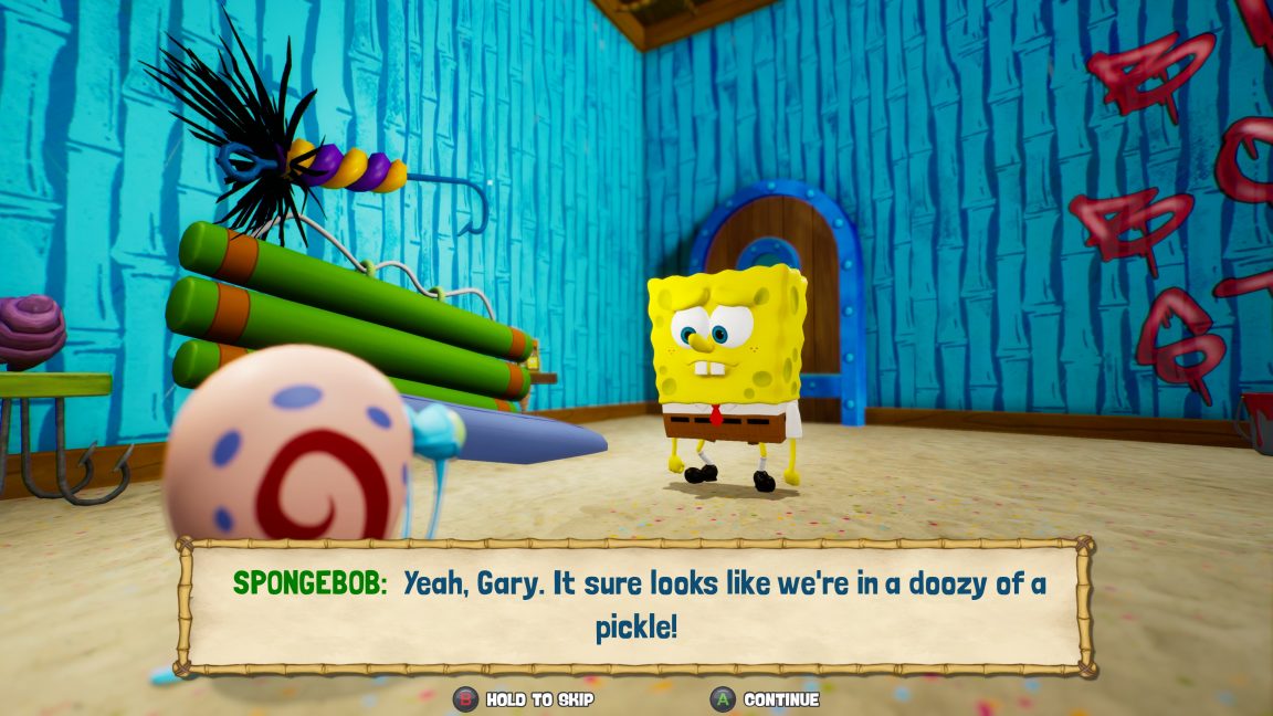
The strangest thing I came across in this game is the complete lack of a control scheme graphic. There are no remapping options, which is unsurprising considering this is a remaster. But one would think there would at least be something to jog your memory as to what button does what, right? Surely those of us with hundreds of games and thousands of other things on our minds aren’t expected to just remember what every single button does? Wrong. Players are told once and never again, unless they travel back to the starting area and re-read the little tutorial signs.
Other options are pretty standard fare, especially for the recent surge of remasters. The accessibility is essentially the same as the original game, it just looks prettier.
SpongeBob managed to mystify me with an issue I’ve not ever seen in a game before with subtitles, which is saying a lot because subtitles are my specialty. I’ve seen them screwed up in every imaginable way. In JRPGs, there’s the standard practice of dialogue being in a nice, easy-to-read box that players press to advance and the actual spoken dialogue also waits to advance. This is a perfect setup for not only deaf or hard of hearing players, but those with cognitive disabilities or even players who just don’t read as fast as others.
SpongeBob tries that approach but somehow, some way, they decided that while the text would be press-to-advance, the spoken dialogue would just keep going. Trying to time my advancing of the subtitle text with the speed of the dialogue felt like a really bad minigame I never wanted to play.
Also on the subtitles front, SpongeBob suffers from the issue that far too many games do; multiple presentation styles for the subtitles. I understand this is done to suit certain scenes in games and realize that the stylized box variety wouldn’t suit cinematics, but this does nothing to help with legibility or consistency. Games don’t actually need to stylize their subtitles to fit the theme of the game. In fact, it’s better if they don’t because this leads to subtitles actually being able to serve their purpose for more people.
Also problematic in SpongeBob is the lack of a colorblind mode - collectibles with varying points are in different colors, and the fact that in this 3D open world-ish platformer, enemies have a distinct sound when they’ve spotted you but a visual cue only when the player is looking at them.
SpongeBob SquarePants: Battle for Bikini Bottom Rehydrated is yet another remaster that brings its gameplay and graphics up to 2020 standards but leaves behind any notion of accessibility.
Desperados 3 was a surprise hit for me. I suck at strategic, tactical games. If ever I’d wanted to be a real life criminal, games that require strategy and planning would have killed that ambition. Desperados 3 is here to teach Souls-like games a lesson: your game can still be hard as hell while offering options that allow disabled players to actually play it.
The game has a wealth of brilliant accessibility options, most just built right into gameplay and not labeled as specific to accessibility. I used just about all of them and I’m still laughably bad at Desperados 3. And that is a wonderful thing. Let me accidentally blow myself up with dynamite, games, but let me do it in an accessible way. The only bad thing I can say about Desperados 3 is that its subtitles are useless.
There are ample subtitle options yet somehow, the most important option of size has been left out.
Whether they’re during cutscenes or in-game, even with that wonderful black background, the subtitles are just so tiny that nobody can read them. They did so much right with them too! Speaker names! A background! NPC ambient chatter is subtitled! But all are equally tiny.
Bad subtitles aside, the options available to disabled players in Desperados 3 are astounding. There’s not one but FOUR slots for custom controller layouts. Everything is remappable and it’s fantastic.
Everything is given a visual cue too. From collectibles to tooltips to enemy line of sight, and areas where there may not be an enemy presently but you will be spotted if one happens upon you while you’re out in the open.
The best part? Players that want a nightmare of an experience without any help at all can turn all of these things off and succeed on what I am positive is sheer luck because I refuse to believe anyone is good at these types of games.
There’s even an option players can toggle to remind them to save the game, which can be done at any time outside of cinematics. This particular option saved me a lot of time and stress, considering that I died about 5000 times while simultaneously forgetting that the game wasn’t auto-saving for me.
I love the customization Desperados 3 allows players, so we can all suck in whatever way suits us best. From choosing just how bright we want enemy outlines to be, or if we want them on at all, to specifically what subtitles we want, Desperados 3 really nails accessibility through choice. The only thing they need to do is make those subtitles bigger.
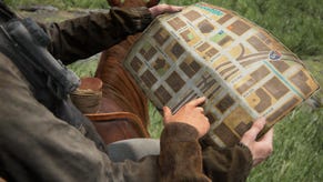
Speaking of accessibility through choice, you may have heard of a new game called The Last of Us Part 2? You may have seen that it launched with an astounding 60+ accessibility options? You may have seen Hermen Hulst, boss of all things Playstation, refer to my review as an important one? (Yes, I’m bragging and will continue to do so.) Or perhaps you’ve seen my Can I Play That? colleague, Steve Saylor, in tears over the overwhelming joy he felt upon seeing the game’s accessibility options? Or maybe you’ve seen sightless gamers, like Brandon Cole and SightlessKombat talk about how they’ve been able to play the game without sighted assistance?
No matter what your thoughts on The Last of Us Part 2 as a sequel or how you feel about the story and its characters, there is no denying that Naughty Dog has created a game that has left the entire industry changed and challenged to do better. Never before has a triple-A game been so inclusive of disabled people in its development process and accessible to disabled players in its gameplay. As Turn 10 and Microsoft Studios’ Jon Knoles said, “It’s almost as if there’s a race among developers to see who can make the most accessible game. I know a little bit about racing, and it’s honestly a race that everyone wins.” I truly hope all studios, both big and small, triple-A and indie, rise to the challenge and try to win the race.
I won’t even try to cover all of the options available to disabled players but let’s dive into a few of the most notable ones, shall we?
The most personally satisfying option TLOU2 has is its amazing subtitles. Players can choose from a variety of sizes, colors, speaker names, and the icing on the cake, that little directional arrow that shows from where the off-screen character is speaking. On top of all this, all dialogue is subtitled. If the player is within range to hear it, it’s got subtitles.
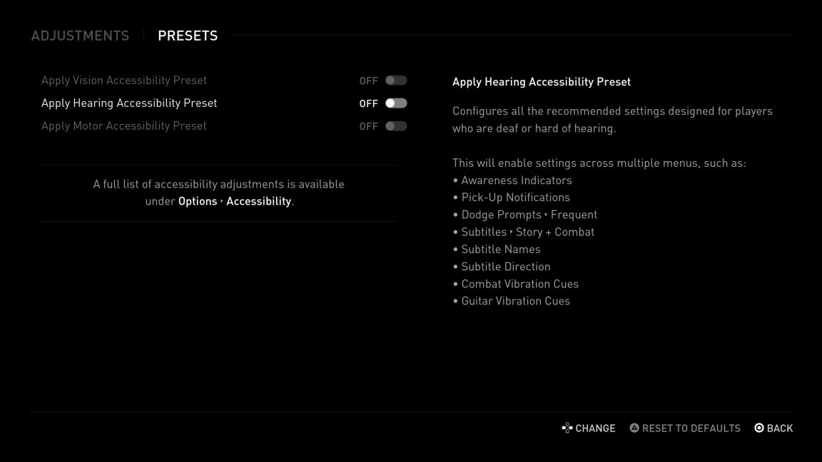
Speaking of deaf and hard of hearing accessibility, how about this preset list compiled specifically for deaf and hard of hearing players?
All the options that players within this group commonly need, in one handy all-on toggle! Of course, you can further customize this and toggle on only what you want. One of these amazing lists of presets exists for vision and motor accessibility too!
The Last of Us 2 may very well be the first non-fighting game or FPS game that sightless players can complete without sighted assistance and this is due to the brilliant addition of things like Enhanced Listen Mode, which allows players to scan for and ping enemies and collectibles and even navigate right to the closest pinged thing. In addition to this, the game has a stunning narration system, complete with a whole directory of unique sounds that players can reference throughout the game. Players near a rope for climbing will hear the sound of a rope when they’re near it. The sound of a drawer opening will play when players are near a drawer they can search. There’s a sound like this for every actionable thing players will come across in the game, making TLOU2 unprecedented in its inclusion of sightless players.
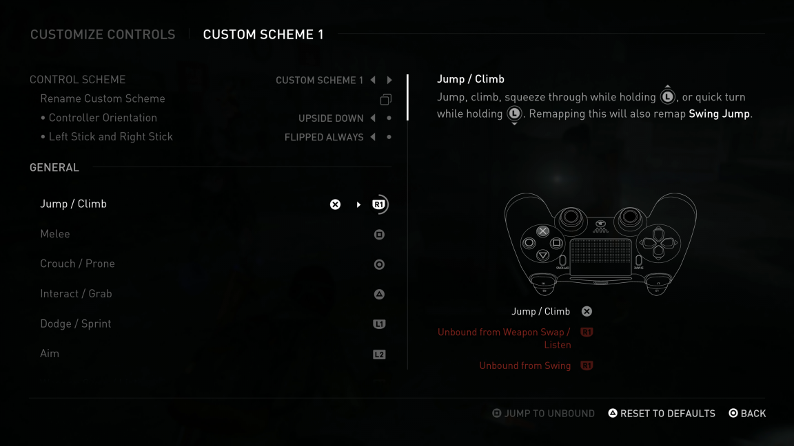
The multiple controller options, and the fact that everything is remappable allows many players with low mobility to customize their experience to the nth degree, even allowing for one-handed play with a sideways or even upside-down controller.
I mentioned in the impressions video I did with Steve Saylor that being a hard of hearing player often leaves me exhausted because playing a game means being in a constant state of active listening. This constant exhaustion often leaves me abandoning games that don’t have enough, or the right accessibility features for me. The Last Of Us 2 would have been no different if not for high contrast mode. There is simply so much stuff to pick up in this game and resources are so scarce that you have to constantly search - there comes a point where I just can’t pay attention to it anymore. I need to collect what I need and be done with it. Usually though, I can’t. I have to keep searching for a box of ammo, always be on the lookout for a health kit refill, and I quit the game halfway through because it’s too damn much.
Enter High Contrast Mode.
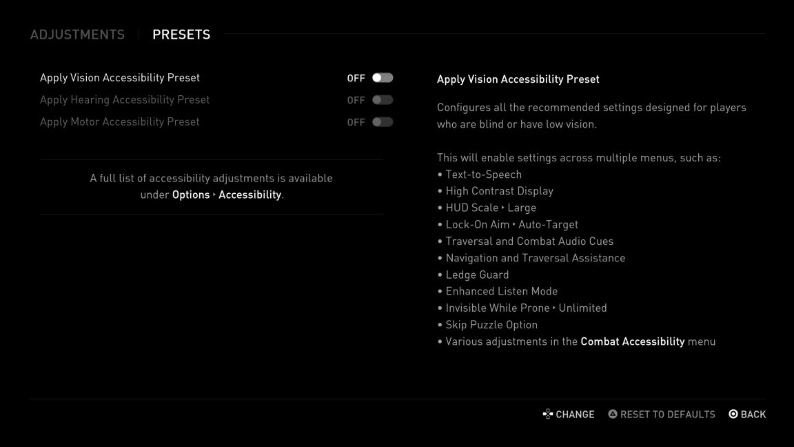
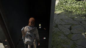
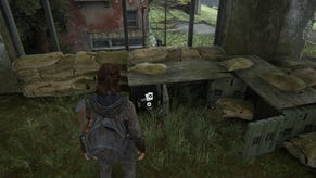
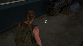
In High Contrast Mode, with the swipe of the tough pad, friendlies are blue, enemies are red, and all that stuff I need is yellow. I can grab it and go on my merry way. While this feature was designed for players with low-vision, it’s a massive boon to those of us who need a little cognitive relief too.
And that’s the truly amazing thing about The Last of Us Part 2, isn’t it? There are simply so many accessibility features and options that I can design an experience that fits exactly what I need it to be, at any time during my playthrough. I’ve seen the sales numbers for TLOU2 within the first few days since launch and I can’t help but wonder how much of that is from disabled players looking to support this game and this studio that had the forethought to include us from the start with one of the most accessible experiences ever.
Naughty Dog has not only raised the bar for what we consider good accessibility with this release, but it has now shown that accessibility is profitable and it will pay off for all who make the effort.
