Ghost of Tsushima, Ooblets, Rocket Arena, Paper Mario - do July’s big games pass the accessibility test?
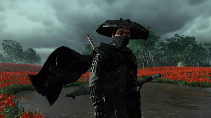
July saw the release of another highly anticipated PS4 exclusive, Ghost of Tsushima. While it doesn’t come close to being the accessibility gem that last month’s The Last of us: Part 2, it and Ooblets have made for a pretty great July during a pandemic, with beautiful biomes to explore and dance battles to be had when many of us are still stuck indoors.
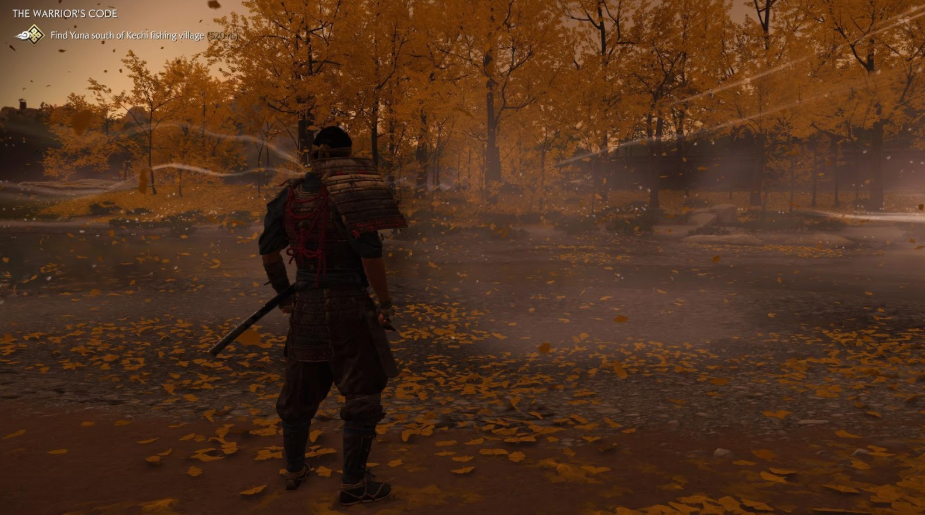
Ghost of Tsushima took some time to grow on me with Sucker Punch’s decision to tie navigation to watching the wind blow. When I reviewed it on launch day, I still wasn’t a fan. I wasn’t used to not being able to move through the massive game world on autopilot and being forced to consider and reconsider my path to most objectives. I deemed it an accessibility failure and asked for traditional waypoints. And while it is still an accessibility problem for some, I’ve grown rather fond of it - it’s not only forcing me to step outside my video game comfort zone and traverse the world creatively, it’s also given me ample opportunity to play photographer.
There’s a handy accessibility menu in which players can toggle important things like subtitle backdrops (unfortunately no subtitle size options), simplified controls and toggles for button holds (unfortunately no remapping or even control scheme choices), and projectile indication.
The projectile indication is unlike I’ve seen in any game in how it’s tied into the narrative. While most games will usually just stick a directional indicator around the center of the screen, Ghost of Tsushima sticks a little bow and arrow icon over the archer’s head and has them shout a warning to their fellow Mongols to get out of the way.
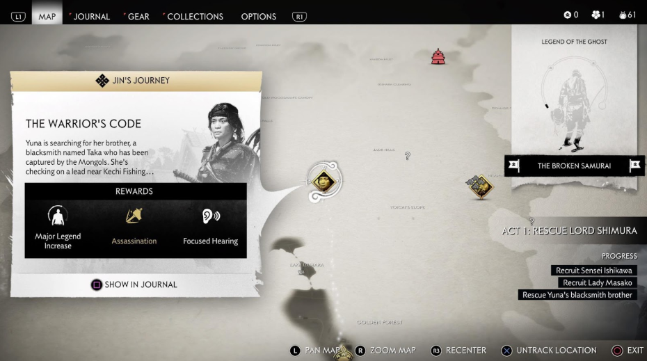
One aspect of Ghost of Tsushima’s accessibility that I don’t love is the focused hearing mode being progression locked. While this feature isn’t designed as an accessibility option, focused hearing, like TLOU2’s enhanced Listen Mode, is a major boon for Deaf and hard of hearing players, allowing us to properly pay attention to surrounding enemies and not be snuck up on or ambushed simply because we didn’t hear the nearby enemy. At least this can be among the first things players do, as Ghost of Tsushima allows players to tackle main objectives and side missions in any order they wish.
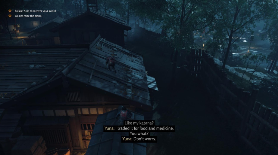
While there is a subtitle background and the size is fine, I’d like to see Sucker Punch patch in size options, as the default will still be far too small for some players. The strange thing about the subtitles is the speaker name presentation. Most games that offer speaker names show the name every time the speaker changes, making it clear exactly who has said what, as is the standard for subtitles and captions. Ghost of Tsushima only features speaker names for characters other than Jin, often leaving Jin’s lines looking like a continuation of what the named speaker said.
By far, the biggest issue for this game is the lack of remapping and control scheme options. Players unable to swipe on the touchpad will be left without any sort of navigational assistance and players unable to press the sticks will be left never crouching in a game that often requires stealth and never running or galloping in a truly massive world. My poor thumbs, which often dislocate upon pressing the sticks, have taken a beating during my many hours in this game and I manage to regret every lengthy play session, which is a shame because Ghost of Tsushima is so stunning that I want to enjoy it for hours on end.
July’s other big release was Paper Mario: The Origami King and true to form with most Nintendo games, Paper Mario is perfectly good with deaf/hoh accessibility and leaves a lot to be desired in nearly every other area of accessibility.
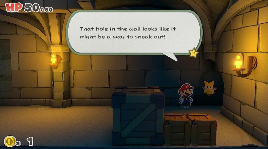
While the presentation of the subtitles drive me mad with the slowest one-letter-at-a-time reveal I’ve ever seen (with no way to force it to advance) their presentation with size and legibility is just fine. The size and shape of the speech bubbles indicates tone and shows who is speaking, and a nice little star shows up to indicate that while you’ve moved house and started a family waiting for every letter of the text to be revealed, you can finally advance the dialogue.
Thankfully there is an option to turn off motion controls and rumble settings available, making the game a bit nicer for players with limited mobility. Nintendo has chosen to stick with its unfortunate practice of blocking off some portions of the settings until those mechanics are revealed later in the game, leaving the options looking quite lacking at the start. Full disclosure here, I did not play Paper Mario for long enough to uncover what the missing three options are in the menu, as the slow subtitles bother me deeply.
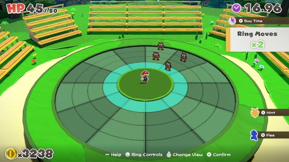
By far the worst part of Paper Mario: The Origami King is the battle system. I’m glad to know I’m not alone in my hatred of this system, as a few seconds on the internet illustrated to me. To battle enemies, players have to solve timed puzzles that involve either lining up enemies in a row or arranging them in a group. Sure, you can spend gold to buy more time or get a hint, but you can also choose to do what I did and flee from every battle. The battle system might not be quite so bad if you didn’t have to fiddle with moving the blue ring to the proper part of the battle ring, but as it stands, this battle system just might be my least favorite thing in any game ever.
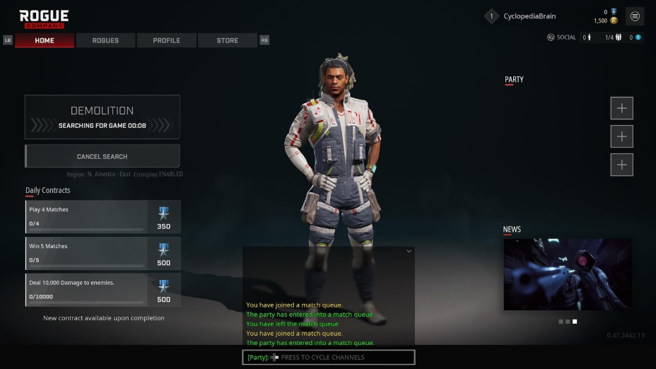
Rogue Company, now available for players who buy a founder’s pack, is a new third-person online shooter released in a time when third-person online shooters are a dime a dozen and need something really special to stand out among the masses. Rogue Company doesn’t have that, unfortunately. Neither in unique gameplay or in accessibility. Rogue Company suffers from the same accessibility oversights that nearly every game of this genre does.
The subtitles are tiny with no indication of who is speaking, though good on High-Rez Studios for at least giving them a background.
The UI text is tiny.
The text chat? Tiny. Though in its defense I never actually managed to survive a round long enough to even glance at text chat.
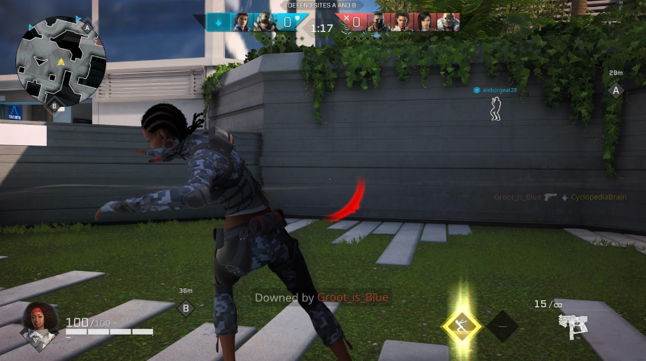
A major issue for me was the lack of subtitles for in-game call outs of what’s going on. If deaf and hard of hearing players can’t intuit what the tiny icons shown during rounds mean, they will be left, as I was, wondering what on earth is happening and what they should be doing. And while you’re standing there trying to guess what the many icons mean, you’ll probably be eliminated because there’s also no indication that enemies are nearby, aside from listening for them, until you’re actually being attacked by someone right behind you.
You can see on the above image that while my teammates are displayed by little blue arrows on the minimap, there’s no indication of the enemy that is right behind me, killing me, except for the reticle telling me that he is right there, killing me.
EA’s Rocket Arena, yet another third-person online shooter, suffers from many of the same accessibility problems as Rogue Company. While it at least manages to have a novel take on the genre (who doesn’t enjoy shooting rockets and blasting opponents into oblivion?) I was genuinely shocked that EA, regular champions of accessibility, published a game missing so many standard accessibility features.
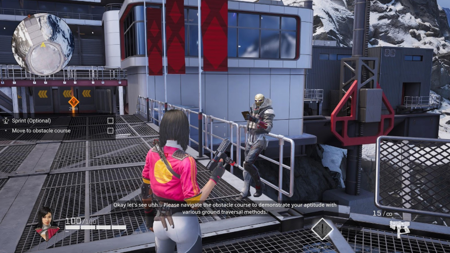
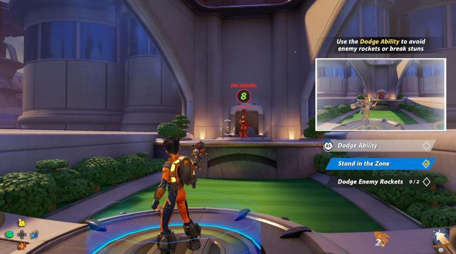
Upon launching the game for the first time, players will be forced into a tutorial. Subtitles are on, with a solid background by default, which I appreciate, but one glaring oversight made the opening minutes of the game nearly impossible for me to pass.
Dodging rockets, which players must successfully do three times before being able to play beyond the tutorial, are bound to a right stick press. You don’t have the option to change this until you’ve successfully completed the tutorial, which left me dislocating my thumb three times.
When you finally can access the controller options, there are eight choices but every single one of them binds an essential action to a stick press, leaving the game inaccessible to a great many players.
Rocket Arena also suffers from many of the same issues regarding deaf and hard of hearing accessibility that Rogue Company does.
My time in Rocket Arena was spent wandering somewhat aimlessly trying to find opponents to shoot but mostly, my time was spent being eliminated over and over again. Why? Because there’s absolutely no indication apart from the sound that a rocket has been launched at you until it has either hit you or a nearby structure.
This alone makes the game very difficult for Deaf and hard of hearing players to enjoy, when we know our experience isn’t even close to being equal to that of our hearing peers. Pair this issue with the incessant thumb dislocations and Rocket Arena quickly becomes a game I won’t be playing again.
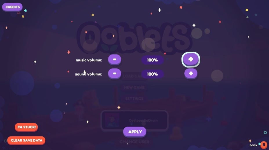
Ooblets, an adorable Pokemon x Stardew Valley game from Glumberland, released into game preview earlier this month and it’s one of the highlights of the summer for me. The adorable Ooblets, the dance battles with catchy little tunes, and even the character animations have proven to be precisely what I need to add a little joy to my living alone during the pandemic. And while the options are very limited at present, at least for me, this is perfectly OK because the gameplay is so enjoyably simplistic.
The game consists of two aspects: exploration and farming, and card-based dance battles. Neither mode really requires complex controls, the most complex bit being holding a trigger while moving the cursor with a stick, and most interaction is completed with a single button press.
While stylized and certainly not ideal for all players, the subtitles are fairly clear and easy to read, though size options would be a nice addition to the game’s full launch.
Same goes for the text on the cards, explaining the effect each move will have. It’s legible but many players will need the text to be much larger to be able to read it comfortably.
Something I really appreciated about the dance battles was that while the music is a major draw to what makes them so adorable, the visuals paired with the music makes them enjoyable for deaf and hard of hearing players, or even just those playing with the sound off.
I do hope to see full remapping and text size options at Ooblets full launch, but for an early access game, it’s still a rather accessible experience.
Finishing up this month is an update to Ghost Recon Breakpoint from Ubisoft. While the update didn’t specifically address anything related to accessibility (I’d argue that there’s not much left to improve on here) the AI squadmates update solved one of the biggest issues regarding deaf/hoh accessibility issues that GRB’s predecessor, Ghost Recon Wildlands, suffered from.
The above image is from Ghost Recon Wildlands and is intended to show the lack of subtitling for the AI squadmates for things like their callouts of nearby enemies and incoming threats. While enemy location is shown generally on the minimap, the squadmate callouts would tell the player precisely where the enemy was and deaf and hard of hearing players missed this entirely.
This problem has been solved with the addition of AI squadmates in Ghost Recon Breakpoint, which, for me, reiterates Ubisoft’s commitment to listening to and taking to heart feedback from disabled players. In fact, I recall our original criticism of this feature being lacking in Ghost Recon Wildlands being among my first of many interactions with Ubisoft’s David Tisserand. At the time, he’d said he couldn’t promise it would be fixed, but noted that he appreciated the feedback and would share it with the team to keep in mind for future games. I’m not at all surprised that he kept his word.
