The best (Darksiders Genesis) and worst (Kentucky Route Zero) games of the month in terms of accessibility
There are games that are thoughtfully and specifically designed with accessibility in mind and there are games that leave me wondering if the developers are even aware disabled people exist. The latter is why my partner and I founded Can I Play That? just over a year ago - the result of years of advocacy within the #a11y community both on and off social media.
Even with endless advocacy, whether or not a disabled person will be able to play and enjoy a game is still, unfortunately, a crapshoot. There are some studios and devs that discuss their game’s accessibility publicly before the title is released, but this is still not a common practice. That’s why I’ll be here each month to discuss the best and worst in game accessibility.
The beginning of 2020 has seen some hits and some tremendous misses in accessibility.
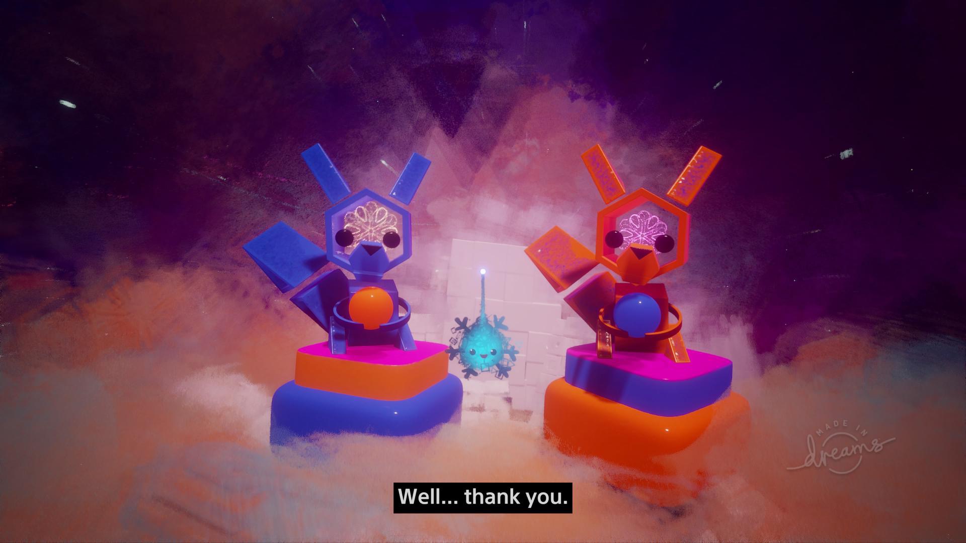
Dreams (PS4) accessibility options
Dreams is a tricky game to discuss in terms of accessibility. While Media Molecule has put tremendous effort into ensuring its game is as inclusive as possible, Dreams is mostly a hub for the creations of other people. Because of this, it’s simply impossible for Media Molecule to ensure all things created in Dreams are equally accessible.
User-created games and experiences range from adorable platformers and puzzlers to relaxing audio-visual experiences which are, without extensive work, inaccessible to blind and or deaf players. On the creation end, Media Molecule has done a remarkable job since early access to improve accessibility.
The early access version of the game was controlled solely by motion controllers while the full release has added standard thumbsticks as an option.
The subtitles are simply amazing, with some impressive size options, though they lack speaker labels for rare cinematics.
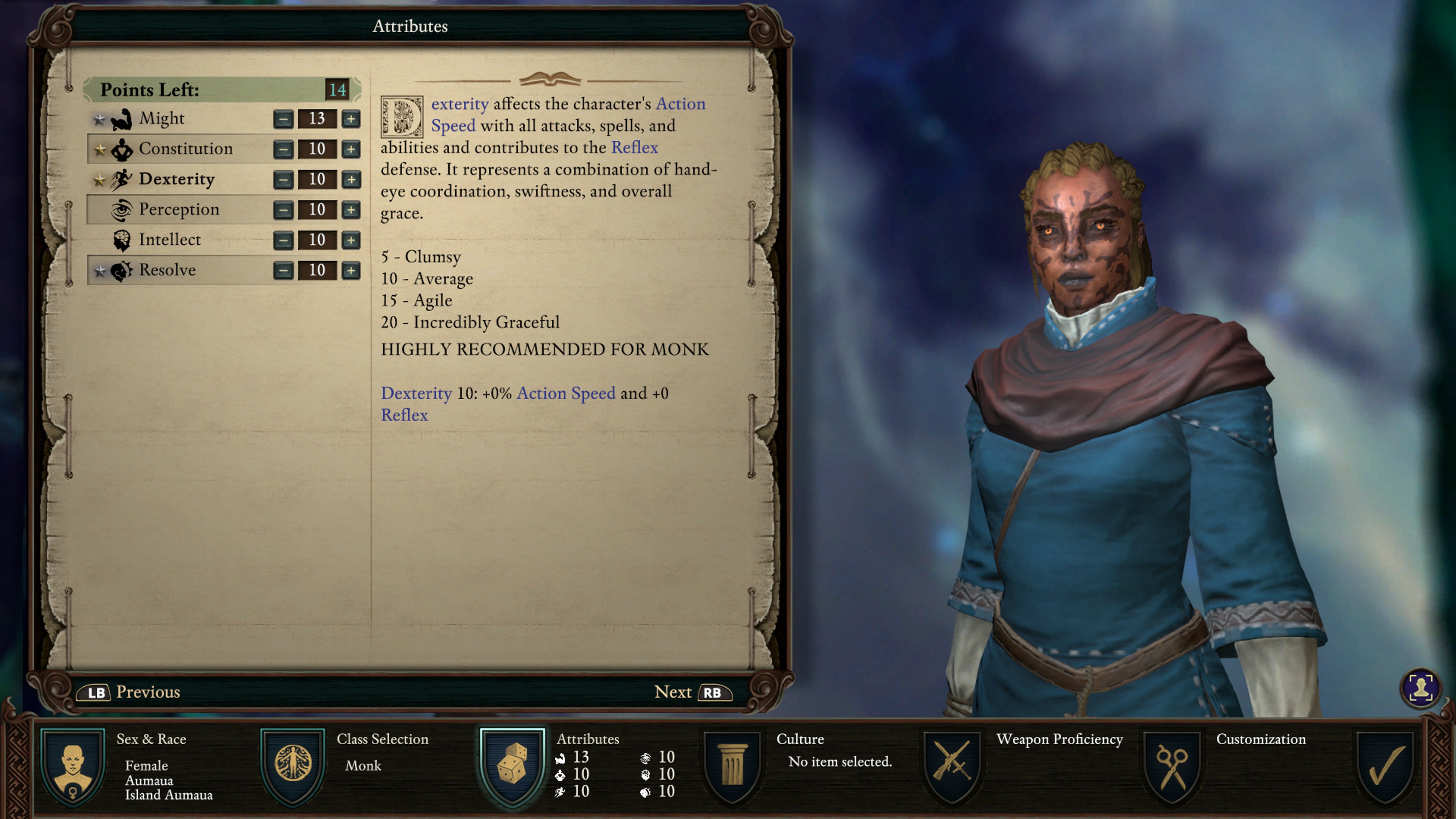
Pillars of Eternity 2 - Ultimate Edition small text
There are some games that leave me wondering if the devs know accessibility is even a thing? Pillars of Eternity 2 is one of those games.
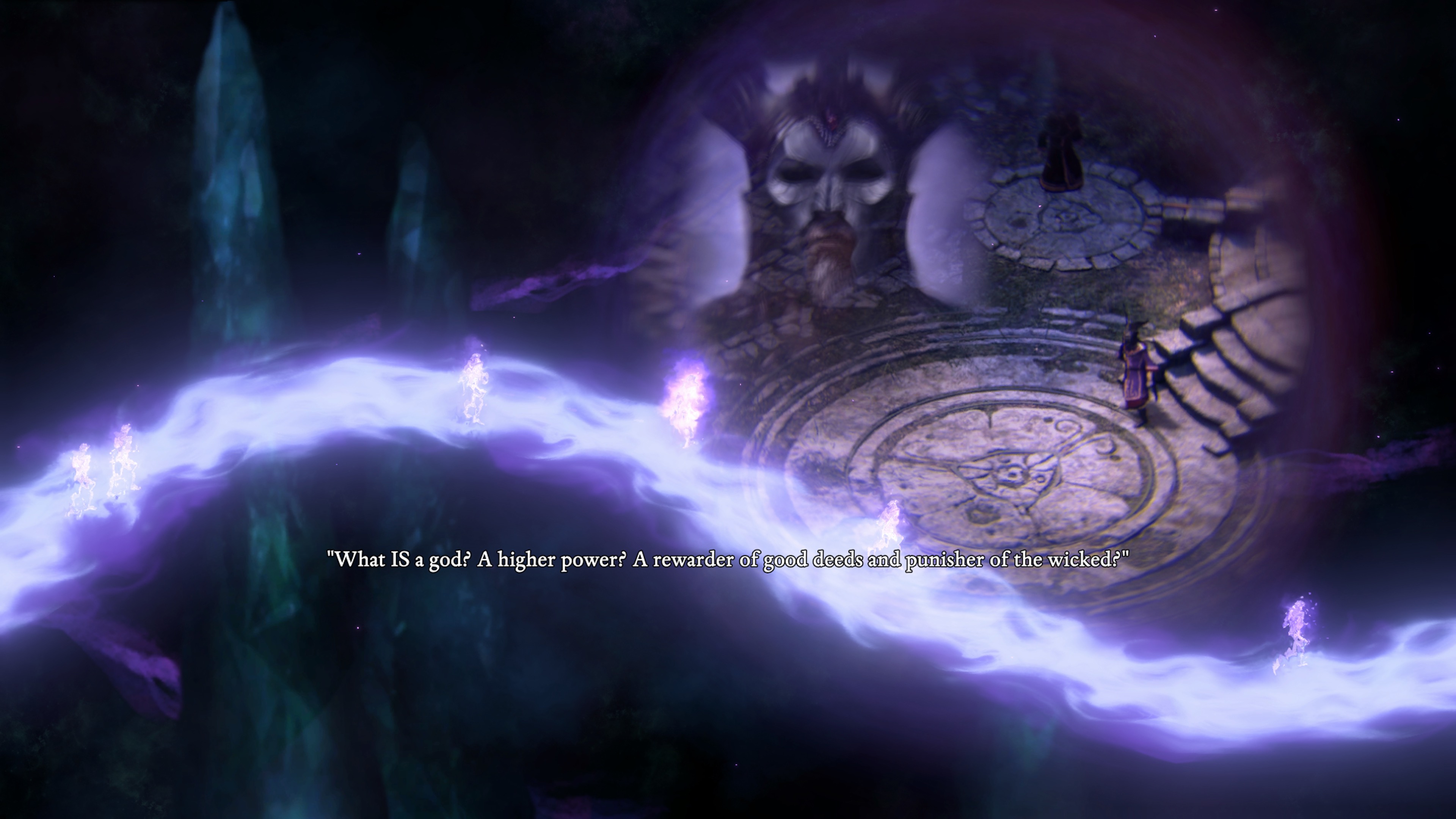
Upon gaining control of your little ghosty character, the subtitles are painfully small and contrast proves to be a problem throughout much of the intro sequence. The character creation menu doesn’t fare much better.
In class selection, the difference in the text you’ve selected versus the rest of the classes is so miniscule that I was about to reboot the game, thinking it didn’t work, before I noticed a very slight bolding of the class I’d selected. The character stats and info that appear at the bottom of the screen are borderline microscopic and the color difference in dialogue options on the one you’ve selected versus the others is, again, barely noticeable.
Unlike the PC version, there is no controller remapping and the radial UI will be inaccessible to many players. Pillars of Eternity 2 would have been one best left not ported to console.
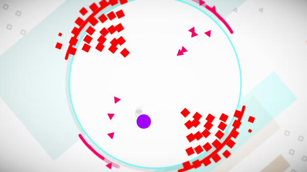
HyperDot accessibility options
HyperDot is a difficult game to be good at, but that’s not due to poor accessibility. HyperDot is a masterclass in accessibility and challenging by design. This is the rare game that will leave both abled and disabled players questioning their skills equally! The solo developer even went as far as to consult with accessibility specialist Cherry Thompson and listed them in the credits.
As a largely visual arcade-style game, deaf and hard of hearing players will find no barriers whatsoever. For players with limited mobility or range of motion, HyperDot has fully customizable controls and allows the use of third-party accessories and software such as Tobii Eye Tracking.
Darksiders Genesis subtitles
Having never played any game in the Darksiders series, I approached the latest release with no expectations for anything, from gameplay to accessibility. I am astounded by how good the studio did with accessibility. Clearly the developers have been listening to all of us working to improve game accessibility and it paid off. Darksiders Genesis launches with a cinematic before you’re shown any sort of menu.
Unlike many games that do this, the cinematic plays with subtitles on. Not only are they on by default, they are nicely sized, they have a background that makes them legible, and text is in different colors for different speakers!
Once past the opening cinematic, players will find an extensive amount of customization, from fully remappable console controls to UI text scaling (which also scales the text of the non-cinematic dialogue subtitles).
Kentucky Route Zero - no options menu
I really wanted to like Kentucky Route Zero because so many other people raved about it, but I just can’t. I tried. I tried so hard, but during my time in Kentucky Route Zero every new thing I saw or had to do gave me a new reason to dislike it. I’m shocked by how a game with minimal things to do can fail so majorly in accessibility. As a disabled player, the first thing I do in every single game I play is jump into the options menu. I couldn’t find one here. I still don’t know if there is one.
Aside from the roman numerals used to indicate act selection, there is nothing intuitive about this menu. If your game makes me feel stupid, I’m not going to want to play it beyond that point. If your game’s menu can manage to make me feel stupid, I’m not going to want to play it at all. Aside from that, even as someone with decent vision, I could barely read the ridiculously thin menu and dialogue text.
Low-vision players will find this game particularly problematic because of this. Deaf/hoh players may struggle to find the game worthwhile as it seems like a game that relies heavily on sound design for immersion and none of that is conveyed visually.
Zombie Army 4: Dead War aim snapping
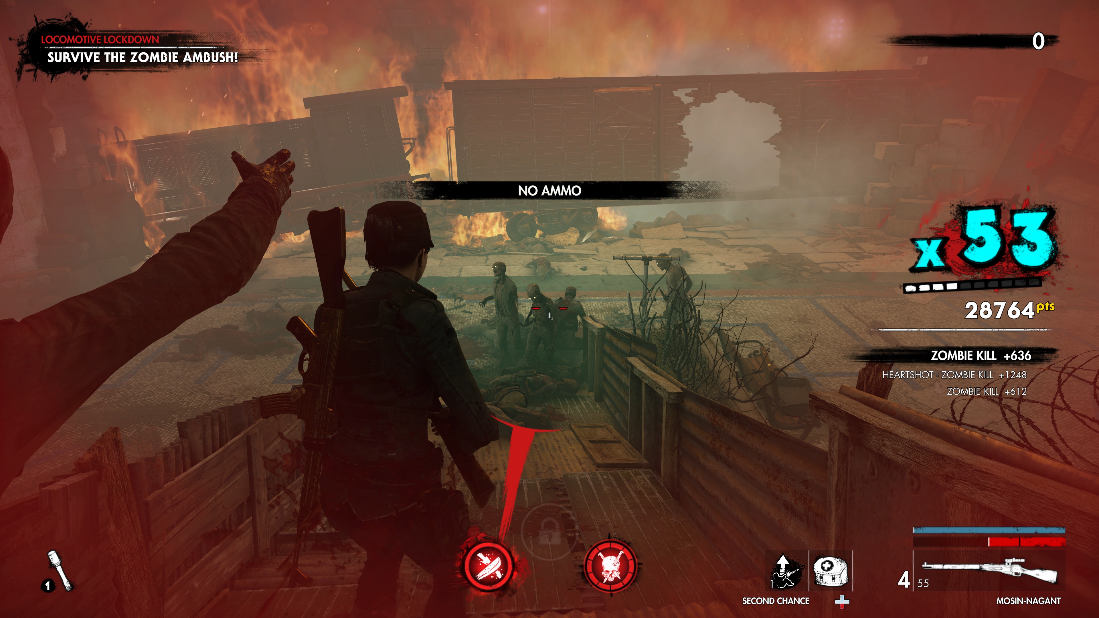
I played this series of games solely for the satisfaction of the x-ray bullet cameras that show the various exploding body parts of the Nazi zombies, so I won’t pretend to have any brilliant things to say about it. I just like seeing those rotting skulls explode. The release of Zombie Army 4 marked a significant improvement in the game’s overall accessibility compared to Zombie Army Trilogy, but there is still room for improvement.
For deaf/hoh players, Zombie Army 4 offers a size selection for subtitle text, along with subtitle text color options and a minimally improved visual indicator system for nearby enemies (it only occurs when the enemies are close enough to actually hit you).
There isn’t full controller remapping for consoles, instead offering two options for control styles. As a player that deals with hand tremors, I need strong aim assistance or snapping in shooters. Zombie Army 4 has it, at least in theory, with sensitivity sliders, but it didn’t seem to work during my time with the game (that or Rebellion and I have very different definitions of “strong” aim assistance). I love this game for its bullet-time cameras, but in terms of overall accessibility, all I can say is that it’s fine.
Read the VG247 Zombie Army 4 review here.
Journey to the Savage Planet - toggle to run
Another game that left me feeling, “Meh, it’s fine,” is Journey to the Savage Planet. The game itself? Absolutely lovely! It’s bright, colorful and funny. It’s everything I wanted in a space exploration game with no heaviness of moral dilemmas, and it certainly doesn’t take itself seriously. The developers did take accessibility seriously though. Kind of.
The subtitles: well, they’re there. That’s about all I can say about them. They’re not microscopic, but they’re also not large enough to read easily, which is unfortunate because the dialogue is fantastic.
Tiny, tiny subtitles aside, there are some nice features! Players can even go so far as to limit the chattiness of their EKO companion. Many may not consider this an accessibility feature, but it is absolutely essential for players who can become easily overloaded by too much chatter and info and players with auditory processing issues.
There’s also aim assistance, a toggle or hold option for running, as well as two controller layout options. They’ve covered many of the most basic accessibility necessities, but the game would benefit tremendously from full controller remapping and subtitle size options.
You can check out the VG247 Journey to the Savage Planet review here.
Metro Exodus accessibility options
Metro Exodus is not a new game. I know. The patch I’m about to discuss is also not new. It was released back in August of 2019. But I just learned about it last week so here we are, pretending that it’s new.
I did a deaf/hoh accessibility review over on my site, Can I Play That, around the game’s release date. If someone would have told me at the time that my review would inspire the devs to make fixes and release a patch, I’d have laughed (this is so rare that it’s happened twice in all my years of doing accessibility reviews). If someone had told me this patch would introduce the single best implementation of a deaf/hoh accessibility feature that I’ve seen, I’d have laughed harder. But again, here we are.
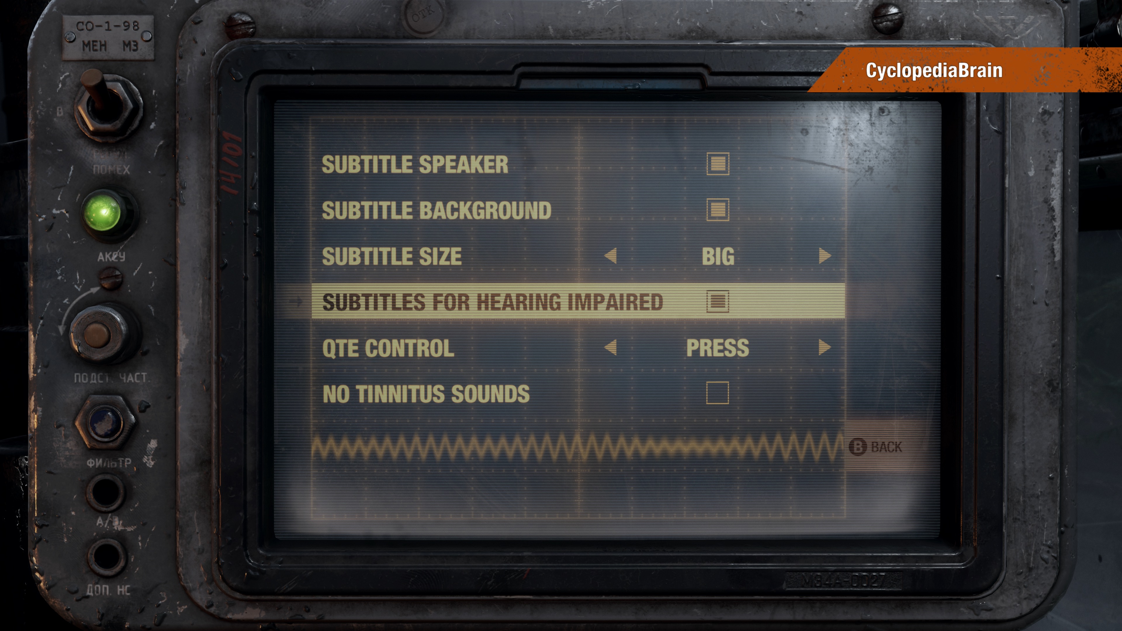
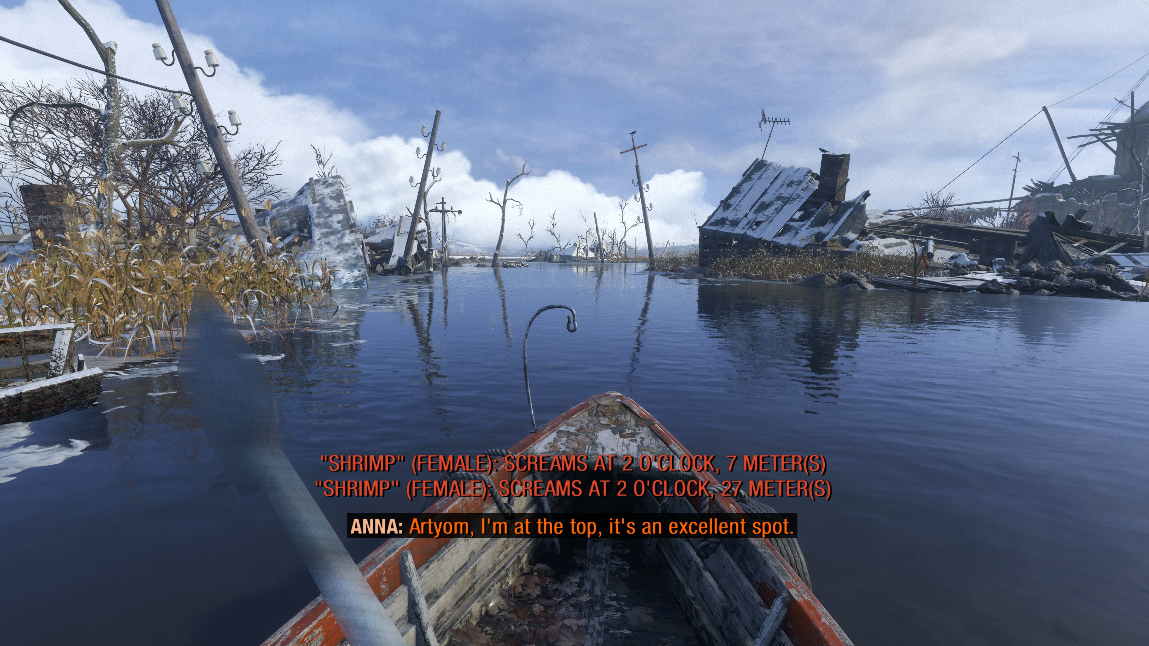
In the accessibility menu, players will now find “subtitles for hearing impaired” and what this magic little feature does is tell players exactly what enemy is doing something nearby (Bandit, Watcher, etc.), what they’re doing (screaming, attacking, searching, etc.), in what direction in the form of an analogue clock, and how far the enemy is from them.
Also new in this patch is the option to turn off tinnitus sounds which is something that really should exist in every game that subjects players to the awfulness.
Here's the VG247 Metro Exodus review.


