Of course The Witcher 3 looks blurrier on Switch - but it's still brilliant
I've seen it, it's real, and it's a little bit like magic. The Witcher 3 runs on the Nintendo Switch - and sure it looks worse, but who cares? It fits in your pocket.
That should probably be CD Projekt's official marketing line for the Nintendo Switch version of The Witcher 3: Wild Hunt - "Yes it looks worse, but it fits in your pocket, shut up." What you've got here is a version of one of the greatest and largest RPGs of all time that's been scaled back visually but is also uncompromised in terms of content - and squeezing all of that stuff onto a single Switch cart is perhaps even more of an achievement than getting it running in the first place.
"We really were focusing on making sure that it's the exact same experience that we have on other platforms," CD Projekt Red senior producer Piotr Chrzanowski explains. The idea is to ensure that in content terms the game is identical to the one found on PC, PlayStation 4 and Xbox One - and that's taken priority over visuals.
That doesn't just mean squeezing the base game, all DLC and expansions and even a couple of different languages (which ones vary by your region) on a single 32GB Nintendo Switch cart - it also means things like not taking the easy way out in busier areas of the game. One easy compromise would be to make a bustling town square less bustling, removing some NPCs to boost the frame rate, for instance - but for the most part, this version of the game doesn't do that. It's shooting to be a strict one-to-one port.
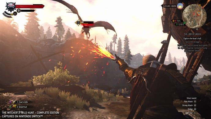
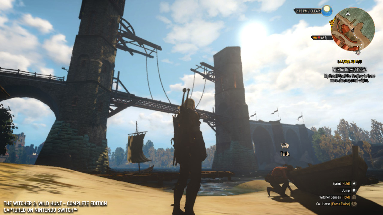
In visual terms it is plainly a compromise, and in the first moment you see it the 'downgrade', as the internet will surely name it, is quite noticeable. In handheld mode the tweaks, adjustments and compromises quickly begin to blend into the background, however, especially when the game is in motion: it's blurrier, but the presentation is such that when in your hands on the Switch's modest handheld screen this is a perfectly acceptable experience - something which many people thought would be impossible when the game was first announced.
"I didn't think it was impossible, but I did think it was a very interesting thing to do," Chrzanowski says. "Impossible wasn't my first reaction. Challenging, yes - but we knew that we have quite a good engine."
CD Projekt's engine holds up well here on the Switch, with the compromises made quite sensible. CD Projekt say the game runs at 540p in handheld mode - so well below high definition - but this doesn't really matter on the Switch's handheld screen. Docked it runs at 720p, and even though performance is steady, that alone makes it clear that if you have access to a PS4, Xbox One or PC, there are better, more paletable options for couch-based Witcher action. For handheld, however, the Switch version is a dream.
Arguably most impressive is how all of this fits on a 32GB game cart - down significantly from the over 50gb The Witcher 3 takes up on PC.
"Well, it's sorcery," Chrzanowski laughs when asked about the compression process, before getting serious. "There's a few things. One is textures, right? You want to make sure that the textures work well within the resolutions that you set up for this project. So that's one thing. Secondly, we can get away from some of the very, very, detailed models, because we don't need that level of detail at 720 in many cases - so you can work with that. We compress the cutscenes to work at 720. So each of those steps - step-by-step, you get some space. Also we worked quite a bit with the sound and a few other of those areas. We learned a lot about the engine over the years - so through all of that we managed to fit it all into 32GB."
Switch carts are expensive, which is why some publishers have put out games on smaller carts and then forced users to download additional data rather than pay out for a more expensive cart. But just as they include bonus extras in their retail packages, CD Projekt is keen to provide a good-value, complete package.
"We certainly know how expensive it is," Chrzanowski says of using a 32GB card. "I think it was a decision, again, that we wanted to make sure that whoever buys the game can enjoy it just as on the other platforms. Not everybody who buys the game has access to the internet. Not everyone wants to download - so we want to make sure that if you buy the game, the physical cartridge, you can just enjoy it. That's what we promise, and what we deliver."
That approach to the design of the game - porting it without making material changes - defines this release. Chrzanowski calls the game "a closed book" - so the only major changes made are for practical reasons. Thus the graphics changes, or a tweaked menu system when in handheld mode that is easier to read on a tiny screen. When docked, the original menu returns - there's that level of dedication to feature parity. That means no Nintendo costumes or extras, either.
In a case such as this, pictures and video will be far more descriptive than words alone - so do take a look at the embedded video and screenshots on this page for a better idea of how The Witcher 3 looks and runs on Switch. But take my word for it - it's real, it works, and Chrzanowski is right - it is like sorcery. It's a step down, but if you've wanted to play this game on the go without lugging around an oversized Alienware laptop, it's a totally acceptable trade-off.
Yes, it looks worse - but come on now; it fits in your pocket. Shut up!


