Pokemon Sword and Shield isn't the long-overdue evolution this series deserves
Pokemon is enjoying something of a renaissance, but the first home console entry in the main series doesn't appear to live up to its potential.
The resurgence of Pokemon isn't just down to the huge success of Pokemon Go, either - there's stuff like Detective Pikachu and new CG-animated movies, but a huge part of the excitement for me is also the Nintendo Switch. After years stuck only on a handheld machine generations behind the rest of the industry in terms of power, Pokemon was finally going to make the jump to something bigger and better. The potential feels endless, and just considering it I'm suddenly a kid again, dreaming about what a main-line Pokemon game for the N64 or GameCube could look like - except bigger and better.
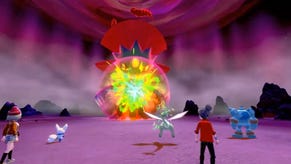
After a brief hands-on with the same content playable at E3, I'm unconvinced Pokemon Sword and Pokemon Shield will actually be bigger or better. Sure, the action is literally bigger thanks to the giant Pokemon of the new Dynamax feature and the fact I'll be able to blast these games up on a 70-inch screen - but I was astonished at just how samey and similar these games feel to everything that's come before.
I'd sort of always excused how stilted and awkward the 3D modeled Pokemon games have often looked, blaming it on the 3DS hardware or the lower budgets of spin-offs like the Stadium games alternately. Let's Go got a pass for being a faithful re-imagining of an older game and supposedly a test-run for developer Game Freak to learn its way around new hardware. With Sword and Shield the excuses are gone. This is a main-line entry in the series that will sell millions and make money hand-over-fist; it should have the budget. This is on the Switch, by no means the most powerful of hardware but a machine that can deliver absolutely gorgeous experiences.
And yet this feels the same. It looks the same. After the hands-on I went straight on YouTube and looked up footage of Pokemon Sun and Moon running at 1080p on a 3DS emulator. Sword and Shield obviously look loads better, but the pair are a damn sight closer than they should be. Blown up on a big screen and sitting next to other upcoming Nintendo-published titles like Astral Chain, Luigi's Mansion 3 and even Link's Awakening really makes the deficiencies of this style all the more prominent.
I've been playing Final Fantasy 10 HD Remaster on my Switch; that's a tweaked and improved version of a turn-based, random encounter-driven RPG that's old enough to legally drink. In battle it looks more dynamic than and exciting than Pokemon Sword and Shield in spite of its age. The stream of water representing hydro pump sprouting out of a character's forehead rather than their mouth or combat-focused water cannons was something that could pass with 2D sprites and on a tiny screen - but the bigger Pokemon's venue gets, the more pathetic this sort of representation looks and the more it sucks all of the excitement and tension out of battles.
During E3 I saw a really dumb thread on a forum suggesting a modern Pokemon game should look as flashy in combat as Final Fantasy 7 remake does. That's very silly, of course - but I don't think it's too much to ask that now the series is on a more powerful machine that it starts to look like other console turn-based RPGs from nearly two decades ago.
All of this, of course, links back to the decision to cut the national Pokedex from the game, meaning that for the very first time it won't be possible to catch 'em all in this entry. This I actually understand: as explained by Sword and Shield producer Junichi Masuda, maintaining balance and building everything required for battles for almost a thousand creatures is a big ask. My sympathy for the team in relation to the backlash against cutting the national dex is significantly lessened when the game feels like it hasn't made any significant leap forward.
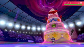
In the hands-on demo, I tackle the water gym. It's not clear where in the game this takes place: everything is power-levelled to level 50. Encounters are swift, simple, and play out exactly as they have in other titles, complete with the entirely flat-feeling presentation. Most of the encounters in the main gym take place in a naff-looking blue void, but when I get to the gym leader (who is a black woman, by the way - representation! Cool!) things look better, taking place in a stadium with packed crowds.
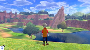
The journey to the leader is fun enough: a couple of random encounters and a neat water-flow puzzle with you switching on and off geysers of water to clear an optimum path to the leader. There's no camera control as is Pokemon tradition, but the jump to the big screen makes that fact feel alien and weird. One major area of Sword and Shield does feature full camera control, and this is the area that's widely appearing in screenshots, which risks giving a false impression the majority of the game will be like that - it will not.
Anyway, this gym is classic Pokemon stuff. It's fine. There's nothing that feels new, however. There's nothing that feels like it's leveraging the vast additional power now available to the development team. At best it feels safe; at worst it feels utterly static to the point of paralysis. Evolution is a major theme of Pokemon, but the series itself seems incredibly resistant to it.
That probably best describes how Sword and Shield appear, at least from this demo: safe and static. If you love Pokemon you know what you're in for - for better and for worse. I'm excited for the new Pokemon and for an adventure in a region based on the UK, but when I imagined the first major Pokemon release making a debut on a Nintendo console rather than a handheld, I imagined so much more. I can't help but be disappointed.
