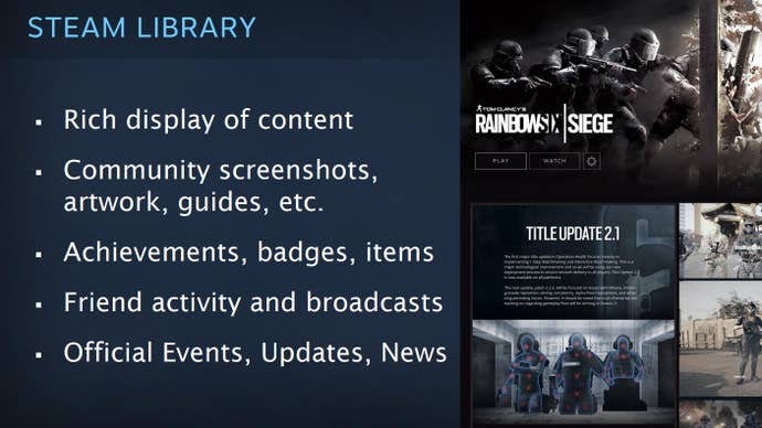
Here's a brief look at Valve's redesigned Steam UI
If you've been following Valve and Steam development news, you'll no doubt have heard of a fabled UI overhaul many times over the past few years.
Pavel Djundik, creator of the popular leaks and data mining website Steam Database, shared a couple of images showing Valve's re-imagined Steam UI.
The shots represent an in-development build, and were part of a PDF distributed at a presentation Valve hosted in January. The UI looks drastically different from the 2017 leak, which had been dug up in Steam's own files.
It appears Valve has redesigned, well, the redesign. It's hard to judge from these shots how everything will fit within the current client. This sort of collage/tile format is new to Steam, but it's been utilised in other major digital stores like Xbox, and even in the menus of many EA Sports games.
Valve intends for the new UI to feature a "rich display of content", and be able to combine traditional store info with community-created content, achievements, and official in-game events and developer blog posts.
The current iteration of the store does feature all of that, of course, but many of the features are scattered throughout the page, as a lot of them were bolted over to the existing design, which itself is ancient.


Valve has referenced this mysterious Steam UI overhaul many times in developer conferences in the past. In January, a product designer at Valve clarified that development on the redesign continues, but that's about it.
