Darksiders 3's unfocused design is stretched thin between Zelda and Souls
Darksiders 3 ditches the flashy, arcady combat of its predecessors for a more methodical approach. Having now played it, I am not convinced that was the right direction to take the sequel.
The timing of Darksiders 3 couldn't have been stranger. On one hand, you could argue that the series no longer has the brand pull it once did, which potentially means this is an unnecessary sequel.
On the other, a sequel to Darksiders represents an interesting challenge for all involved; a chance to start something fresh or improve on an existing formula. Needless to say, I was anxious to start playing to see for myself what a modern Darksiders can be.
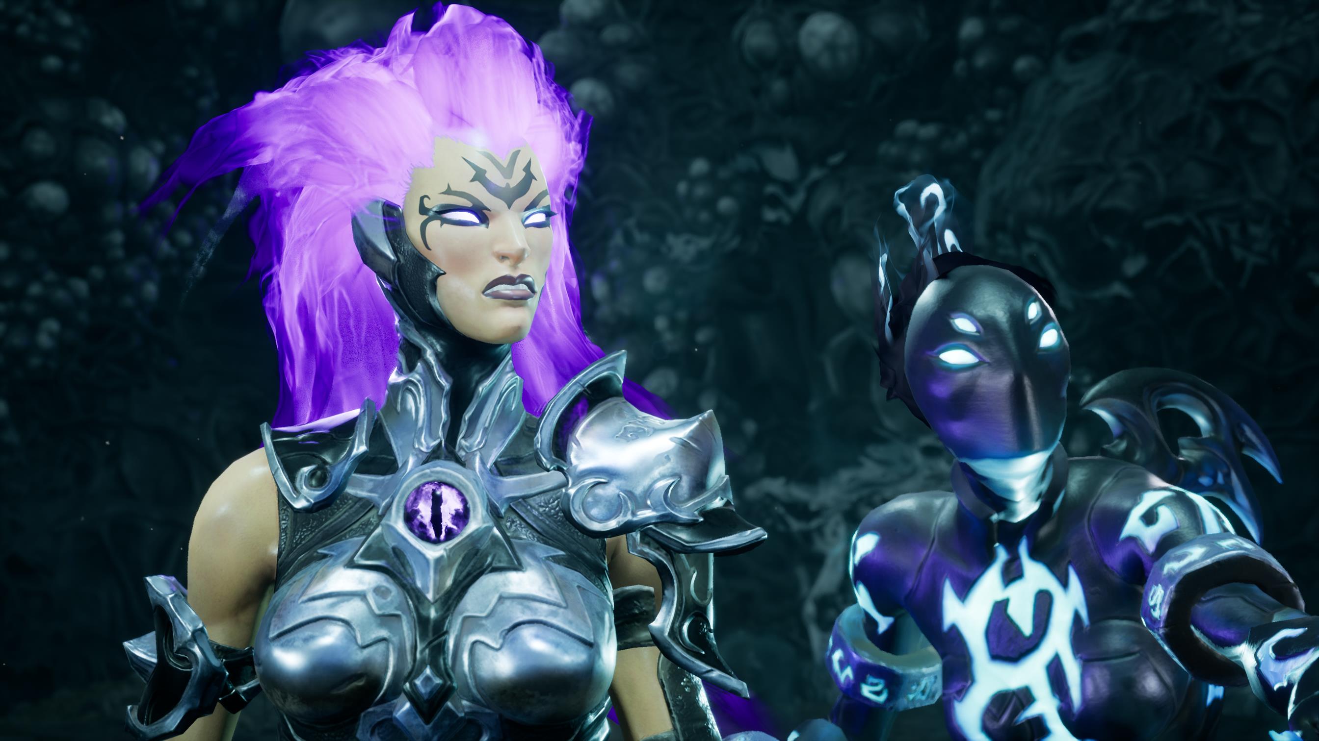
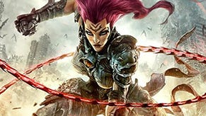
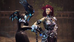
The preview build starts off partway through the story, with Fury, the game’s protagonist, having already acquired two Hollows. These are subclasses that each offer a different elemental effect and unique attacks. One imbues Fury’s whip with flame, while the other with a type of magic called Force. Judging by the menu's layout, it appears Darksiders 3 will have four Hollows.
If you already guessed these powers can also be used to unlock previously inaccessible areas in the game’s world, you’d be correct. In the demo, certain obstacles needed to be burned off with a flame attack, and purple fungus-covered walls could only be demolished with a Force heavy attack. The metroidvania influences of the original games do return here, but they're manifested in different ways.
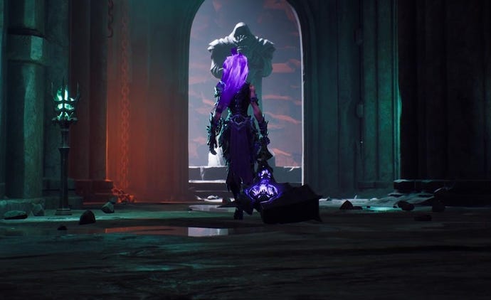
The game world is surprisingly open, and the absence of a map made exploring every pathway exciting. It’s not usually easy to judge whether you’re headed in the intended direction or meandering off the beaten path, but that could just be the area the build started in.
It’s also a very vertical world, with lots of out-of-sight areas hiding loot (and ambushes) waiting for those who can spot them, and figure out how to reach them. This is another thing that benefits from not having a map.
With the expanded emphasis on world design comes a desire to sort of make it its own character. This is the first thing I can safely say was inspired by From Software’s designs. I’d have to play the entire game to judge if Gunfire Games has been successful in creating a world worthy of exploring, but the sewer level featured in the preview build left me worried.
It’d be genuinely surprising and interesting if, along with taking out the map, Gunfire also left the entire game world open for exploration from the start. Some areas could still be gated off, of course, to maintain control of difficulty and pace.
The biggest manifestation of these Souls inspirations, however, can be clearly seen in Darksiders 3’s combat. Fury is fragile, and I found it best to keep enemies at a distance. Her whips help with that, but the range is short enough that you can still feel every attack’s impact the way you would with a sword.
With such low survivability, you’re practically required to be methodical with your approach. Enemies are plentiful, and they tend to stay in pairs or around one another often. An all-in approach is often the quickest way to die. Most situations are best approached with tact; waiting for enemies to separate so you can isolate a straggler, or performing a jumping attack to start a busy fight with some free damage.
There’s nothing wrong with having tactical combat, obviously; Souls games are some of my favourite RPGs, but it doesn’t serve Darksiders 3 nearly as well. The combat of these games, and certainly in 3, always look like they were intended to be flashy and sometimes over the top. You can see that in the many visual effects that accompany every attack. Readability, then, was never a concern.
Injecting tactical elements into Darksiders combat and asking players to consider their approach will inevitably result in an over-reliance on “safe” combos and surefire attacks. For instance, I found it hard to air juggle certain enemies in the game, and I realised that after having lost over a quarter of my HP when I tried it on them enough times.
Air juggles look cool and feel good, but they're evidently best kept to smaller foes. This will likely be tweaked and balanced as development progresses, but it wasn't immediately clear which enemies are immune to which attacks. This another fault of the game's visuals, which favour style over practicality.
The most egregious thing in the demo by far is how lock-on works. The 2D targeting/Zelda-style lock-on returns in Darksiders 3, and I can honestly say it has no place being in a game as challenging and methodical as this one wants to be. Dealing with more than one enemy is a nightmare because Fury always locks on to the nearest target she’s facing.
If you move the left analogue stick slightly in any direction, away from the enemy you're fighting, lock-on is bound to track a different target. I’ve died so many times doing this and never quite figured out how the camera works.
It's also still tied to holding the trigger, which goes against years of muscle memory - and frankly, instinct - when dealing with challenging combat in games. I found it impossible to maintain lock-on while pacing my attacks and watching spacing.
The game tries to compensate for this by encouraging dodging, offering a high-damage attack whenever you execute a perfect dodge. This reliance on dodging is further reinforced by the lack of a stamina meter. But the unwieldy lock-on negates that emphasis almost immediately, and forces you to keep it 1v1 whenever possible.
Even then, the camera completely breaks anytime your view catches a wall. It doesn't pull out as you'd expect, and the game doesn't turn walls transparent for visibility. This is another thing that would be a minor annoyance in an action-focused game, but it's rage-inducing in this.
And sure, you can always ignore locking-on completely, but it means losing track of your target’s health, which is not something you want, especially if you're fighting multiples of the same enemy.
There's no excuse for making lock-on such a hassle to use in a 2018 game. Willingly or not, the current implementation tells me lock-on isn't necessary, which goes against the slower pace of combat Darksiders 3 is trying to maintain.
A flashy action game likely doesn't need a lock-on system, but a Souls-like does. This duality in design goals is what hurts the game the most. Darksiders 3 at times feels like a port of a last-generation game with this generation’s graphical fidelity. Outside of character movement, Fury doesn’t control very well.
She can double jump, but it’s not high enough. She also has a tendency to grab ledges, and with how little forward momentum you get from these jumps it can make reaching moderately high platforms a chore. Holding down the jump button unleashes a rocket thrust that always goes upwards.
You have little control over it, so forget using it as an attack opener. It makes it feel like the move was put in the game for a specific reason and not something to be used at will.
So much of my time with Darksiders 3 was spent counting the what-ifs. What if Gunfire leaned harder into Souls inspirations, or what if it abandoned them completely for something akin to Devil May Cry, or a modern take on its Zelda-inspired past?
I suspect these discussions happened at the studio at one point or another during development, but it's disappointing to see that a consensus seemingly wasn't reached.
Darksiders 3 has an identity crises. Its design is evidently stretched between two very different directions, with each claiming some parts and leaving the rest to the other.
I'll be the first to admit that combat in either of the two Darksiders wasn't particularly special, but it was always focused. Smaller enemies made the player feel powerful, and bosses demanded finesse, but none were punishing enough to require the methodical approach 3 expects of the player.
Gunfire needs to find the balance, even if it means cutting features and refocusing the game. I'd be fine with a game that leans into either direction, so long as it commits. As it stands, though, it's hard to enjoy it for what it is.
Impressions are based on PC code. Darksiders 3 is out November 27 on PC, PS4, and Xbox One.
