The remake of Secret of Mana fares well in this direct comparison
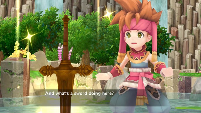
Putting the remake side-by-side with the original version of Secret of Mana shows how closely the remake matches the original, while also showcasing its upgrades.
Although the recently announced PS4/Vita/Steam remake of the SNES classic looks a little bare in some screens and videos released so far, when put next to the original the work that has gone into it is a little clearer. This video, from Cycu1, is based on footage from the playable demo shown at PAX West.
The look of this new version has been controversial, but it comes off fairly well here. It's clear that the designers have adhered closely to the layout of the original game, and the mini-map in the corner of the screen closely resembles the artwork from the original. The fact that character faces don't move while they talk during cutscenes is a bit odd, though.
It might be missing some of those cool retro effects that the SNES original packed in, but the dynamic camera during cutscenes is nice, and the environments are quite lovely (note the shifting shadows cast by clouds too). It also looks like movement will be more fluid in the remake.
In any case, we'll know next year how it turned out - Secret of Mana is due for release on February 15, 2018. If you'd rather stick with the original, it'll be the thirteenth best game on the SNES Classic Mini.


