Battlefield 4 gets new, cleaner UI on PS4 and Xbox One
The promised Battlefield 4 UI overhaul is now available on consoles.
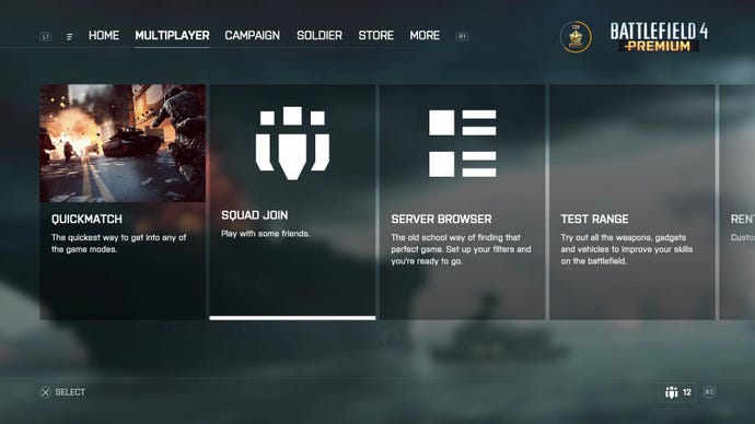
DICE's aspirations to build a central, unified UI for all the Battlefield games on consoles has its first real-world test today. Battlefield 4 is the first game to get the new UI, available now on PlayStation 4 and Xbox One.
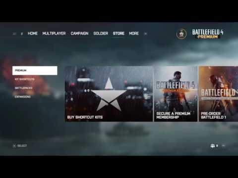
The new user interface is part of a 4GB patch that's been released earlier, with a similar update for PC still up in the air. This change doesn't affect in-game elements such as the map or deployment icons. Instead, it's meant to help players hop between the different Battlefield games (provided they own them) seamlessly.
Take a look at the gallery below to get an idea (via TheTacticalBrit).
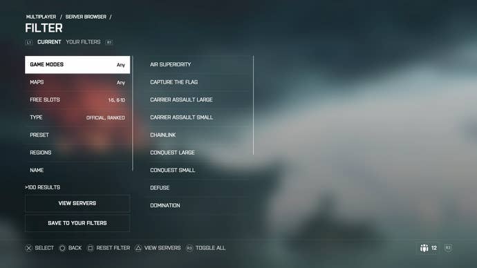
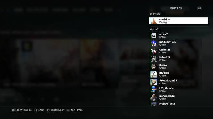
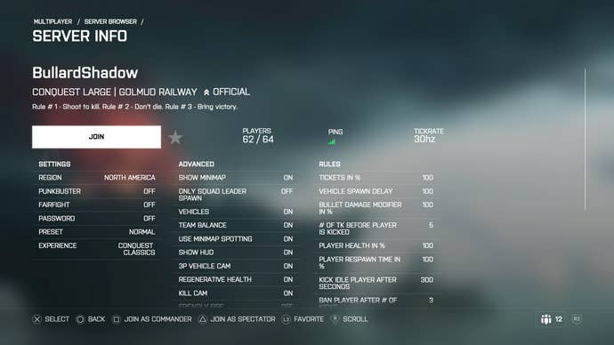
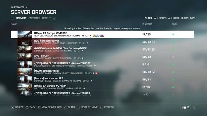
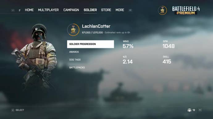
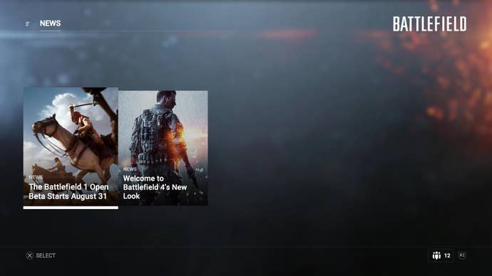
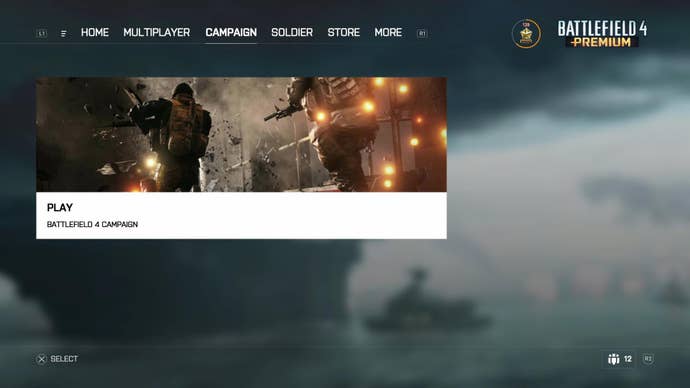
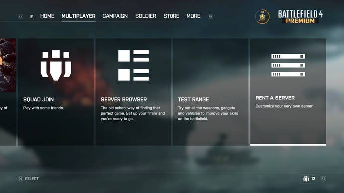
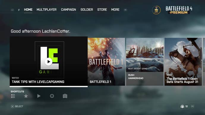
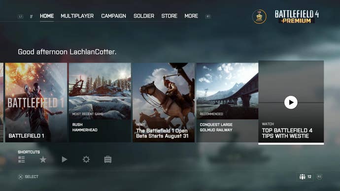
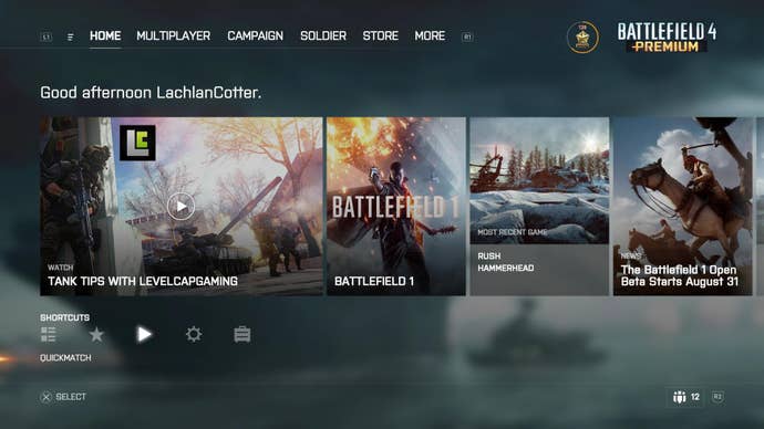
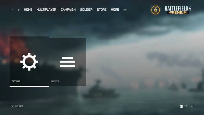
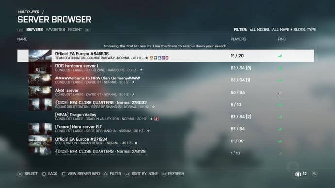
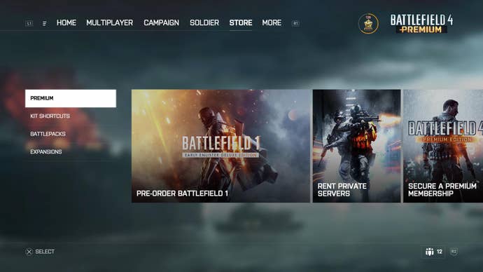
Battlelog is now gone, and the homepage has been redesigned to be easier to read at a glance. You now have tabs at the top for navigation, with big tile boxes under each tab. The server browser and quick join options for multiplayer are still there, though. You'll be able to also see other updates from the web, such as news, YouTube videos etc.
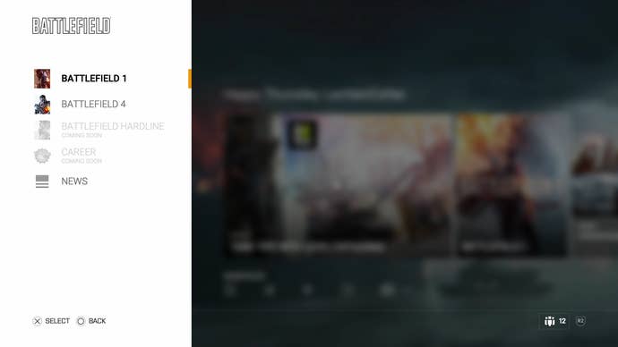
As you can see in the video above, via YouTube user Coldape, there's a panel on the left that lets you quickly jump between Battlefield 4, Battlefield Hardline, and the upcoming Battlefield 1. Hardline will get a similar update to its UI later, whereas Battlefield 1 will launch with it.
Squad Join, the feature that allows players to party up before joining a server and puts them on the same team as a squad, has also gotten some updates. DICE says spawning on your friends should be much smoother.
