10 years on, Resident Evil 6’s giraffe fellatio remains unparalleled
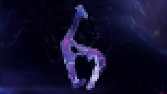
If you know, you know. And if you don't, I'm sorry to ruin Resident Evil 6's box art for you.
Lots of pre-release video games suffer the fate of becoming the subject of memes. Assassin’s Creed has come under fire for melting NPC faces, and many a ‘visual downgrade’ has launched campaigns of know-it-all fans to drone on about despicable devs. But one of the funniest of all time is this week turning a decade old: Resident Evil 6’s logo.
The logo, of course, is quite innocuous in nature. Resident Evil is a game about viruses, and the logo is meant to resemble a virus under a microscope or whatever. I get it. I see it. But back in the run-up to Resident Evil’s release, people saw something else entirely.
They saw a giraffe, being fellated by a doubled-over figure. And now I’ve said it, even those of you who weren’t terminally online in 2012 probably see it too. The giraffe BJ logo cannot be unseen, like a debauched Rorschach test.
I genuinely quite fondly remember the madness of this time. Media outlets reported on it. Twitter and forum users were in disbelief. Gleeful sicko fan artists redrew it with alarming clarity that I definitely will not link to or picture here. The logo gave people great joy, and in the end even Capcom quietly referenced its meme status in a couple of now long-gone social media posts.
This era was when Resident Evil was on one, the video game development equivalent of somebody who’d taken too much of something, leading to their brain running at a million miles an hour. Any inkling the series had to be grounded or down-to-earth had been ejected. With the mood around the series at this time, I’m still kind of amazed the series didn’t pull a Dino Crisis and send the zombies to space.
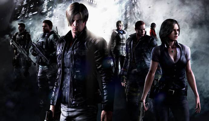
The logo’s accidental hilarity, in that sense, seemed to accurately match up to where the series was at the time – often unintentionally funny and misinterpreted, selling bucket-loads despite being on a path that was, let’s be fair, pretty messy and a wee bit crap.
Thinking about the logo and the tenth anniversary of Resident Evil 6 brings into focus something else, too: how brave and clever Capcom was with its choice to tone things down and head right back to basics for Resident Evil 7.
In situations like this, rarely do game companies actually see the iceberg coming. While it didn’t quite meet Capcom’s expectations, in sales terms Resident Evil 6 was ultimately as successful as Resident Evil 5 – moving over 8 million copies. Whatever Capcom’s expectations were, that made it at the time one of the top two best-selling Resident Evil games to date, and well inside Capcom’s top 5 games of all time. The easy thing to do would’ve just been to make another one, but polish it more and avoid the embarrassing logo and paying an exorbitant marketing fee to get lampooned by Conan O’Brien for being hyper camp.
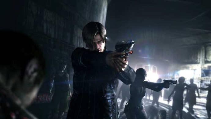
And yet, Capcom sensed the mood shifting even as it cheekly winked to the giraffe meme in social media posts, and made an adjustment. The coming iceberg – of people tiring of a balls-to-the-wall, stupid, not very scary Resident Evil – was steered around with style and substance. The series delivered something fresh. Ten years on, it’s difficult to view the decisions taken in the wake of RE6 for the next game as anything less than genius.
That thinking has been rewarded. The relatively down-to-earth Resident Evil 7 sits at 11 million copies sold. The similarly stripped-back Resident Evil 2 remake is closing in on 10 million; and those bombastic RE titles are now down at sixth and seventh on Capcom’s all-time best-sellers list. The shift worked, and Resident Evil is arguably in better health than it’s ever been. And, so far, none of the logos since have looked like a sex act. Maybe RE9 will deliver on that front – here’s hoping.
