The Witcher 3 sets a new generational standard for graphics
The Witcher 3: Wild Hunt is the new standard in outrageously pretty.
"The Witcher 3 is more than just eye-candy. Destiny, once the loveliest thing I had ever looked upon, has been outclassed."
The Witcher 3 is even better looking than the screenshots would have you believe, and until you see it in motion, running on a system you know well, you just won't get how pretty it really is.
It's really hard to talk about graphics without retreating into numbers - frame rates, resolutions, polygons per model. In the dick-measuring world of video games this works pretty well, because everyone wants the biggest numbers and the most words like "mega" attached to development terms. But I'm gonna give it a go anyway.
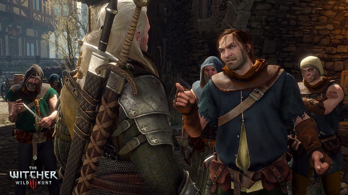
Check out Geralt in any screenshots. You see his mail shirt? You see how it's not just a flat texture, but modelled so that you can see the individual links? And they move around him as he moves?
Okay, that's impressive. It really is. But those links are pretty big. When you get the game actually in front of you, start a conversation with someone and look at their clothes. Really look; don't just click through the conversation and get back to the wolf smacking.
One of the early scenes has Geralt in a tavern, looking for information on Yennefer's whereabouts. One of the characters he can talk to - a scholar, I think - is wearing a garment with some sort of ruff-like collar made out of alternate strips of two different coloured fabrics. Look y'all, I don't know anything about fashion - I don't know how else to describe it.
Anyway, the point is if you look you can see the weave on the two fabrics, something many people don't even notice
While you're there in the tavern, which is impressively dark thanks to a realistic approach to construction methods of the time, why not stop and check out the decor? The locals of White Orchard aren't going to appear in Better Homes & Gardens any time soon, but it's worth taking a look anyway. In addition to the fetching, hand-painted floral decorations, one of the tavern's most notable charms are its pottery tankards.
Honest to goodness, these tankards. They're decorated with - clay snakes. You remember this from high school art, or maybe just play-doh as a kid. You roll a snake out and then you can curl it up into a shape and stick it on a flat (or cylindrical) surface. This is fully modelled, on something as inconsequential as a tankard, so that you can see the hollows between the different decorations. And then the whole thing is glazed, and reflects light the way glaze does, with that sort of under-surface shine.
Someone at CD Projekt RED sat down and created these assets. You're probably never going to notice them, unless it's pointed out for you. But that kind of attention to detail is just one example of just how good the graphics are. The world of The Witcher 3 is spectacular looking.
In battle, graphics take a back seat to gameplay, right? That's true, and the magical effects I saw in The Witcher 3 had nowhere near the dazzle and display of, say, Dragon Age. This actually made it a lot easier to see what was going on, to be honest, and it must be said that what The Witcher 3 lacks in the showiness of its special effects it makes up in its attention to detail literally everywhere else.
Anyway, the good looks of The Witcher 3 are more than just a bit of eye-candy. This is something that I realised while I was sitting around at home after my demo, glumly contemplating the fact that Destiny, once the loveliest thing I had ever looked upon, has been outclassed - and started thinking about why.
I think it's because The Witcher 3 has a genuine open world. When you walk or ride around in it, you're only limited by the natural barriers of terrain and vegetation. Other games, including certain shooters I love with a deep tenderness, are more like arenas connected by improbable, twisting, load-masking corridors made from unrealistic canyons and structures that would not have served any useful purpose.
Instead of hemming you in, CD Projekt RED lets you roam wherever you like. The sorts of barriers you encounter are psychological rather than actual. Paths take the kinds of meandering route they do in the real world, moving around obstacles rather than through them, and as a result so do you.
"Nobody is going to look at the console versions and say 'I bet the PC version is better', because The Witcher 3 is the best-looking game of the generation so far."
Pushing through thick vegetation is low, and it's hard to see any threats around you or where you're going - so you're more likely to look for paths. Making your way point to point over uneven terrain is frustrating, as your horse Roach balks and stumbles over rocks, so why not ride along the top of the ridge instead? And falling down a cliff can be a real pain if there's nowhere nearby to climb back up, discouraging you from taking such shortcuts.
This is design, not graphics per se, but it contributes to the natural look of the world, which is a tremendous accomplishment and well worth calling out for especial notice. When you're not beating up monsters or guards, or solving mysteries in the town hubs, just getting around in the open world in a genuine pleasure. The world is so ridiculously big that you probably won't want to do it more than once, and thanks to fast travel you won't have to, but that first time is going to be great.
I don't know which element to gush over first. Perhaps let's start with something few other games manage to do: proper vegetation. No matter how hard they try, most games don't do trees very well. They're just big blocky columns plopped down in such a way that they never get in your way. In The Witcher 3, the trees and shrubs are scattered much more naturally, not afraid to impede the player. This helps create a feeling of isolation; just a short distance from town you're isolated, unable to see or hear civilisation. Just like real life, in those places where we still have any natural growth woods left. Throw in the wind system, with vegetation bending and bouncing back before breezes, and you have something beautiful.
Now let's throw some light in there. I don't remember being blown away by the sky boxes during the day night cycle, but I did love the changing light. Sometimes it goes pink with the sunset, which does detract from the seriousness of cutscene events when it's glinting off the helmets in half of the shots. It filters through trees, casting dappled pools that come and go depending on the weather and angle. It glares off snow, and sparkles on water, and is altogether delightful.
It's particularly pleasing to see that the PS4 and Xbox One version holds up against the PC. Of course, if you have a 4K display and a rig powerful enough to turn all the settings up to maximum, then the PC-loving wizards of CD Projekt RED will reward you for your investment.
I didn't play the PC version myself, but I watched another player at it. To the cursory glance, there's parity - the console versions really are very lovely and if you're not a graphics fanatic you have absolutely nothing to worry about.
I really mean that. Nobody is going to look at the console versions and say "I bet the PC version is better", because The Witcher 3 is the best-looking game of the generation so far.
Oh, don't give me that face - we'll only be a year and a half in when The Witcher 3 launches, and something always has to be the best in field. When the new consoles first launched we were impressed, and then when a new batch of games released half to a full year later we were even more impressed, and now we're even more impressed. Nothing is as good-looking as The Witcher 3: Wild Hunt. It is a new generational standard, and other developers are going to have work hard to raise the bar again.
More on The Witcher 3: Wild Hunt


.jpg?width=291&height=164&fit=crop&quality=80&format=jpg&auto=webp)

